
Client Request
"CleanMyMac is already a successful product, but it feels like many new users aren't fully connecting with its value. We need to make that value easier to understand."
value
Ksenia Demchenko
Senior SEO Specialist
MacPaw Inc.
macOS
Productivity
Performance
Security
Utilities

About the product
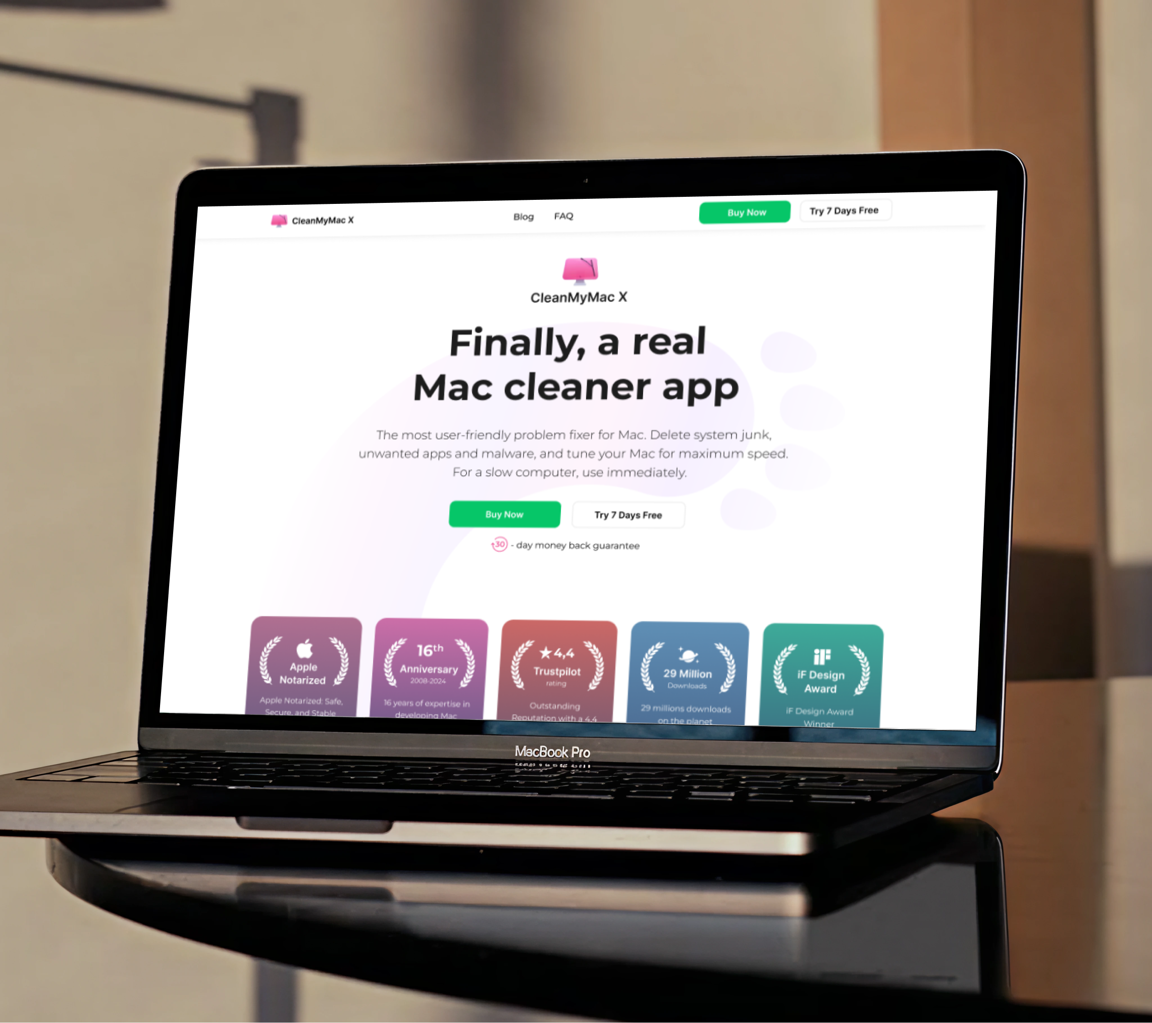
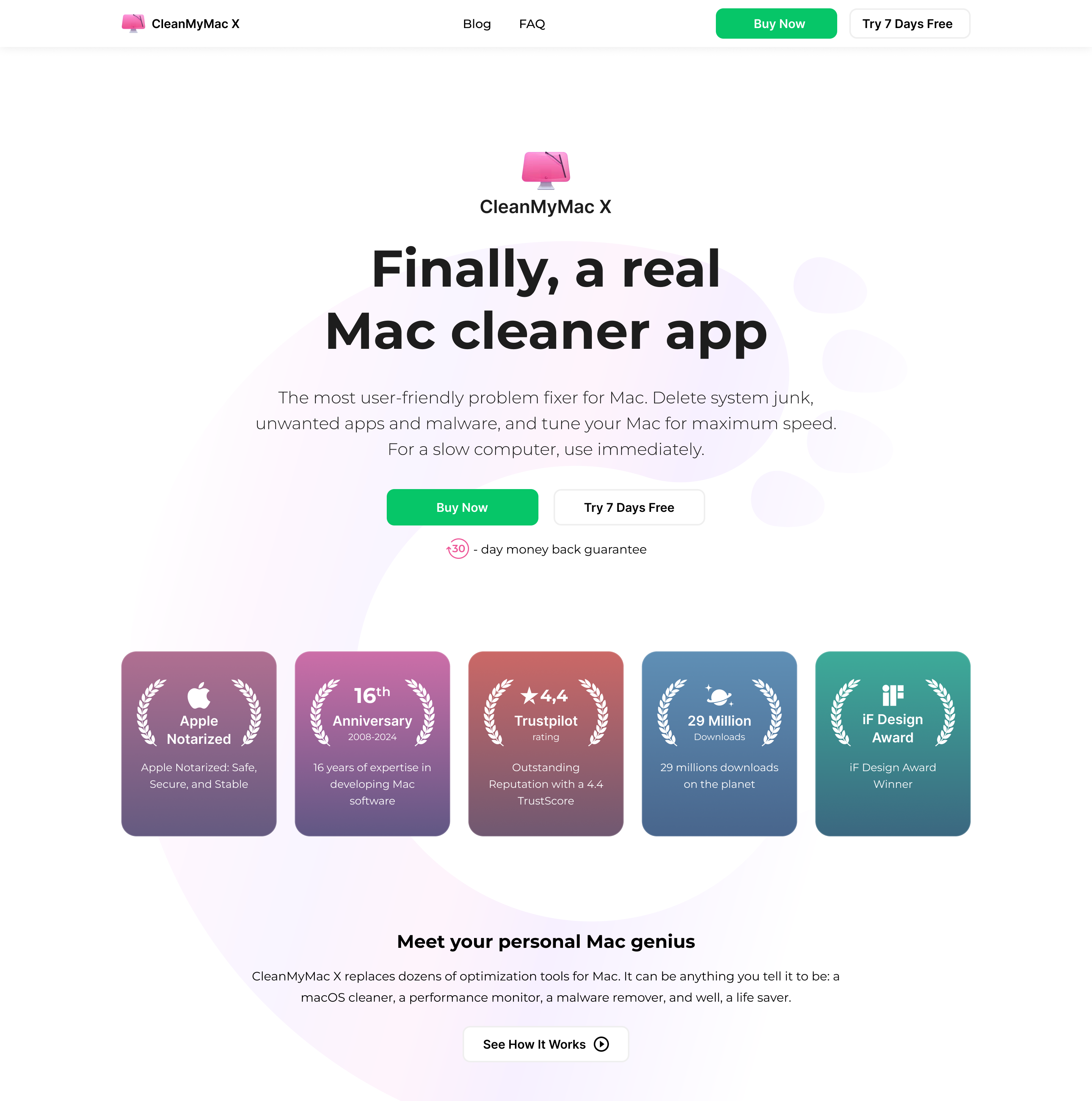
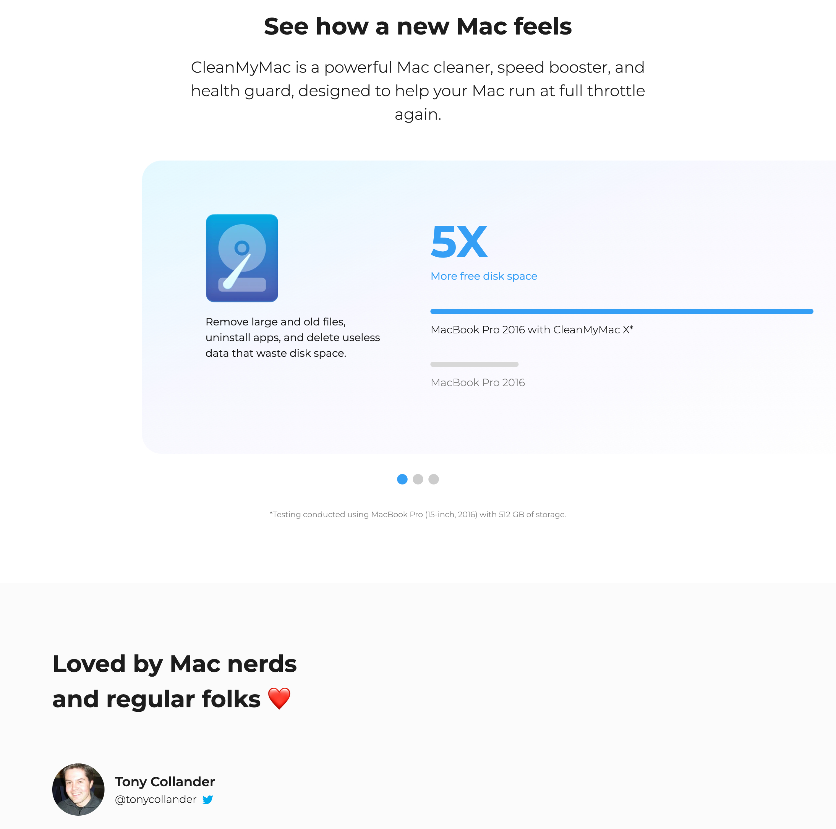
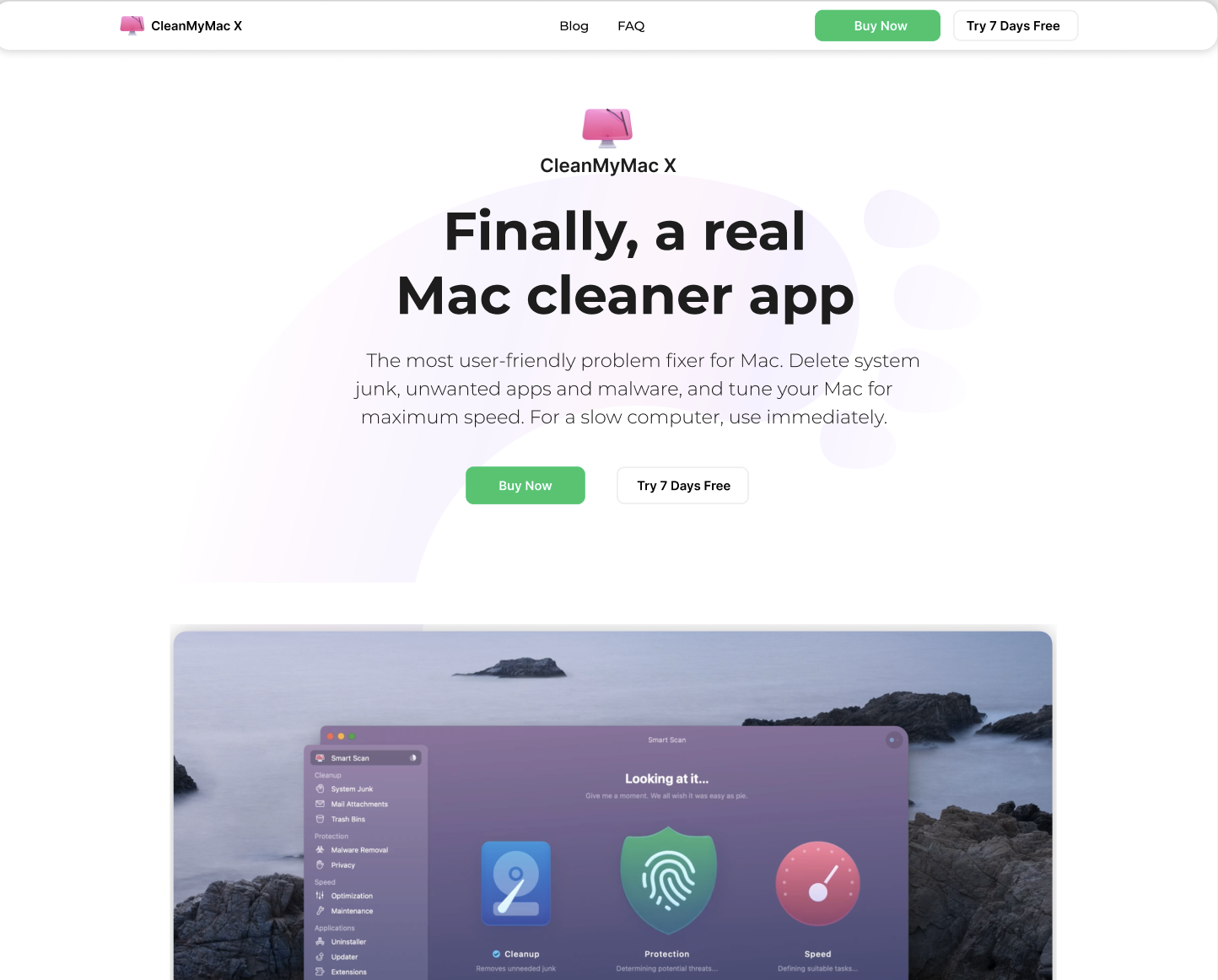
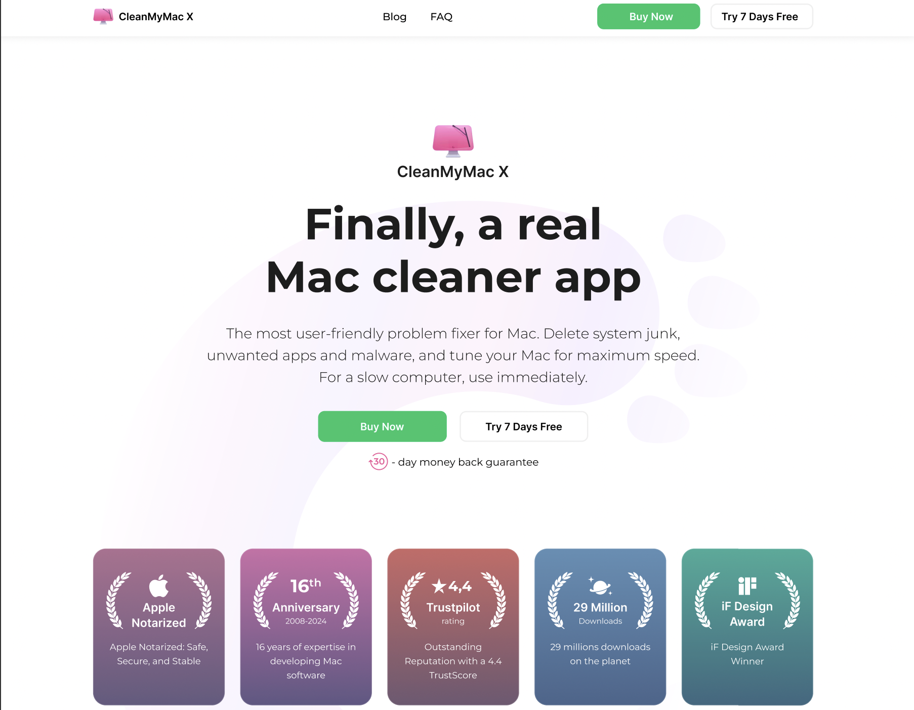
CleanMyMac is an all-in-one macOS utility that helps users optimize performance, free up storage, and maintain system health. Trusted by millions of users worldwide, it simplifies complex maintenance tasks through a single intuitive experience.
Existing version A
Problems

❌
Unclear Value
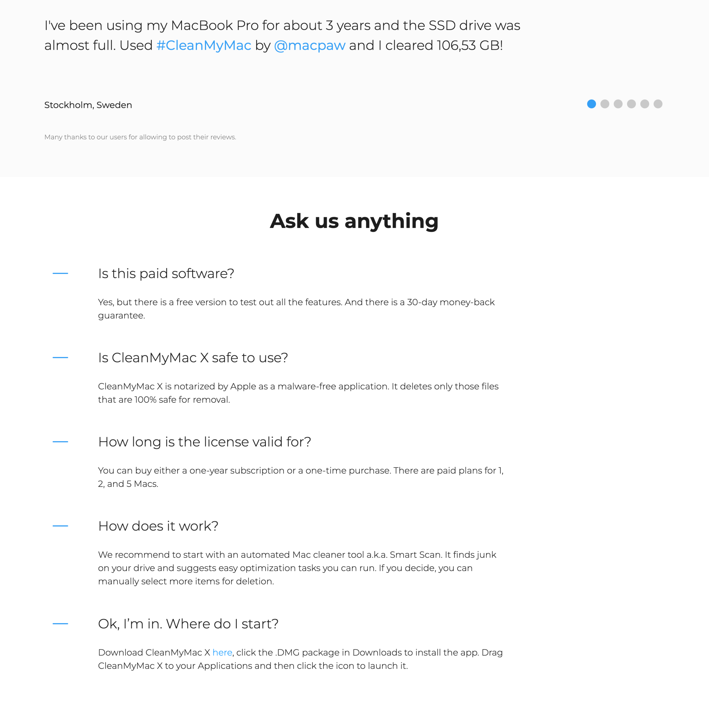
Research showed that many users didn't fully understand what CleanMyMac does or why they need it.
❌
Trust Barrier
User interviews revealed hesitation around trusting optimization tools and their effectiveness.
❌
Low Trial Conversion
Analytics showed significant drop-off between Homepage visits and Trial sign-ups.
❌
Weak Value Communication
User research indicated that features were easier to notice than the benefits they delivered.
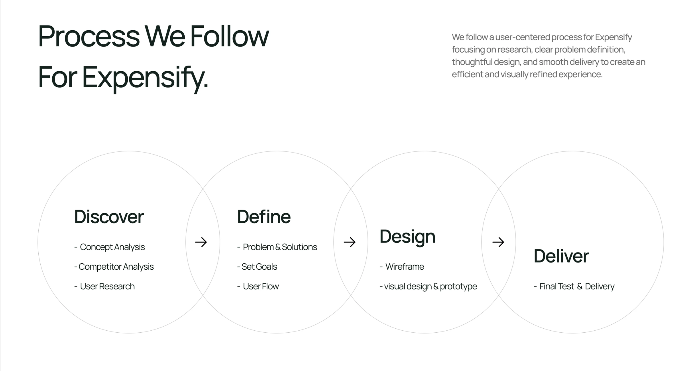
Optimization Strategy
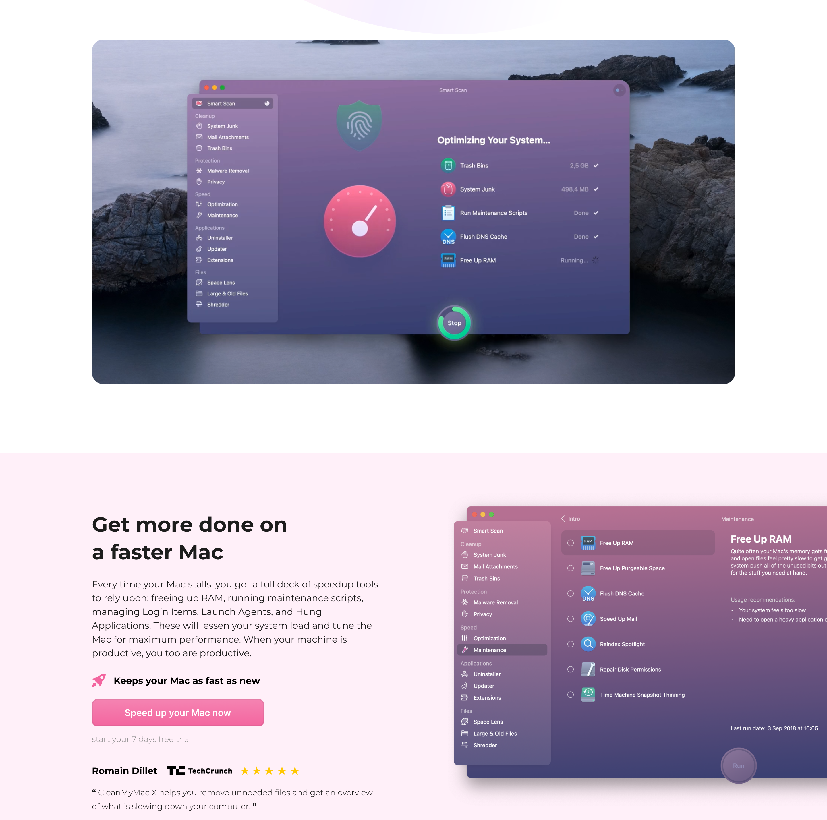
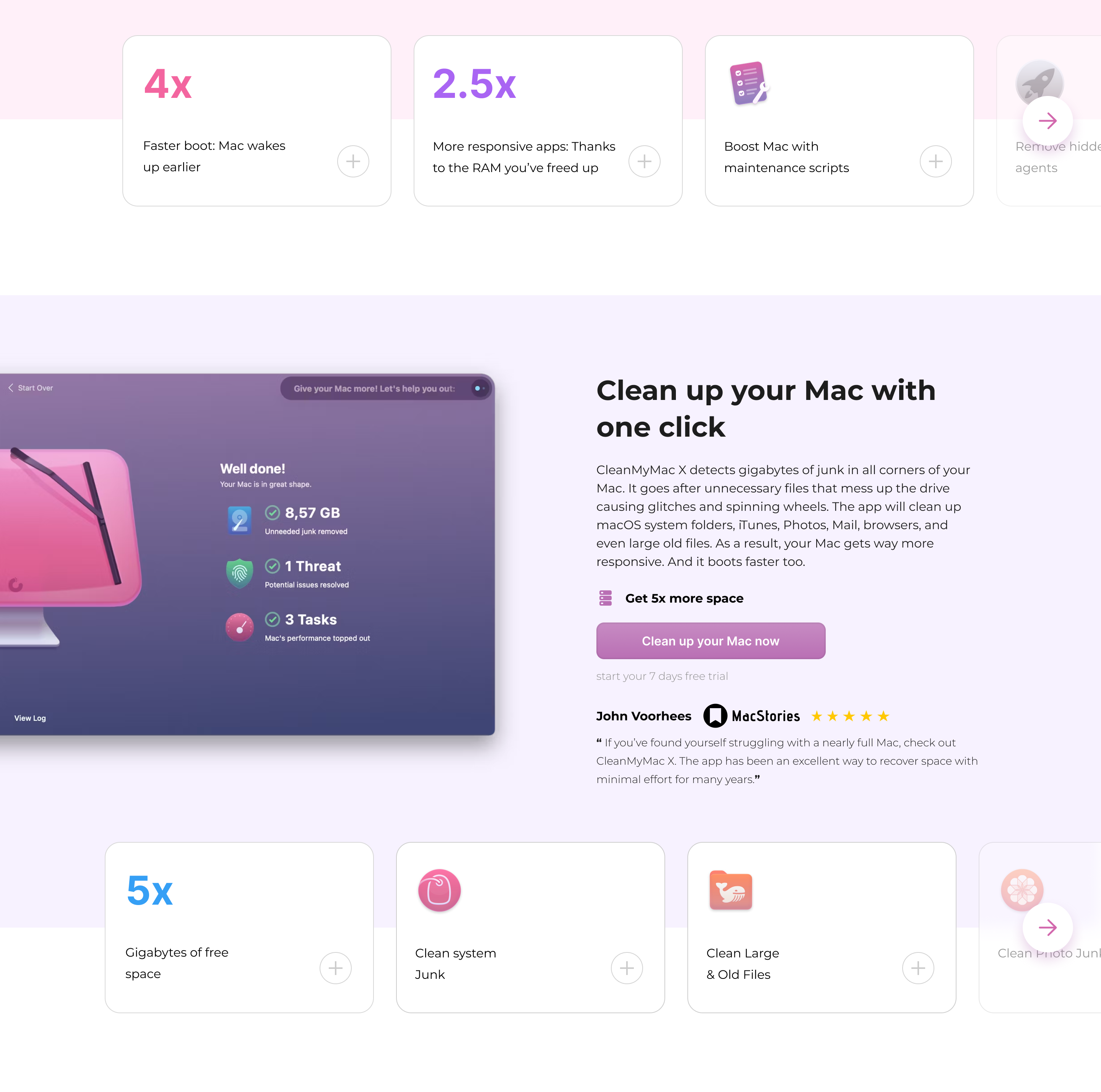
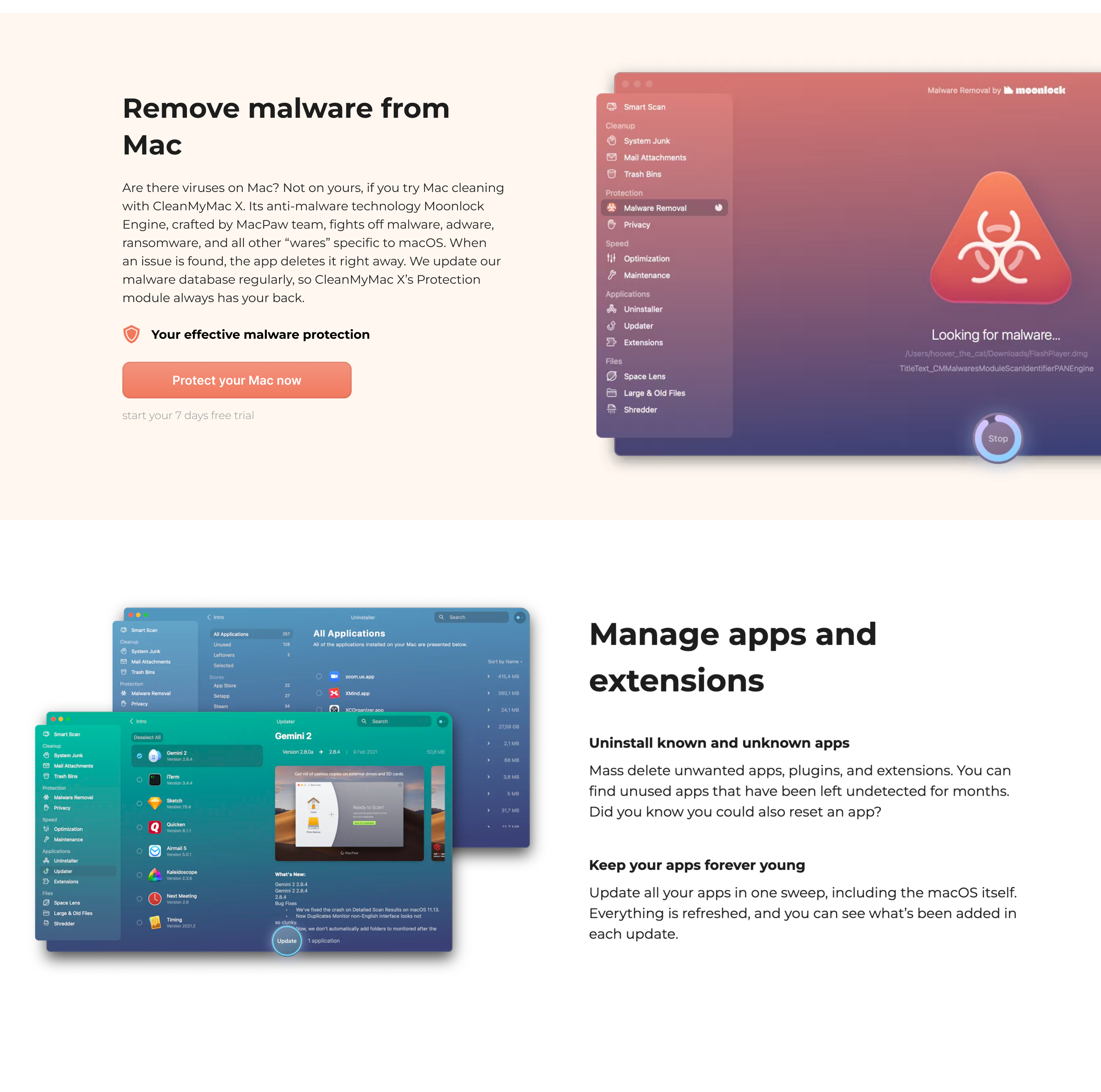
Based on research and analytics, we focused on reducing uncertainty, improving product understanding, and making value more visible throughout the acquisition journey. The strategy centered around strengthening trust signals, clarifying benefits, and helping users connect product capabilities with real-world outcomes.


Trust
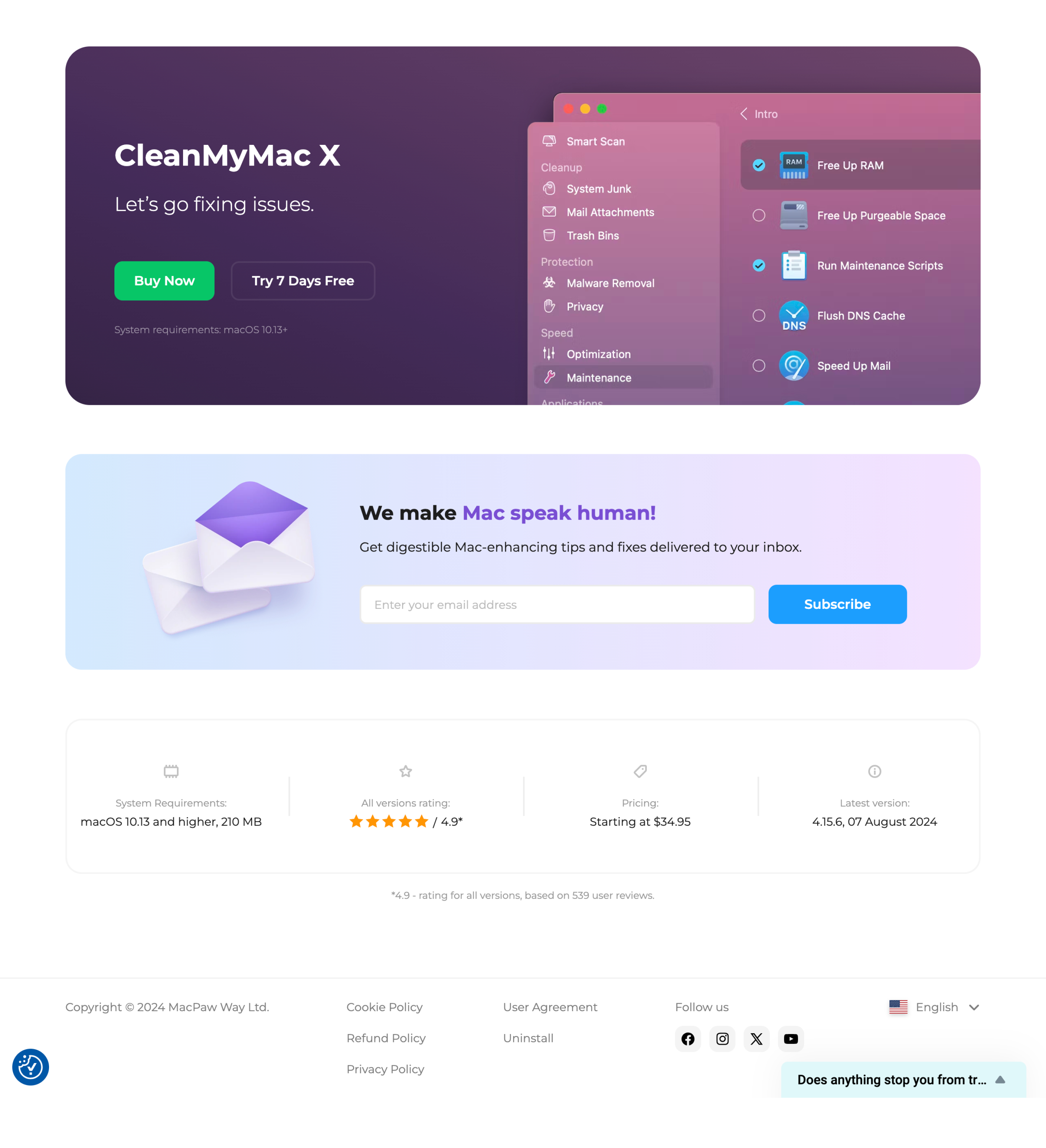
Highlighted awards, ratings, downloads, and guarantees to reduce hesitation.
Clarity
Made the product easier to understand by simplifying messaging and structure.
Value
Shifted communication from features to outcomes and user benefits.
Guidance
Improved content hierarchy and CTAs to support decision-making.

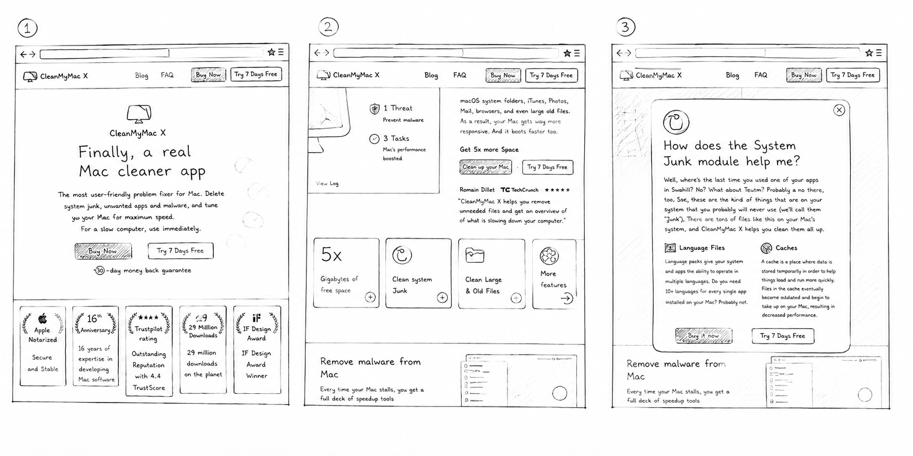
Concept Exploration

Color System
The color system was designed to balance trust, clarity, and product personality. Soft gradients and vibrant accents help communicate product benefits while keeping the experience approachable and easy to navigate.
A965F3
Trust Purple
Used across product visuals and feature sections to reinforce the brand and create a trustworthy, premium feel.
F3659F
Benefit Pink
Used to highlight product benefits, outcomes, and performance improvements throughout the experience.
FFFFFF
Neutral White
Provides clarity, readability, and visual balance across content-heavy sections.
06C668
Action Green
Used for primary CTAs and key actions to drive attention and encourage conversions.
Overview
CleanMyMac is a well-known Mac optimization tool by MacPaw. My goal was to improve the landing experience and increase conversions
Montserrat
16 px
20 px
24 px
32 px
40 px
48px
64px
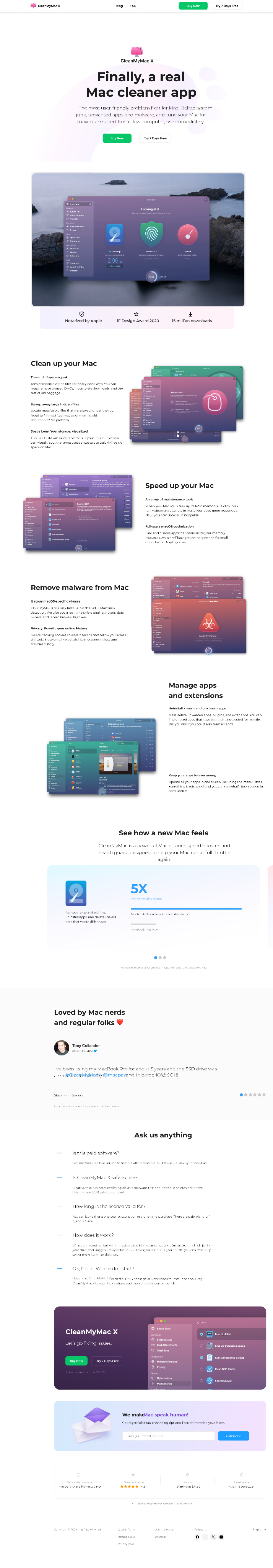
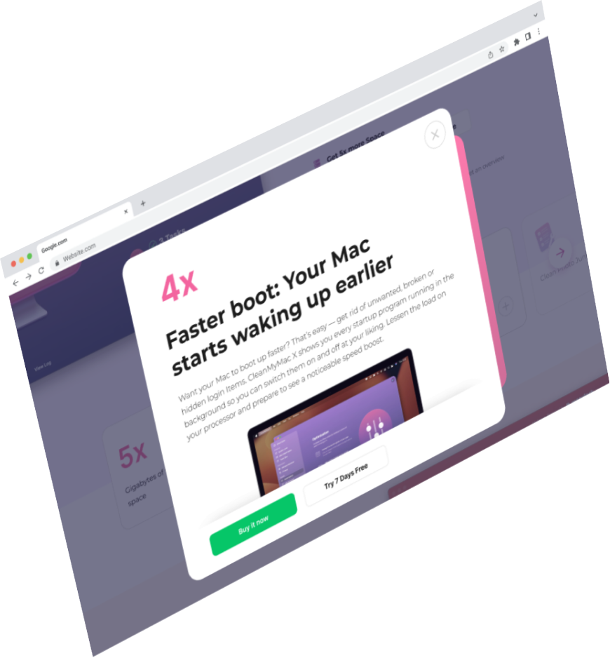
Final Design
Final Solution
The redesign improved how users discover, understand, and evaluate the product. By strengthening trust signals, clarifying benefits, and simplifying key interactions, the experience became more focused on helping users make confident decisions.
Results
Aug-Sep 2024
Version A
Homepage → Transaction
CvR 2.02%
Trial Sign-up → Transaction
CvR 8.69%
Trial Activated → Transaction
CvR 24.76%
CvR (A)
Version B
Homepage → Transaction
CvR 2.41%
Trial Sign-up → Transaction
CvR 10.55%
Trial Activated → Transaction
CvR 25.18%
CvR +20%
Overview
CleanMyMac is a well-known Mac optimization tool by MacPaw. My goal was to improve the landing experience and increase conversions by making the value clearer and the page easier to trust. The product was strong. The communication was not strong enough.
Great products don't always need more features. Sometimes they just need a clearer way to communicate their value.
value


CleanMyMac is a macOS utility product, but its landing page didn’t clearly communicate value or build enough trust, which limited conversions. I redesigned the experience by simplifying the messaging, improving visual hierarchy, and strengthening trust signals, resulting in clearer positioning and higher conversion performance.
https://summerofsoccer.expedia.com/
Published:
Sep 2024
Industry:
Consumer SaaS
Project Type:
CRO hypothesis
My Role:
Product Designer
Scale:
29 million downloads
Business Impact:
+19% ARPU
+20% CvR
Book 15 minutes call
Let’s Discussyour Project!
Schedule a Consult


© Copyright 2022, All Rights Reserved
Client Request
"CleanMyMac is already a successful product, but it feels like many new users aren't fully connecting with its value. We need to make that value easier to understand."
value

Ksenia Demchenko
Senior SEO Specialist
MacPaw Inc.

macOS
Productivity
Performance
Security
Utilities
About the product
CleanMyMac is an all-in-one macOS utility that helps users optimize performance, free up storage, and maintain system health. Trusted by millions of users worldwide, it simplifies complex maintenance tasks through a single intuitive experience.
Existing version A
Problems

❌
Unclear Value
Research showed that many users didn't fully understand what CleanMyMac does or why they need it.
❌
Trust Barrier
User interviews revealed hesitation around trusting optimization tools and their effectiveness.
❌
Low Trial Conversion
Analytics showed significant drop-off between Homepage visits and Trial sign-ups.
❌
Weak Value Communication
User research indicated that features were easier to notice than the benefits they delivered.
OptimizationStrategy


Trust
Clarity
Value
Guidance
Highlighted awards, ratings, downloads, and guarantees to reduce hesitation.
Made the product easier to understand by simplifying messaging and structure.
Shifted communication from features to outcomes and user benefits.
Improved content hierarchy and CTAs to support decision-making.

Based on research and analytics, we focused on reducing uncertainty, improving product understanding, and making value more visible throughout the acquisition journey. The strategy centered around strengthening trust signals, clarifying benefits, and helping users connect product capabilities with real-world outcomes.
Concept Exploration
A965F3
Trust Purple
Used across product visuals and feature sections to reinforce the brand and create a trustworthy, premium feel.
F3659F
Benefit Pink
Used to highlight product benefits, outcomes, and performance improvements throughout the experience.
FFFFFF
Neutral White
Provides clarity, readability, and visual balance across content-heavy sections.
06C668
Action Green
Used for primary CTAs and key actions to drive attention and encourage conversions.
Typography
Montserrat was selected for its strong readability, modern appearance, and clean geometric structure. The typeface helps communicate information clearly while supporting both marketing content and product-focused messaging.
Montserrat
Color System
The color system was designed to balance trust, clarity, and product personality. Soft gradients and vibrant accents help communicate product benefits while keeping the experience approachable and easy to navigate.
16 px
20 px
24 px
32 px
40 px
48px
64 px
Final Design
Final Solution
The redesign improved how users discover, understand, and evaluate the product. By strengthening trust signals, clarifying benefits, and simplifying key interactions, the experience became more focused on helping users make confident decisions.
Results
Aug-Sep 2024
Version A
Homepage → Transaction
CvR 2.02%
Trial Sign-up → Transaction
CvR 8.69%
Trial Activated → Transaction
CvR 24.76%
CvR (A)
Version B
Homepage → Transaction
CvR 2.41%
Trial Sign-up → Transaction
CvR 10.55%
Trial Activated → Transaction
CvR 25.18%
CvR +20%


Great products don't always need more features. Sometimes they just need a clearer way to communicate their value.
value
The project demonstrated how research, experimentation, and product design can uncover meaningful growth opportunities without changing the core product. By improving trust, product understanding, and value communication, the redesigned experience created a clearer path toward conversion and delivered measurable business impact.
CleanMyMac is a macOS utility product, but its landing page didn’t clearly communicate value or build enough trust, which limited conversions. I redesigned the experience by simplifying the messaging, improving visual hierarchy, and strengthening trust signals, resulting in clearer positioning and higher conversion performance.
https://summerofsoccer.expedia.com/
Book 15 minutes call
Published:
Sep 2024
Industry:
Consumer SaaS
Project Type:
CRO hypothesis
My Role:
Product Designer
Scale:
29 million downloads
Business Impact:
+19% ARPU
+20% CvR
Let’s Discuss your Project!
Schedule a Consult
© Copyright 2022, All Rights Reserved
Kyrylo Buriak
Client Request
"CleanMyMac is already a successful product, but it feels like many new users aren't fully connecting with its value. We need to make that value easier to understand."
value
Ksenia Demchenko
Senior SEO Specialist
MacPaw Inc.
macOS
Productivity
Performance
Security
Utilities
About the product
CleanMyMac is an all-in-one macOS utility that helps users optimize performance, free up storage, and maintain system health. Trusted by millions of users worldwide, it simplifies complex maintenance tasks through a single intuitive experience.
Existing version A
Problems
❌
Unclear Value
Research showed that many users didn't fully understand what CleanMyMac does or why they need it.
❌
Trust Barrier
User interviews revealed hesitation around trusting optimization tools and their effectiveness.
❌
Low Trial Conversion
Analytics showed significant drop-off between Homepage visits and Trial sign-ups.
❌
Weak Value Communication
User research indicated that features were easier to notice than the benefits they delivered.
OptimizationStrategy
Trust
Clarity
Value
Guidance
Highlighted awards, ratings, downloads, and guarantees to reduce hesitation.
Made the product easier to understand by simplifying messaging and structure.
Shifted communication from features to outcomes and user benefits.
Improved content hierarchy and CTAs to support decision-making.
Based on research and analytics, we focused on reducing uncertainty, improving product understanding, and making value more visible throughout the acquisition journey. The strategy centered around strengthening trust signals, clarifying benefits, and helping users connect product capabilities with real-world outcomes.
Concept Exploration
A965F3
Trust Purple
Used across product visuals and feature sections to reinforce the brand and create a trustworthy, premium feel.
F3659F
Benefit Pink
Used to highlight product benefits, outcomes, and performance improvements throughout the experience.
FFFFFF
Neutral White
Provides clarity, readability, and visual balance across content-heavy sections.
06C668
Action Green
Used for primary CTAs and key actions to drive attention and encourage conversions.
Typography
Montserrat was selected for its strong readability, modern appearance, and clean geometric structure. The typeface helps communicate information clearly while supporting both marketing content and product-focused messaging.
Montserrat
Color System
The color system was designed to balance trust, clarity, and product personality. Soft gradients and vibrant accents help communicate product benefits while keeping the experience approachable and easy to navigate.
16 px
20 px
24 px
32 px
40 px
48px
64 px
Final Design
Final Solution
The redesign improved how users discover, understand, and evaluate the product. By strengthening trust signals, clarifying benefits, and simplifying key interactions, the experience became more focused on helping users make confident decisions.
Results
Aug-Sep 2024
Version A
Homepage → Transaction
CvR 2.02%
Trial Sign-up → Transaction
CvR 8.69%
Trial Activated → Transaction
CvR 24.76%
CvR (A)
Version B
Homepage → Transaction
CvR 2.41%
Trial Sign-up → Transaction
CvR 10.55%
Trial Activated → Transaction
CvR 25.18%
CvR +20%
Great products don't always need more features. Sometimes they just need a clearer way to communicate their value.
value
The project demonstrated how research, experimentation, and product design can uncover meaningful growth opportunities without changing the core product. By improving trust, product understanding, and value communication, the redesigned experience created a clearer path toward conversion and delivered measurable business impact.
CleanMyMac is a leading macOS utility trusted by millions of users worldwide. The project focused on optimizing the acquisition funnel by improving trust, value communication, and decision-making throughout the user journey. The redesign was validated through A/B testing and delivered measurable improvements in conversion, transactions, and ARPU.
Published:
Sep 2024
Industry:
Consumer SaaS
Project Type:
Growth Optimization & CRO
My Role:
Product Designer
Scale:
29 million downloads
Business Impact:
+19% ARPU
+20% CvR
Book 15 minutes call
Let’s Discuss your Project!
Schedule a Consult
© Copyright 2022, All Rights Reserved
Kyrylo Buriak
Client Request
"CleanMyMac is already a successful product, but it feels like many new users aren't fully connecting with its value. We need to make that value easier to understand."
value
Ksenia Demchenko
Senior SEO Specialist
MacPaw Inc.
macOS
Productivity
Performance
Security
Utilities
About the product
CleanMyMac is an all-in-one macOS utility that helps users optimize performance, free up storage, and maintain system health. Trusted by millions of users worldwide, it simplifies complex maintenance tasks through a single intuitive experience.
Existing version A
Problems
❌
Unclear Value
Research showed that many users didn't fully understand what CleanMyMac does or why they need it.
❌
Trust Barrier
User interviews revealed hesitation around trusting optimization tools and their effectiveness.
❌
Low Trial Conversion
Analytics showed significant drop-off between Homepage visits and Trial sign-ups.
❌
Weak Value Communication
User research indicated that features were easier to notice than the benefits they delivered.
OptimizationStrategy
Trust
Clarity
Value
Guidance
Highlighted awards, ratings, downloads, and guarantees to reduce hesitation.
Made the product easier to understand by simplifying messaging and structure.
Shifted communication from features to outcomes and user benefits.
Improved content hierarchy and CTAs to support decision-making.
Based on research and analytics, we focused on reducing uncertainty, improving product understanding, and making value more visible throughout the acquisition journey. The strategy centered around strengthening trust signals, clarifying benefits, and helping users connect product capabilities with real-world outcomes.
Concept Exploration
A965F3
Trust Purple
Used across product visuals and feature sections to reinforce the brand and create a trustworthy, premium feel.
F3659F
Benefit Pink
Used to highlight product benefits, outcomes, and performance improvements throughout the experience.
FFFFFF
Neutral White
Provides clarity, readability, and visual balance across content-heavy sections.
06C668
Action Green
Used for primary CTAs and key actions to drive attention and encourage conversions.
Typography
Montserrat was selected for its strong readability, modern appearance, and clean geometric structure. The typeface helps communicate information clearly while supporting both marketing content and product-focused messaging.
Montserrat
Color System
The color system was designed to balance trust, clarity, and product personality. Soft gradients and vibrant accents help communicate product benefits while keeping the experience approachable and easy to navigate.
16 px
20 px
24 px
32 px
40 px
48px
64 px
Final Design
Final Solution
The redesign improved how users discover, understand, and evaluate the product. By strengthening trust signals, clarifying benefits, and simplifying key interactions, the experience became more focused on helping users make confident decisions.
Results
Aug-Sep 2024
Version A
Homepage → Transaction
CvR 2.02%
Trial Sign-up → Transaction
CvR 8.69%
Trial Activated → Transaction
CvR 24.76%
CvR (A)
Version B
Homepage → Transaction
CvR 2.41%
Trial Sign-up → Transaction
CvR 10.55%
Trial Activated → Transaction
CvR 25.18%
CvR +20%
Great products don't always need more features. Sometimes they just need a clearer way to communicate their value.
value
The project demonstrated how research, experimentation, and product design can uncover meaningful growth opportunities without changing the core product. By improving trust, product understanding, and value communication, the redesigned experience created a clearer path toward conversion and delivered measurable business impact.
CleanMyMac is a leading macOS utility trusted by millions of users worldwide. The project focused on optimizing the acquisition funnel by improving trust, value communication, and decision-making throughout the user journey. The redesign was validated through A/B testing and delivered measurable improvements in conversion, transactions, and ARPU.
Wisit the live page
Published:
Sep 2024
Industry:
Consumer SaaS
Project Type:
Growth Optimization & CRO
My Role:
Product Designer
Scale:
29 million downloads
Business Impact:
+19% ARPU
+20% CvR
Book 15 minutes call
Let’s Discuss your Project!
Schedule a Consult
© Copyright 2022, All Rights Reserved
Kyrylo Buriak