
Client Request
"The content is valuable, but the app feels outdated. We need a modern learning experience that attracts new students and keeps them engage. "
engaged
Research Insights
Data Highlights
First-Session Drop-off
High
New users frequently left before reaching their first learning session, indicating friction during the initial experience.



Content Discovery
Low
Students struggled to quickly find relevant learning materials, reducing engagement with educational content.
User Insights

"The app feels outdated compared to other learning apps."
User Interview, New Visitor
"It takes too long to find the study material I need."
User Interview, Regular User
"Everything feels buried behind too many screens."
User Interview, Potential Trial User
ⓘ Charts illustrate relative user behavior trends rather than actual product metrics.
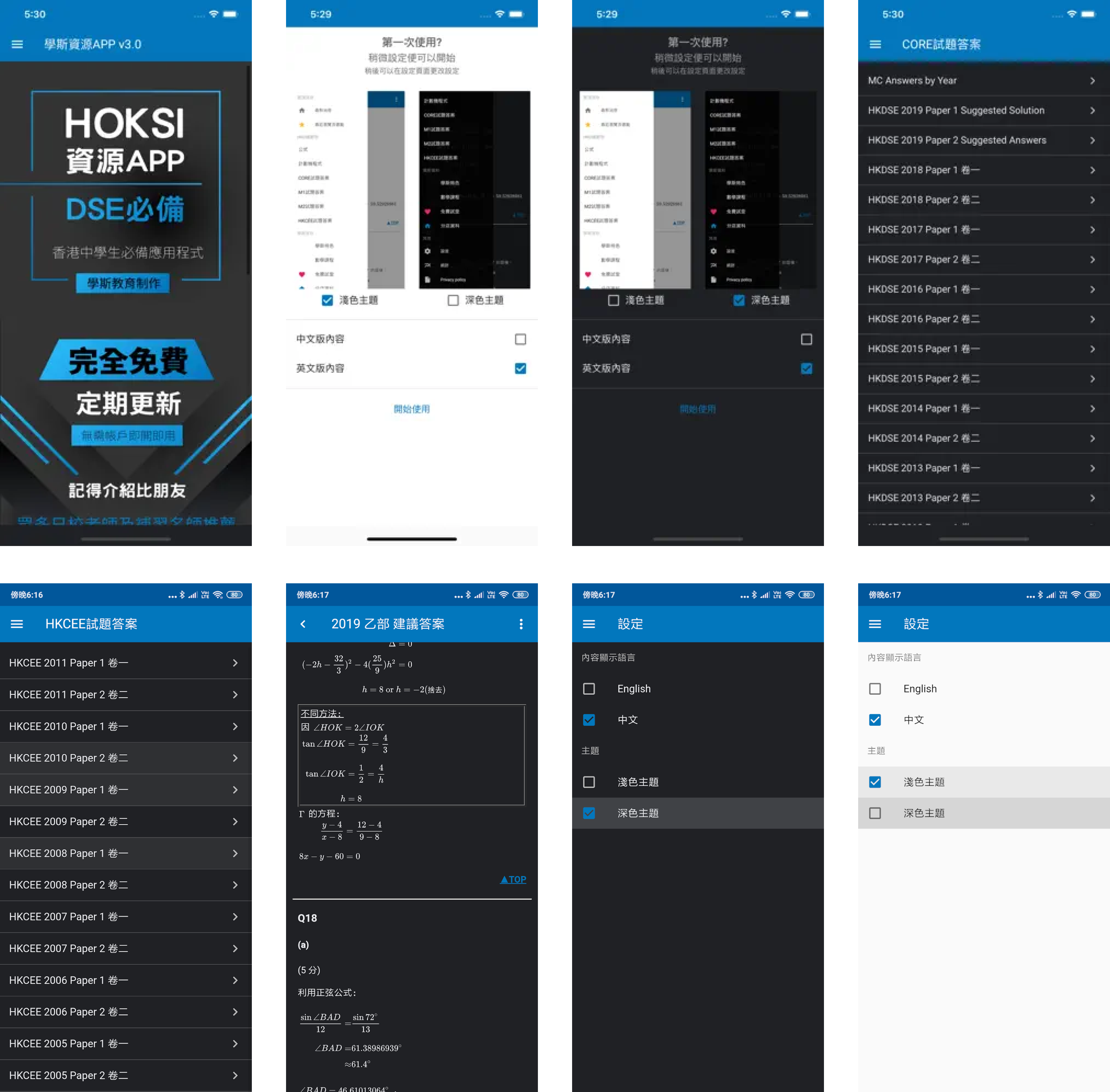
Existing version A
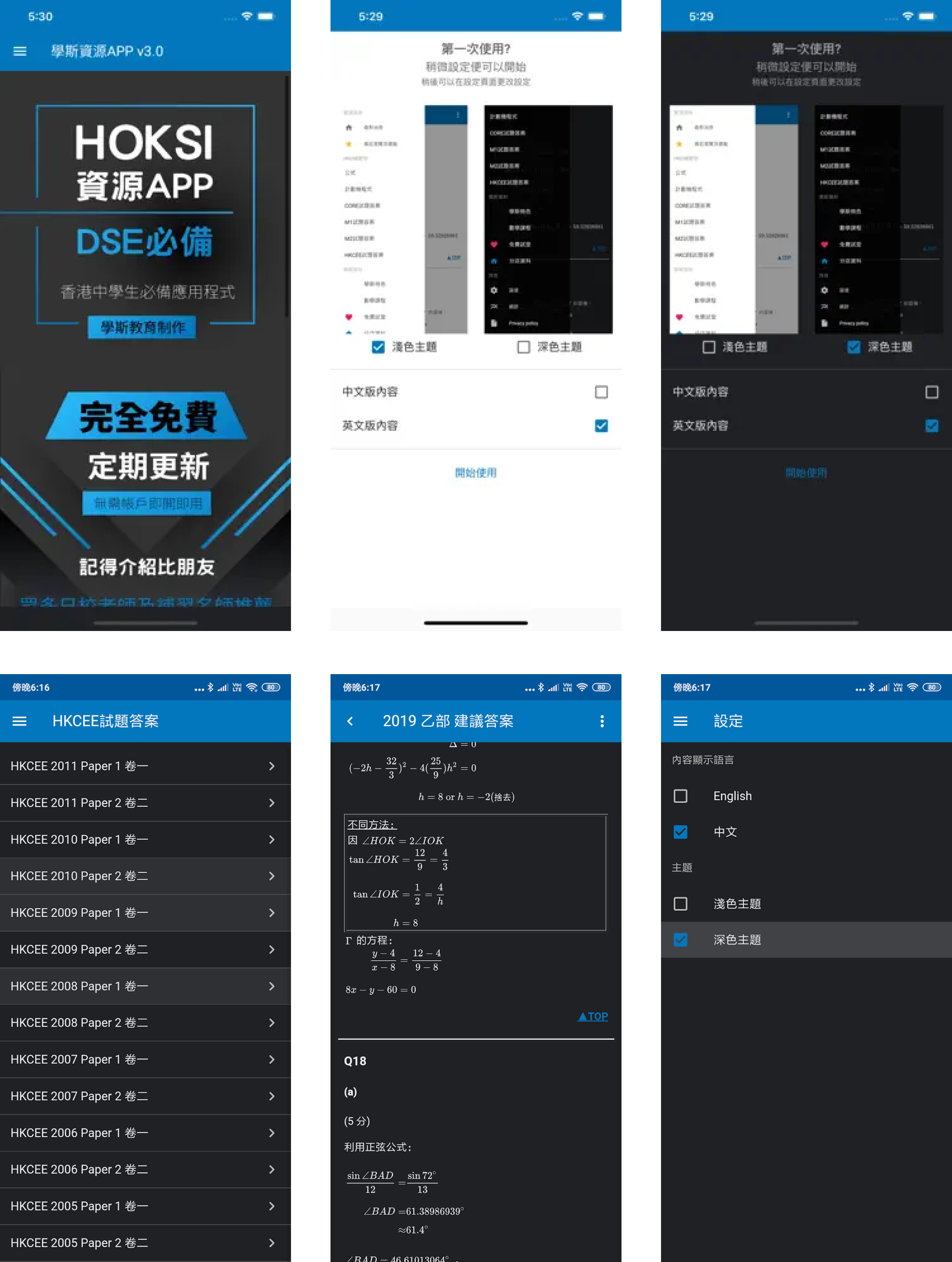
Challenges

❌
Outdated Experience
The legacy interface reduced trust and made the product feel less competitive.
❌
Low Content Discovery
Students struggled to quickly find relevant subjects and learning materials.
❌
High Navigation Friction
Complex user flows slowed down access to educational content.
❌
Limited Scalability
The existing structure made it difficult to expand the platform with new features.
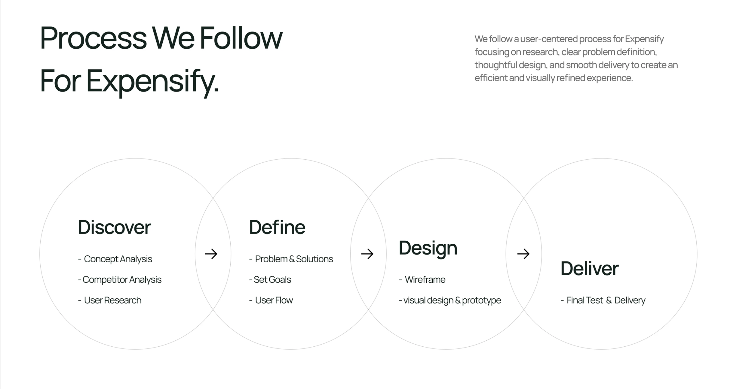
Optimization Strategy



Navigation
Structure
Engagement
Scalability
Simplify user flows so students can reach learning materials in fewer steps.
Reorganize educational content into clear, predictable learning paths.
Create a more intuitive and enjoyable learning experience that encourages students to return.
Build reusable components and UX patterns to support future product expansion.

The redesign focused on reducing friction throughout the learning journey while making the platform easier to navigate, understand, and expand. Instead of simply refreshing the interface, the goal was to improve how students discovered content, interacted with learning materials, and returned to the app over time.
#000000
Content & Readability
High-contrast typography improves readability and keeps educational content easy to scan.
#4F929F
Supporting Actions
Highlights secondary actions, learning states, and complementary interface elements without competing with primary actions.
#8C85DE
Progress & Motivation
Used to represent progress, achievements, and educational features while adding personality to the product.
#2F71DA
Primary Actions
Used for primary actions, navigation, and key interactive elements to guide students through the learning journey.
Typography
THICCCBOI was selected for its modern, friendly character and excellent readability across mobile interfaces. Its clean geometry supports long reading sessions while creating a recognizable and approachable product identity.
THICCCBOI

Color System
The color system was designed to create a focused and approachable learning experience. Blue reinforces trust and clarity, while supporting colors improve content hierarchy, navigation, and feature recognition across the product.
16 px
20 px
24 px
32 px
40 px
48 px
64 px
Concept Exploration
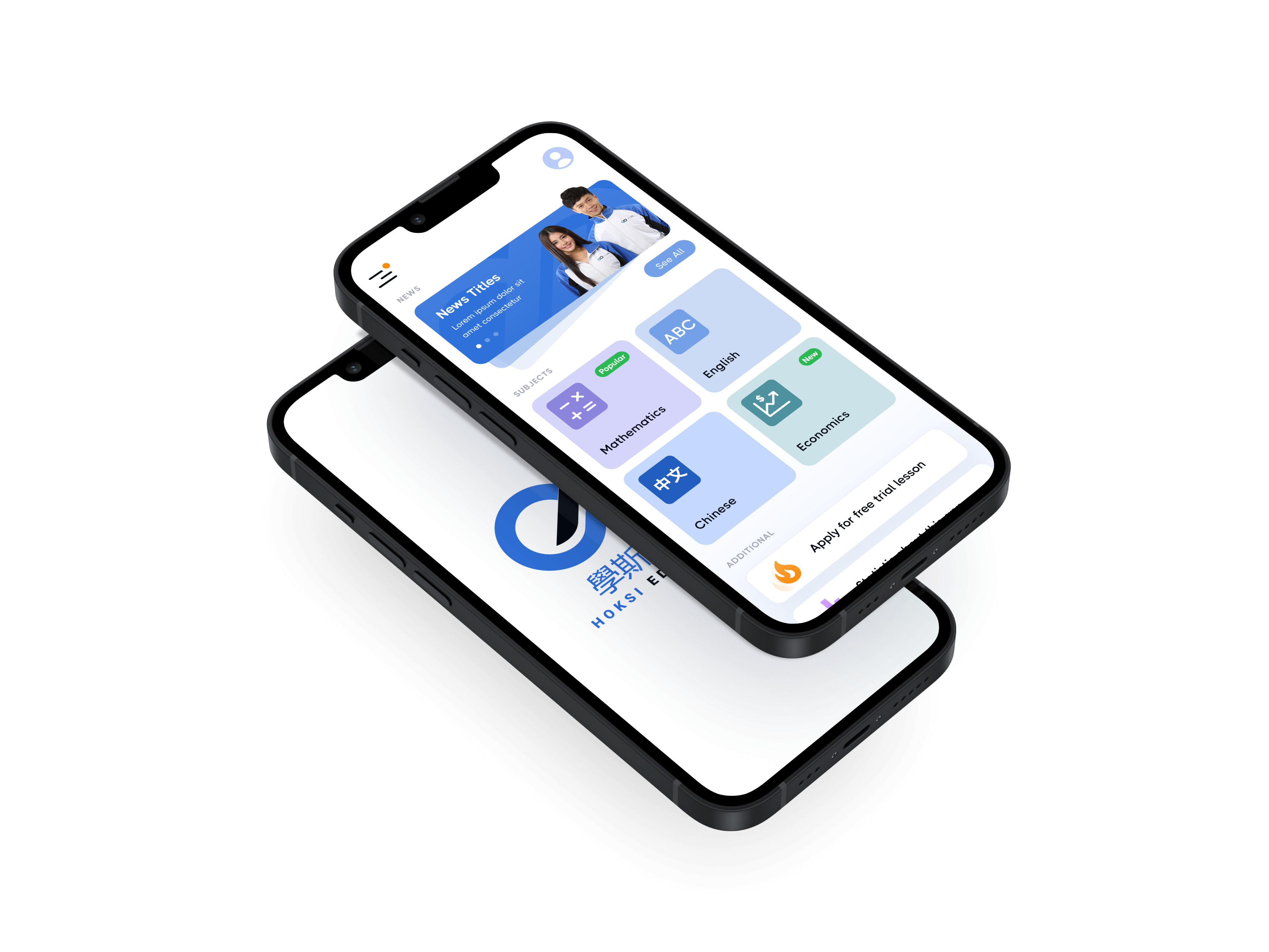
The initial concepts restructured the product around students' learning journeys rather than long content lists. New navigation patterns, modular subject cards, and clearer content hierarchy were explored to reduce friction and improve discoverability.
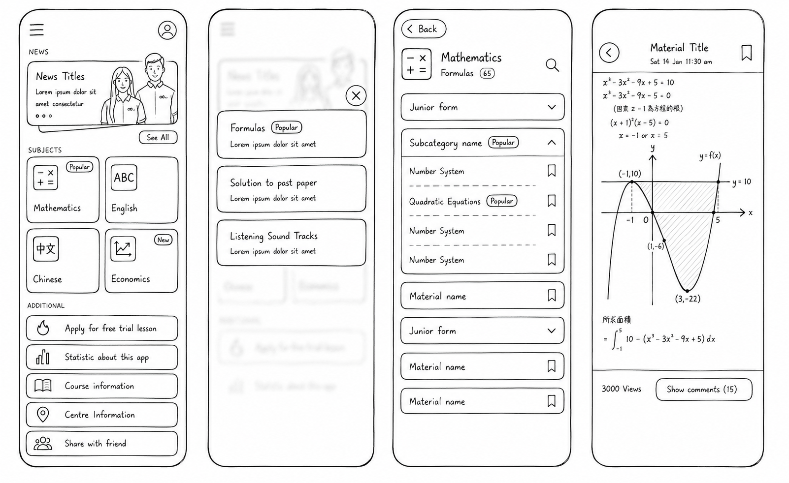
Design
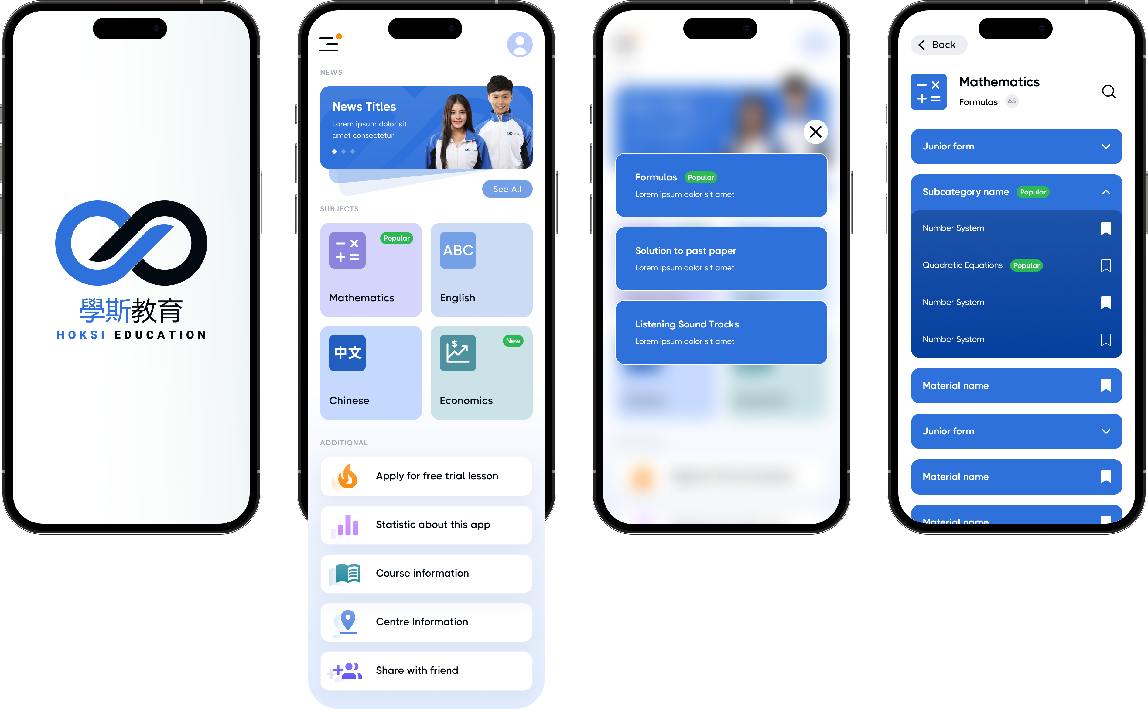
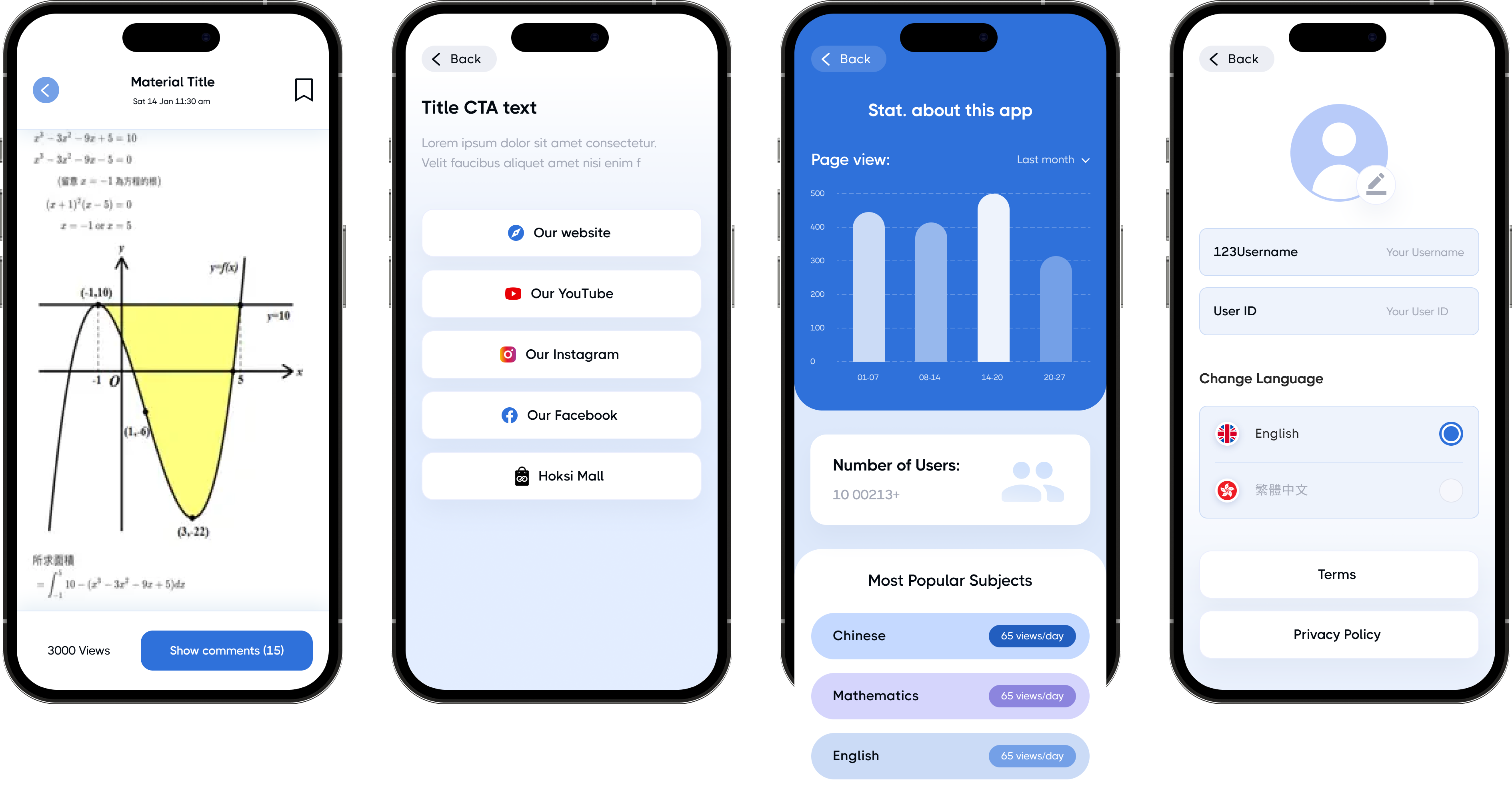
The final interface introduced a clean dashboard, modular subject cards, and a consistent visual language that made learning materials easier to discover. Modern layouts, improved hierarchy, and intuitive interactions created a more engaging and approachable learning experience.
Results
May 2022
Version A
Challenges:
❌
Outdated Experience
❌
Trust Barrier
❌
High Navigation Friction
❌
Limited Scalability
CvR (A)
Version B

App Install → First Lesson
+30% Activation
First Lesson → Returning User
+20% Engagement
Weekly Active Users
+18% Retention
CvR +30%
Client Request
“The redesign went beyond visual improvements, creating a product foundation that makes future development faster, more consistent, and easier to scale.”
foundation

HOKSI is a digital learning platform that helps students prepare for exams through structured educational content and interactive learning tools. The redesign focused on improving user acquisition and engagement by creating a modern, intuitive, and scalable learning experience.
Published:
May 2022
Industry:
Education Technology
Project Type:
CRO hypothesis
My Role:
Product Designer
Business Impact:
+30% CvR
Book 15 minutes call
Let’s Discussyour Project!
Schedule a Consult


© Copyright 2022, All Rights Reserved

Client Request
"The content is valuable, but the app feels outdated. We need a modern learning experience that attracts new students and keeps them engage."
engaged
Research Insights
Data Highlights
First-Session Drop-off
High
New users frequently left before reaching their first learning session, indicating friction during the initial experience.



Content Discovery
Low
Students struggled to quickly find relevant learning materials, reducing engagement with educational content.
User Insights

"The app feels outdated compared to other learning apps."
User Interview, New Visitor
"It takes too long to find the study material I need."
User Interview, Regular User
"Everything feels buried behind too many screens."
User Interview, Potential Trial User
ⓘ Charts illustrate relative user behavior trends rather than actual product metrics.
Existing version A
Challenges

❌
Outdated Experience
The legacy interface reduced trust and made the product feel less competitive.
❌
Low Content Discovery
Students struggled to quickly find relevant subjects and learning materials.
❌
High Navigation Friction
Complex user flows slowed down access to educational content.
❌
Limited Scalability
The existing structure made it difficult to expand the platform with new features.
OptimizationStrategy


Navigation
Structure
Engagement
Scalability
Simplify user flows so students can reach learning materials in fewer steps.
Reorganize educational content into clear, predictable learning paths.
Create a more intuitive and enjoyable learning experience that encourages students to return.
Build reusable components and UX patterns to support future product expansion.

The redesign focused on reducing friction throughout the learning journey while making the platform easier to navigate, understand, and expand. Instead of simply refreshing the interface, the goal was to improve how students discovered content, interacted with learning materials, and returned to the app over time.
#000000
Content & Readability
High-contrast typography improves readability and keeps educational content easy to scan.
#4F929F
Supporting Actions
Highlights secondary actions, learning states, and complementary interface elements without competing with primary actions.
#8C85DE
Progress & Motivation
Used to represent progress, achievements, and educational features while adding personality to the product.
#2F71DA
Primary Actions
Used for primary actions, navigation, and key interactive elements to guide students through the learning journey.
Typography
THICCCBOI was selected for its modern, friendly character and excellent readability across mobile interfaces. Its clean geometry supports long reading sessions while creating a recognizable and approachable product identity.
THICCCBOI
Color System
The color system was designed to create a focused and approachable learning experience. Blue reinforces trust and clarity, while supporting colors improve content hierarchy, navigation, and feature recognition across the product.
16 px
20 px
24 px
32 px
40 px
48 px
64 px
Concept Exploration
The initial concepts restructured the product around students' learning journeys rather than long content lists. New navigation patterns, modular subject cards, and clearer content hierarchy were explored to reduce friction and improve discoverability.
Design
The final interface introduced a clean dashboard, modular subject cards, and a consistent visual language that made learning materials easier to discover. Modern layouts, improved hierarchy, and intuitive interactions created a more engaging and approachable learning experience.
Results
May 2022
Version A
Challenges:
❌
Outdated Experience
❌
Trust Barrier
❌
High Navigation Friction
❌
Limited Scalability
CvR (A)
Version B
App Install → First Lesson
+30% Activation
First Lesson → Returning User
+20% Engagement
Weekly Active Users
+18% Retention
CvR +30%
“The redesign went beyond visual improvements, creating a product foundation that makes future development faster, more consistent, and easier to scale.”
foundation
HOKSI is a digital learning platform that helps students prepare for exams through structured educational content and interactive learning tools. The redesign focused on improving user acquisition and engagement by creating a modern, intuitive, and scalable learning experience.
Book 15 minutes call
Published:
May 2022
Industry:
Education Technology
Project Type:
Mobile app Redesign
My Role:
Product Designer
Business Impact:
+30% CvR
Let’s Discuss your Project!
Schedule a Consult
© Copyright 2022, All Rights Reserved
Kyrylo Buriak
Client Request
"The content is valuable, but the app feels outdated. We need a modern learning experience that attracts new students and keeps them engage."
engaged
Research Insights
Data Highlights
First-Session Drop-off
High
New users frequently left before reaching their first learning session, indicating friction during the initial experience.
Content Discovery
Low
Students struggled to quickly find relevant learning materials, reducing engagement with educational content.
User Insights
"The app feels outdated compared to other learning apps."
User Interview, New Visitor
"It takes too long to find the study material I need."
User Interview, Regular User
"Everything feels buried behind too many screens."
User Interview, Potential Trial User
ⓘ Charts illustrate relative user behavior trends rather than actual product metrics.
Existing version A
Challenges

❌
Outdated Experience
The legacy interface reduced trust and made the product feel less competitive.
❌
Low Content Discovery
Students struggled to quickly find relevant subjects and learning materials.
❌
High Navigation Friction
Complex user flows slowed down access to educational content.
❌
Limited Scalability
The existing structure made it difficult to expand the platform with new features.
OptimizationStrategy


Navigation
Structure
Engagement
Scalability
Simplify user flows so students can reach learning materials in fewer steps.
Reorganize educational content into clear, predictable learning paths.
Create a more intuitive and enjoyable learning experience that encourages students to return.
Build reusable components and UX patterns to support future product expansion.
The redesign focused on reducing friction throughout the learning journey while making the platform easier to navigate, understand, and expand. Instead of simply refreshing the interface, the goal was to improve how students discovered content, interacted with learning materials, and returned to the app over time.
#000000
Content & Readability
High-contrast typography improves readability and keeps educational content easy to scan.
#4F929F
Supporting Actions
Highlights secondary actions, learning states, and complementary interface elements without competing with primary actions.
#8C85DE
Progress & Motivation
Used to represent progress, achievements, and educational features while adding personality to the product.
#2F71DA
Primary Actions
Used for primary actions, navigation, and key interactive elements to guide students through the learning journey.
Typography
THICCCBOI was selected for its modern, friendly character and excellent readability across mobile interfaces. Its clean geometry supports long reading sessions while creating a recognizable and approachable product identity.
THICCCBOI
Color System
The color system was designed to create a focused and approachable learning experience. Blue reinforces trust and clarity, while supporting colors improve content hierarchy, navigation, and feature recognition across the product.
16 px
20 px
24 px
32 px
40 px
48 px
64 px
Concept Exploration
The initial concepts restructured the product around students' learning journeys rather than long content lists. New navigation patterns, modular subject cards, and clearer content hierarchy were explored to reduce friction and improve discoverability.
Design
The final interface introduced a clean dashboard, modular subject cards, and a consistent visual language that made learning materials easier to discover. Modern layouts, improved hierarchy, and intuitive interactions created a more engaging and approachable learning experience.
Results
May 2022
Version A
Challenges:
❌
Outdated Experience
❌
Trust Barrier
❌
High Navigation Friction
❌
Limited Scalability
CvR (A)
Version B
App Install → First Lesson
+30% Activation
First Lesson → Returning User
+20% Engagement
Weekly Active Users
+18% Retention
CvR +30%
“The redesign went beyond visual improvements, creating a product foundation that makes future development faster, more consistent, and easier to scale.”
foundation
HOKSI is a digital learning platform that helps students prepare for exams through structured educational content and interactive learning tools. The redesign focused on improving user acquisition and engagement by creating a modern, intuitive, and scalable learning experience.
Book 15 minutes call
Published:
May 2022
Industry:
Education Technology
Project Type:
Mobile app Redesign
My Role:
Product Designer
Business Impact:
+30% CvR
Let’s Discuss your Project!
Schedule a Consult
© Copyright 2022, All Rights Reserved
Kyrylo Buriak
Client Request
"The content is valuable, but the app feels outdated. We need a modern learning experience that attracts new students and keeps them engage."
engaged
Research Insights
Data Highlights
First-Session Drop-off
High
New users frequently left before reaching their first learning session, indicating friction during the initial experience.
Content Discovery
Low
Students struggled to quickly find relevant learning materials, reducing engagement with educational content.
User Insights
"The app feels outdated compared to other learning apps."
User Interview, New Visitor
"It takes too long to find the study material I need."
User Interview, Regular User
"Everything feels buried behind too many screens."
User Interview, Potential Trial User
ⓘ Charts illustrate relative user behavior trends rather than actual product metrics.
Existing version A
Challenges
❌
Outdated Experience
The legacy interface reduced trust and made the product feel less competitive.
❌
Low Content Discovery
Students struggled to quickly find relevant subjects and learning materials.
❌
High Navigation Friction
Complex user flows slowed down access to educational content.
❌
Limited Scalability
The existing structure made it difficult to expand the platform with new features.
OptimizationStrategy
Navigation
Structure
Engagement
Scalability
Simplify user flows so students can reach learning materials in fewer steps.
Reorganize educational content into clear, predictable learning paths.
Create a more intuitive and enjoyable learning experience that encourages students to return.
Build reusable components and UX patterns to support future product expansion.
The redesign focused on reducing friction throughout the learning journey while making the platform easier to navigate, understand, and expand. Instead of simply refreshing the interface, the goal was to improve how students discovered content, interacted with learning materials, and returned to the app over time.
#000000
Content & Readability
High-contrast typography improves readability and keeps educational content easy to scan.
#4F929F
Supporting Actions
Highlights secondary actions, learning states, and complementary interface elements without competing with primary actions.
#8C85DE
Progress & Motivation
Used to represent progress, achievements, and educational features while adding personality to the product.
#2F71DA
Primary Actions
Used for primary actions, navigation, and key interactive elements to guide students through the learning journey.
Typography
THICCCBOI was selected for its modern, friendly character and excellent readability across mobile interfaces. Its clean geometry supports long reading sessions while creating a recognizable and approachable product identity.
THICCCBOI
Color System
The color system was designed to create a focused and approachable learning experience. Blue reinforces trust and clarity, while supporting colors improve content hierarchy, navigation, and feature recognition across the product.
16 px
20 px
24 px
32 px
40 px
48 px
64 px
Concept Exploration
The initial concepts restructured the product around students' learning journeys rather than long content lists. New navigation patterns, modular subject cards, and clearer content hierarchy were explored to reduce friction and improve discoverability.
Design
The final interface introduced a clean dashboard, modular subject cards, and a consistent visual language that made learning materials easier to discover. Modern layouts, improved hierarchy, and intuitive interactions created a more engaging and approachable learning experience.
Results
May 2022
Version A
Challenges:
❌
Outdated Experience
❌
Trust Barrier
❌
High Navigation Friction
❌
Limited Scalability
CvR (A)
Version B
App Install → First Lesson
+30% Activation
First Lesson → Returning User
+20% Engagement
Weekly Active Users
+18% Retention
CvR +30%
“The redesign went beyond visual improvements, creating a product foundation that makes future development faster, more consistent, and easier to scale.”
foundation
HOKSI is a digital learning platform that helps students prepare for exams through structured educational content and interactive learning tools. The redesign focused on improving user acquisition and engagement by creating a modern, intuitive, and scalable learning experience.
Published:
May 2022
Industry:
Education Technology
Project Type:
Mobile app Redesign
My Role:
Product Designer
Business Impact:
+30% CvR
Book 15 minutes call
Let’s Discuss your Project!
Schedule a Consult
© Copyright 2022, All Rights Reserved
Kyrylo Buriak
Client Request
"The content is valuable, but the app feels outdated. We need a modern learning experience that attracts new students and keeps them engage."
engaged
Research Insights
Data Highlights
First-Session Drop-off
High
New users frequently left before reaching their first learning session, indicating friction during the initial experience.
Content Discovery
Low
Students struggled to quickly find relevant learning materials, reducing engagement with educational content.
User Insights
"The app feels outdated compared to other learning apps."
User Interview, New Visitor
"It takes too long to find the study material I need."
User Interview, Regular User
"Everything feels buried behind too many screens."
User Interview, Potential Trial User
ⓘ Charts illustrate relative user behavior trends rather than actual product metrics.
Existing version A
Challenges
❌
Outdated Experience
The legacy interface reduced trust and made the product feel less competitive.
❌
Low Content Discovery
Students struggled to quickly find relevant subjects and learning materials.
❌
High Navigation Friction
Complex user flows slowed down access to educational content.
❌
Limited Scalability
The existing structure made it difficult to expand the platform with new features.
OptimizationStrategy
Navigation
Structure
Engagement
Scalability
Simplify user flows so students can reach learning materials in fewer steps.
Reorganize educational content into clear, predictable learning paths.
Create a more intuitive and enjoyable learning experience that encourages students to return.
Build reusable components and UX patterns to support future product expansion.
The redesign focused on reducing friction throughout the learning journey while making the platform easier to navigate, understand, and expand. Instead of simply refreshing the interface, the goal was to improve how students discovered content, interacted with learning materials, and returned to the app over time.
#000000
Content & Readability
High-contrast typography improves readability and keeps educational content easy to scan.
#4F929F
Supporting Actions
Highlights secondary actions, learning states, and complementary interface elements without competing with primary actions.
#8C85DE
Progress & Motivation
Used to represent progress, achievements, and educational features while adding personality to the product.
#2F71DA
Primary Actions
Used for primary actions, navigation, and key interactive elements to guide students through the learning journey.
Typography
THICCCBOI was selected for its modern, friendly character and excellent readability across mobile interfaces. Its clean geometry supports long reading sessions while creating a recognizable and approachable product identity.
THICCCBOI
Color System
The color system was designed to create a focused and approachable learning experience. Blue reinforces trust and clarity, while supporting colors improve content hierarchy, navigation, and feature recognition across the product.
16 px
20 px
24 px
32 px
40 px
48 px
64 px
Concept Exploration
The initial concepts restructured the product around students' learning journeys rather than long content lists. New navigation patterns, modular subject cards, and clearer content hierarchy were explored to reduce friction and improve discoverability.
Design
The final interface introduced a clean dashboard, modular subject cards, and a consistent visual language that made learning materials easier to discover. Modern layouts, improved hierarchy, and intuitive interactions created a more engaging and approachable learning experience.
Results
May 2022
Version A
Challenges:
❌
Outdated Experience
❌
Trust Barrier
❌
High Navigation Friction
❌
Limited Scalability
CvR (A)
Version B
App Install → First Lesson
+30% Activation
First Lesson → Returning User
+20% Engagement
Weekly Active Users
+18% Retention
CvR +30%
“The redesign went beyond visual improvements, creating a product foundation that makes future development faster, more consistent, and easier to scale.”
foundation
HOKSI is a digital learning platform that helps students prepare for exams through structured educational content and interactive learning tools. The redesign focused on improving user acquisition and engagement by creating a modern, intuitive, and scalable learning experience.
Published:
May 2022
Industry:
Education Technology
Project Type:
Growth Optimization & CRO
My Role:
Product Designer
Business Impact:
+30% CvR
Book 15 minutes call
Let’s Discuss your Project!
Schedule a Consult
© Copyright 2022, All Rights Reserved
Kyrylo Buriak
Client Request
"The content is valuable, but the app feels outdated. We need a modern learning experience that attracts new students and keeps them engage."
engaged
Research Insights
Data Highlights
First-Session Drop-off
High
New users frequently left before reaching their first learning session, indicating friction during the initial experience.
Content Discovery
Low
Students struggled to quickly find relevant learning materials, reducing engagement with educational content.
User Insights
"The app feels outdated compared to other learning apps."
User Interview, New Visitor
"It takes too long to find the study material I need."
User Interview, Regular User
"Everything feels buried behind too many screens."
User Interview, Potential Trial User
ⓘ Charts illustrate relative user behavior trends rather than actual product metrics.
Existing version A
Challenges
❌
Outdated Experience
The legacy interface reduced trust and made the product feel less competitive.
❌
Low Content Discovery
Students struggled to quickly find relevant subjects and learning materials.
❌
High Navigation Friction
Complex user flows slowed down access to educational content.
❌
Limited Scalability
The existing structure made it difficult to expand the platform with new features.
OptimizationStrategy
Navigation
Structure
Engagement
Scalability
Simplify user flows so students can reach learning materials in fewer steps.
Reorganize educational content into clear, predictable learning paths.
Create a more intuitive and enjoyable learning experience that encourages students to return.
Build reusable components and UX patterns to support future product expansion.
The redesign focused on reducing friction throughout the learning journey while making the platform easier to navigate, understand, and expand. Instead of simply refreshing the interface, the goal was to improve how students discovered content, interacted with learning materials, and returned to the app over time.
#000000
Content & Readability
High-contrast typography improves readability and keeps educational content easy to scan.
#4F929F
Supporting Actions
Highlights secondary actions, learning states, and complementary interface elements without competing with primary actions.
#8C85DE
Progress & Motivation
Used to represent progress, achievements, and educational features while adding personality to the product.
#2F71DA
Primary Actions
Used for primary actions, navigation, and key interactive elements to guide students through the learning journey.
Typography
THICCCBOI was selected for its modern, friendly character and excellent readability across mobile interfaces. Its clean geometry supports long reading sessions while creating a recognizable and approachable product identity.
THICCCBOI
Color System
The color system was designed to create a focused and approachable learning experience. Blue reinforces trust and clarity, while supporting colors improve content hierarchy, navigation, and feature recognition across the product.
16 px
20 px
24 px
32 px
40 px
48 px
64 px
Concept Exploration
The initial concepts restructured the product around students' learning journeys rather than long content lists. New navigation patterns, modular subject cards, and clearer content hierarchy were explored to reduce friction and improve discoverability.
Design
The final interface introduced a clean dashboard, modular subject cards, and a consistent visual language that made learning materials easier to discover. Modern layouts, improved hierarchy, and intuitive interactions created a more engaging and approachable learning experience.
Results
May 2022
Version A
Challenges:
❌
Outdated Experience
❌
Trust Barrier
❌
High Navigation Friction
❌
Limited Scalability
CvR (A)
Version B
App Install → First Lesson
+30% Activation
First Lesson → Returning User
+20% Engagement
Weekly Active Users
+18% Retention
CvR +30%
“The redesign went beyond visual improvements, creating a product foundation that makes future development faster, more consistent, and easier to scale.”
foundation
HOKSI is a digital learning platform that helps students prepare for exams through structured educational content and interactive learning tools. The redesign focused on improving user acquisition and engagement by creating a modern, intuitive, and scalable learning experience.
Published:
May 2022
Industry:
Education Technology
Project Type:
Growth Optimization & CRO
My Role:
Product Designer
Business Impact:
+30% CvR
Book 15 minutes call
Let’s Discuss your Project!
Schedule a Consult
© Copyright 2022, All Rights Reserved
Kyrylo Buriak
Client Request
"The content is valuable, but the app feels outdated. We need a modern learning experience that attracts new students and keeps them engage."
engaged
Research Insights
Data Highlights
First-Session Drop-off
High
New users frequently left before reaching their first learning session, indicating friction during the initial experience.
Content Discovery
Low
Students struggled to quickly find relevant learning materials, reducing engagement with educational content.
User Insights
"The app feels outdated compared to other learning apps."
User Interview, New Visitor
"It takes too long to find the study material I need."
User Interview, Regular User
"Everything feels buried behind too many screens."
User Interview, Potential Trial User
ⓘ Charts illustrate relative user behavior trends rather than actual product metrics.
Existing version A
Challenges
❌
Outdated Experience
The legacy interface reduced trust and made the product feel less competitive.
❌
Low Content Discovery
Students struggled to quickly find relevant subjects and learning materials.
❌
High Navigation Friction
Complex user flows slowed down access to educational content.
❌
Limited Scalability
The existing structure made it difficult to expand the platform with new features.
OptimizationStrategy
Navigation
Structure
Engagement
Scalability
Simplify user flows so students can reach learning materials in fewer steps.
Reorganize educational content into clear, predictable learning paths.
Create a more intuitive and enjoyable learning experience that encourages students to return.
Build reusable components and UX patterns to support future product expansion.
The redesign focused on reducing friction throughout the learning journey while making the platform easier to navigate, understand, and expand. Instead of simply refreshing the interface, the goal was to improve how students discovered content, interacted with learning materials, and returned to the app over time.
#000000
Content & Readability
High-contrast typography improves readability and keeps educational content easy to scan.
#4F929F
Supporting Actions
Highlights secondary actions, learning states, and complementary interface elements without competing with primary actions.
#8C85DE
Progress & Motivation
Used to represent progress, achievements, and educational features while adding personality to the product.
#2F71DA
Primary Actions
Used for primary actions, navigation, and key interactive elements to guide students through the learning journey.
Typography
THICCCBOI was selected for its modern, friendly character and excellent readability across mobile interfaces. Its clean geometry supports long reading sessions while creating a recognizable and approachable product identity.
THICCCBOI
Color System
The color system was designed to create a focused and approachable learning experience. Blue reinforces trust and clarity, while supporting colors improve content hierarchy, navigation, and feature recognition across the product.
16 px
20 px
24 px
32 px
40 px
48 px
64 px
Concept Exploration
The initial concepts restructured the product around students' learning journeys rather than long content lists. New navigation patterns, modular subject cards, and clearer content hierarchy were explored to reduce friction and improve discoverability.
Design
The final interface introduced a clean dashboard, modular subject cards, and a consistent visual language that made learning materials easier to discover. Modern layouts, improved hierarchy, and intuitive interactions created a more engaging and approachable learning experience.
Results
May 2022
Version A
Challenges:
❌
Outdated Experience
❌
Trust Barrier
❌
High Navigation Friction
❌
Limited Scalability
CvR (A)
Version B
App Install → First Lesson
+30% Activation
First Lesson → Returning User
+20% Engagement
Weekly Active Users
+18% Retention
CvR +30%
“The redesign went beyond visual improvements, creating a product foundation that makes future development faster, more consistent, and easier to scale.”
foundation
HOKSI is a digital learning platform that helps students prepare for exams through structured educational content and interactive learning tools. The redesign focused on improving user acquisition and engagement by creating a modern, intuitive, and scalable learning experience.
Published:
May 2022
Industry:
Education Technology
Project Type:
Growth Optimization & CRO
My Role:
Product Designer
Business Impact:
+30% CvR
Book 15 minutes call
Let’s Discuss your Project!
Schedule a Consult
© Copyright 2022, All Rights Reserved
Kyrylo Buriak