HOKSI Education App
Starting point and the core problem
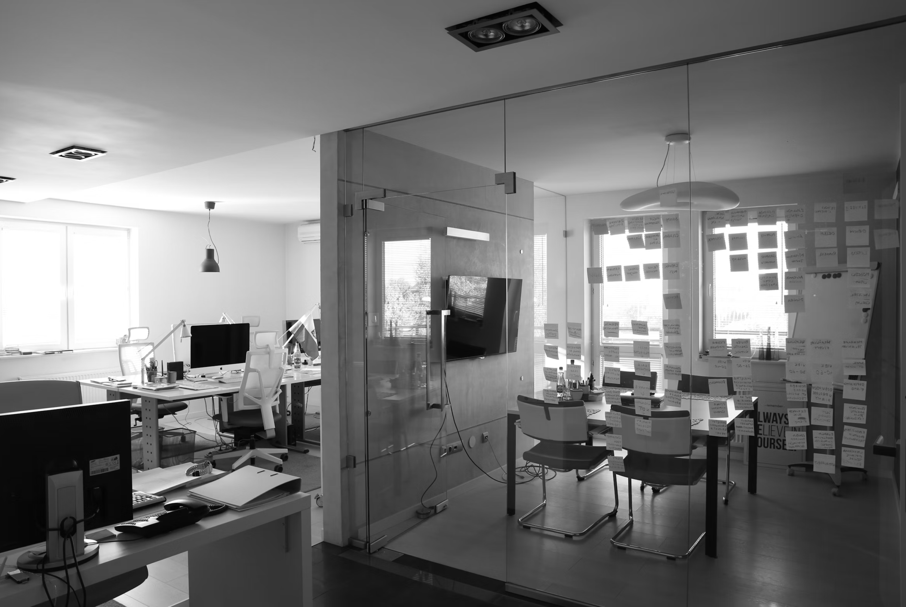
When I joined the HOKSI project, the client already had a functional but outdated educational app widely used by students preparing for DSE exams. The app’s biggest weakness was not the visuals but the structure. Content was long, unorganised and difficult to navigate, with no clear hierarchy, no onboarding, no bookmarking, no comments and no modern UX standards. Students jumped between formulas, exam solutions and explanations with no logical path or support. Since the client wanted a complete transformation, the project required rebuilding the product from the ground up, starting with a new information architecture that could handle multiple subjects, two languages and different content formats.

Building the structure and defining the flows
This redesign was a full end to end product creation. I started with text based wireframes to define the logic behind subjects, materials and navigation. I then built low fidelity wireframes to design flows that helped students reach content faster and with fewer steps. The home screen became the entry point instead of the login screen to let users access the app immediately. I structured each subject as a clear set of categories, such as formulas, past papers and explanations, so students could move predictably through the content. Once the logic and journeys were validated, I moved to high fidelity wireframes and created a scalable design system that supported both English and Chinese layouts.
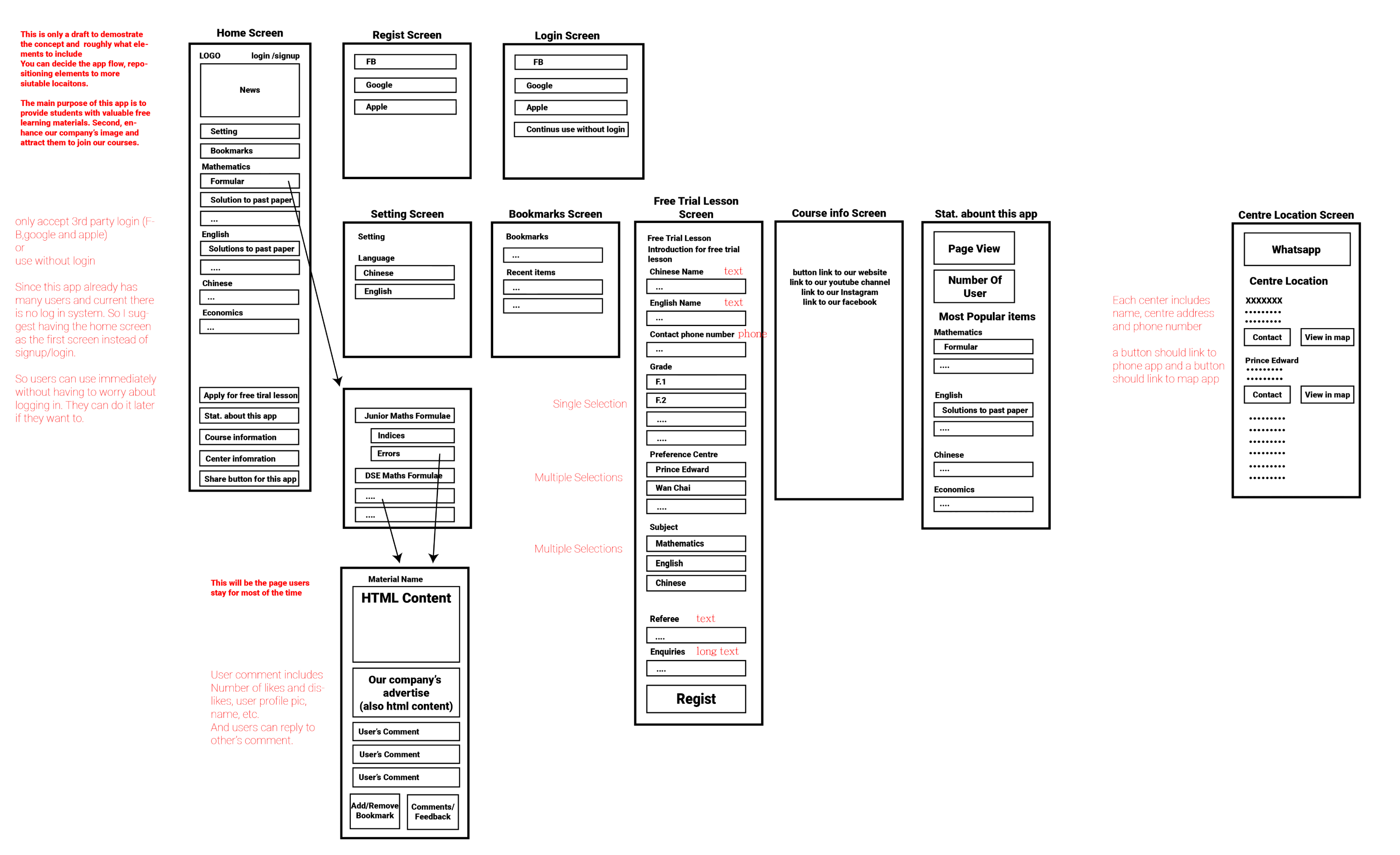
Visual identity and key UX improvements
I redesigned the entire visual language to make the app feel modern and easy to use. The home screen received a friendly layout with clear entry points, and materials were presented through modular cards that made long and complex content easier to read. Mathematical graphs and exam explanations were displayed in a clean format, without the visual noise present in the original app. I introduced a redesigned comments section with avatars, replies and likes, as well as a bookmark system, centre locations with WhatsApp integration, error states and a consistent light and dark theme. While concepts for progress tracking and gamification were developed, they were planned for later releases, and the initial version focused on clarity, structure and speed.

Final results and the full product delivery
Every screen, component and flow was created from scratch, from the first draft of the wireframes to the final UI. The result aligned with the client’s goals: a modern, structured and scalable educational app designed to grow with future features like progress tracking, gamification and advanced analytics. The redesign made the user experience significantly clearer, helped students reach learning materials much faster and transformed the old app into a clean and reliable learning platform. What began as a fragmented tool turned into a complete, thoughtfully designed product ready for the next stage of the company’s growth.