
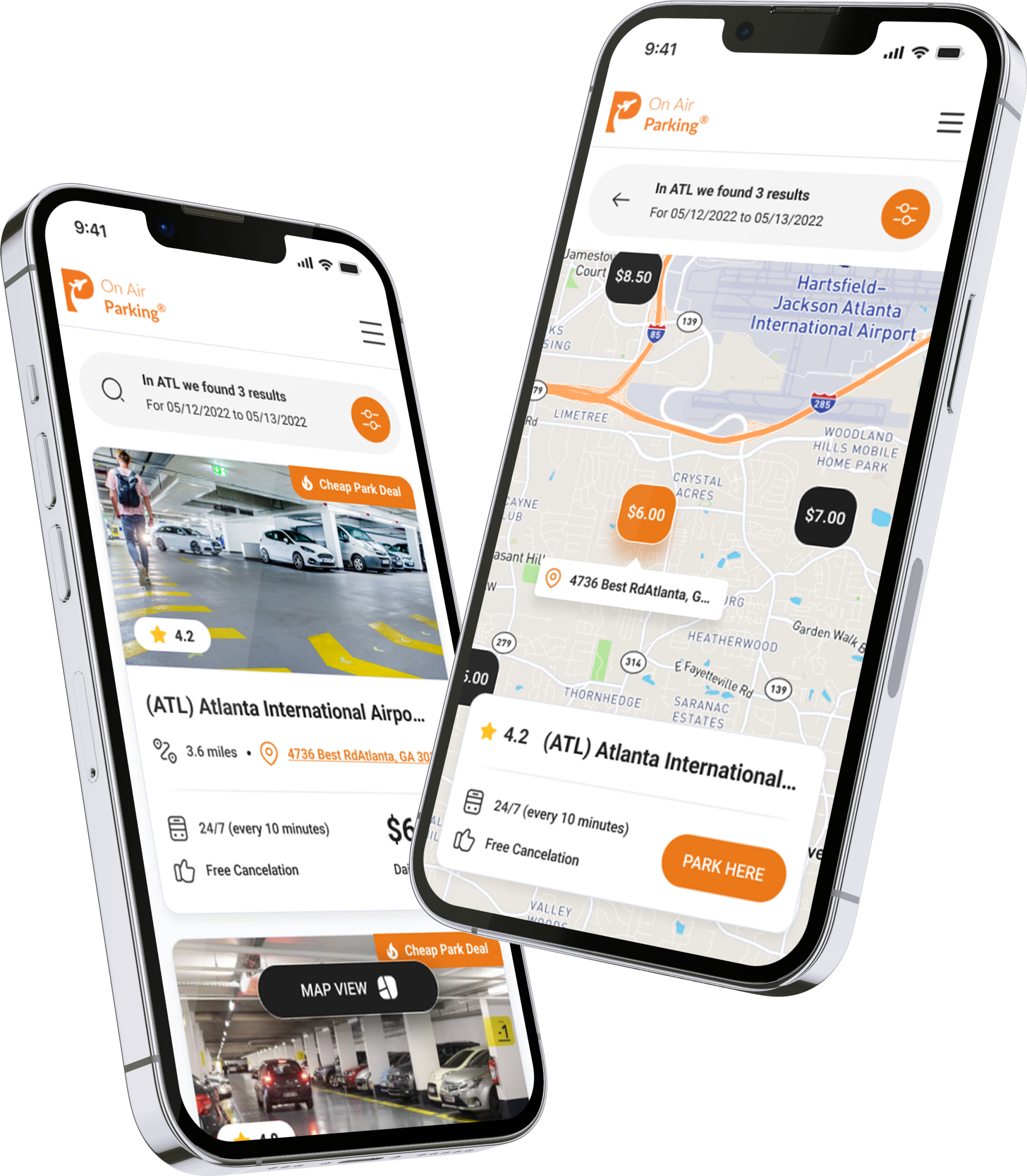
Client Request
"We want to simplify the parking selection experience and help users make faster, more confide booking decisions before completing their reservation."
confident
Airport Parking
Travel Tech
Online Booking
Mobile App
Reservation Platform

Overview
This project focused on optimizing a critical step in the OnAir Parking booking funnel. Through UX research and conversion analysis, we identified opportunities to improve how users compared parking options before making a reservation. The work explored multiple design hypotheses, balancing user experience improvements with realistic development effort, ultimately leading to a 20% increase in booking conversion.
Research Insights
Data Highlights
Search Results Drop-off
High
Only small part of users who reached the search results page continued to a parking details page, revealing a major decision bottleneck early in the booking journey.



Location Uncertainty
❌ Critical
Almost one in four support requests were related to parking location, while many others asked about shuttle frequency and distance to the airport—showing that users lacked essential information before booking.
User Insights

"I can't tell where this parking lot is actually located."
Customer Support
"How far is it from the airport terminal?"
Customer Support
"I don't know if the shuttle is frequent enough for my flight."
Customer Support
"I need to understand the location before I can book."
Customer Support
ⓘ Charts illustrate relative user behavior trends rather than actual product metrics.
Existing version A

Challenges
Jan-Mar 2024

❌
Missing Location Context
Users couldn't easily understand where each parking facility was located relative to the airport.
❌
Difficult Comparison
Key decision-making information was scattered, making parking options difficult to compare.
❌
Limited Visibility
Essential details like shuttle frequency, cancellation policy, and distance required extra effort to find.
❌
Low Booking Confidence
Many users lacked enough information to confidently reserve a parking spot.
❌
Early Decision Drop-off
Users frequently abandoned the booking journey before exploring parking details.
Overview Overview
We redesigned the search experience to help users compare parking options faster and make booking decisions with greater confidence. By improving location visibility, information hierarchy, and decision-making context, we reduced uncertainty before reservation.



Location
Make parking locations easier to understand and compare.
Clarity
Prioritize the information users need before booking.
Comparison
Help users evaluate multiple parking options at a glance.
Confidence
Provide enough context to support faster booking decisions.


Color System
The interface uses a warm color palette centered around orange to reinforce the brand identity and highlight primary actions. White provides clarity and spaciousness, while dark neutral tones create strong contrast for content and key interface elements.
#EB7819
Primary Brand
Used for primary actions, navigation highlights, and key interactive elements.
#FFFFFF
Surface
The primary background color, providing a clean and distraction-free interface.
#1F1F1F
Neutral
Used for headings, important content, and high-contrast interface components.
#FFBE17
Accent
Applied to promotional elements, highlights, and secondary visual emphasis.
Typography
Roboto provides excellent readability across mobile interfaces with a clean, neutral appearance. Its wide range of weights creates clear visual hierarchy while supporting fast scanning and effortless interaction throughout the booking experience.
Roboto
16 px
20 px
24 px
32 px
40 px
48 px
64 px
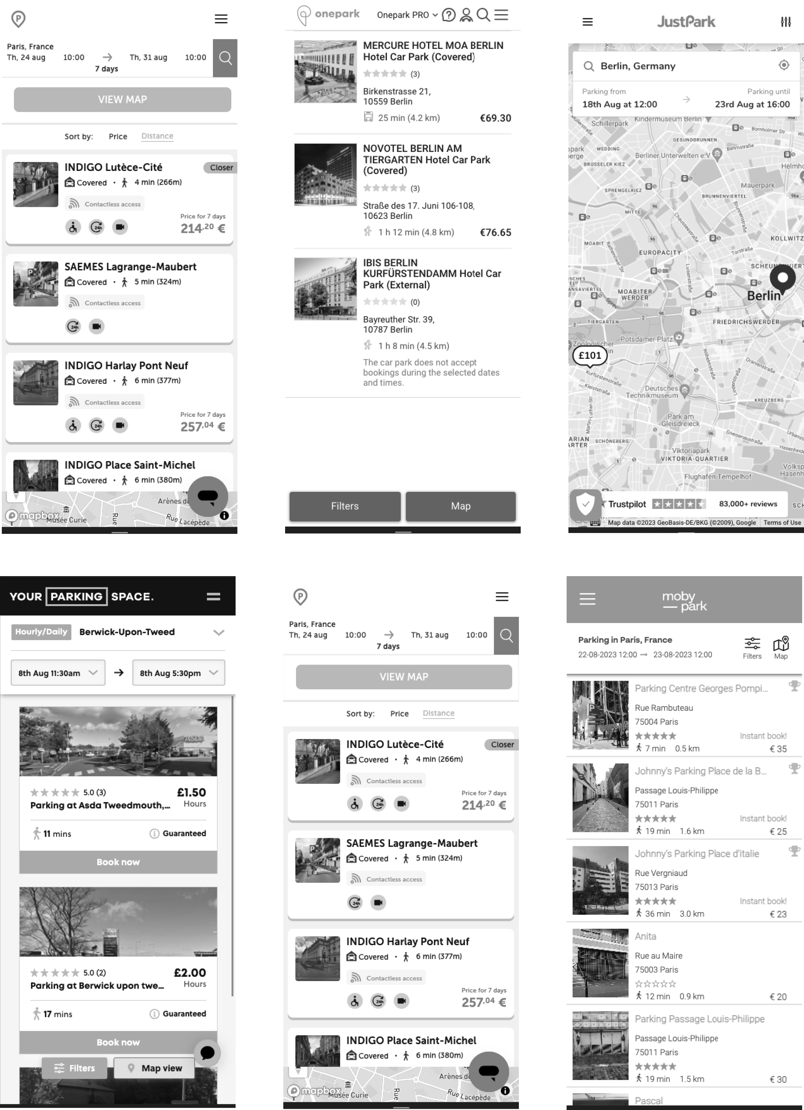
Competitors
Multiple concepts explored different ways to improve the parking selection experience by making location information more visible and easier to understand. The exploration focused on reorganizing the information hierarchy, integrating map interactions, redesigning parking cards, simplifying navigation between list and map views, and helping users compare parking options with less effort.
Concept Exploration
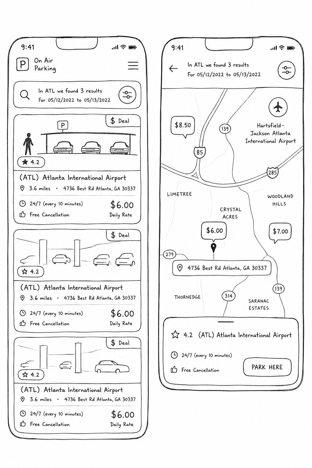
Multiple concepts explored different ways to improve the parking selection experience by making location information more visible and easier to understand. The exploration focused on reorganizing the information hierarchy, integrating map interactions, redesigning parking cards, simplifying navigation between list and map views, and helping users compare parking options with less effort.
Design
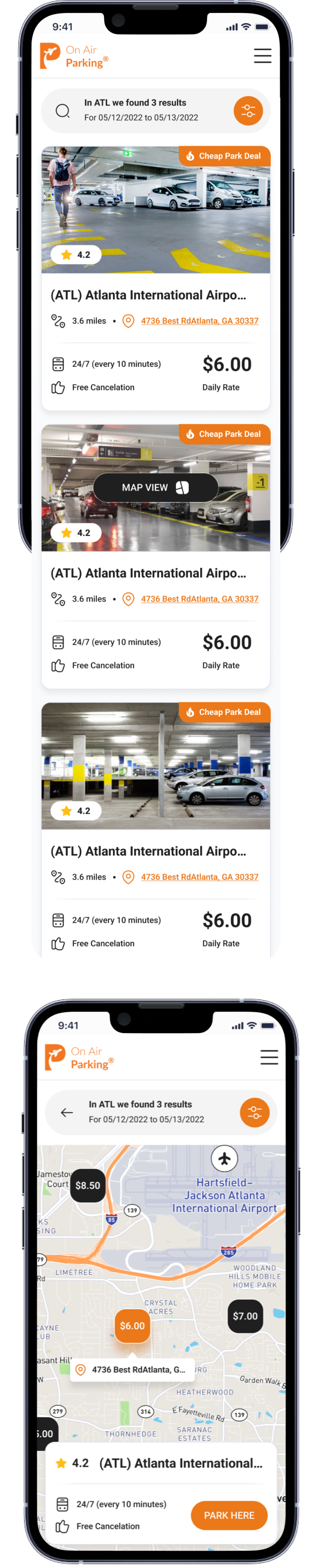
The final design introduced a cleaner visual hierarchy, redesigned parking cards, integrated map and list experiences, and clearer presentation of pricing, shuttle details, ratings, and location information. Refined spacing, stronger visual contrast, and streamlined interactions created a faster, more intuitive booking experience while reducing uncertainty before reservation.
Results
Aug-Sep 2024
Version A
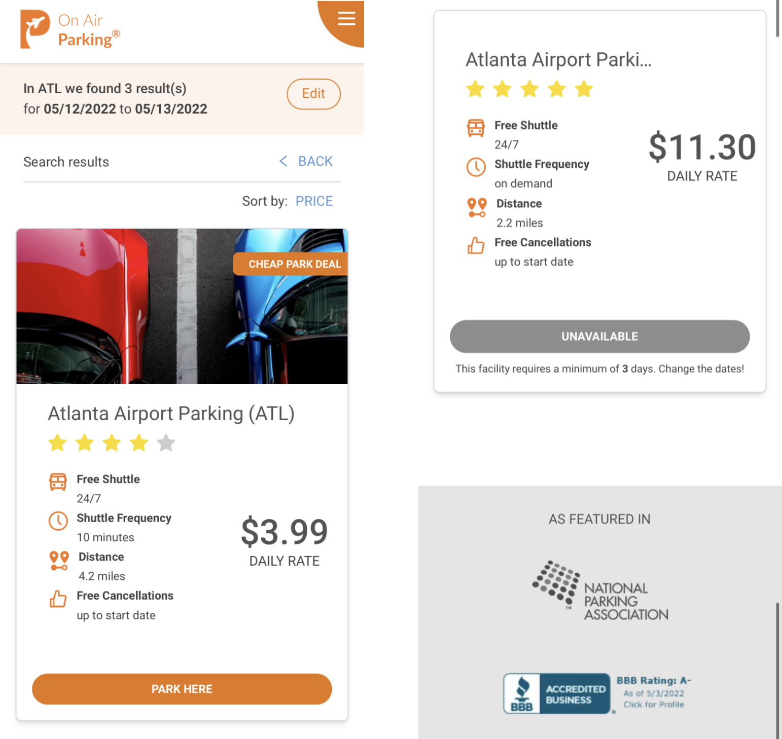
Challenges:
❌
Missing Location Context
❌
Difficult Comparison
❌
Limited Visibility
❌
Low Booking Confidence
CvR (A)
Version B
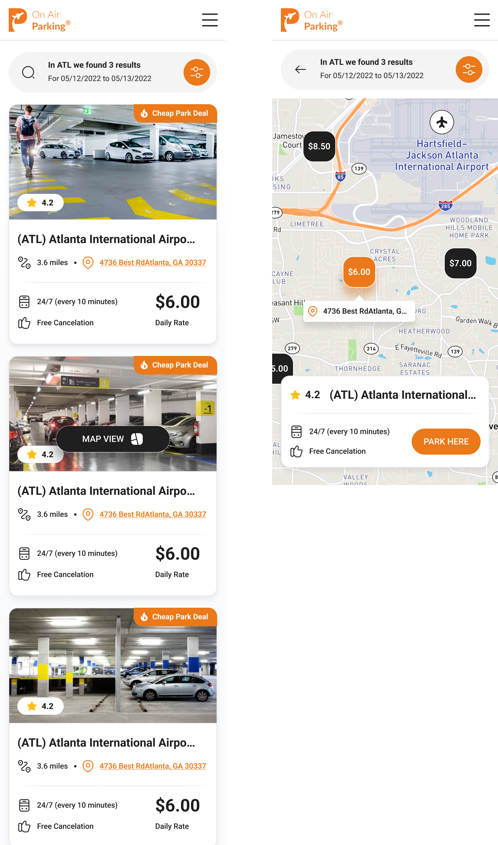
Search Results → Parking Details
+18% CvR
Parking Details → Reservation
+4% CvR
Search Results → Reservation
+20% CvR
+20%Booking CvR
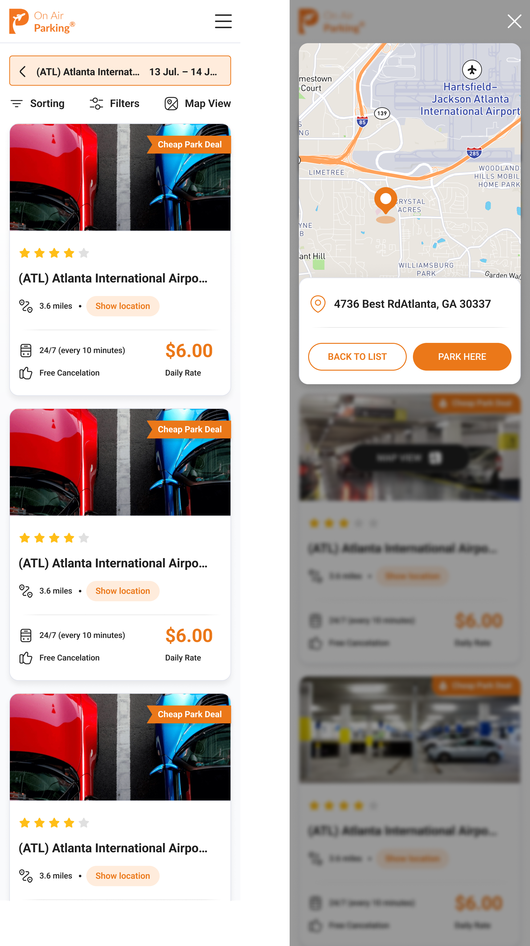
Balanced Solution
A mid-level concept introducing a simplified location preview and enhanced information hierarchy. This approach improved decision-making while keeping development complexity significantly lower than the fully interactive experience.
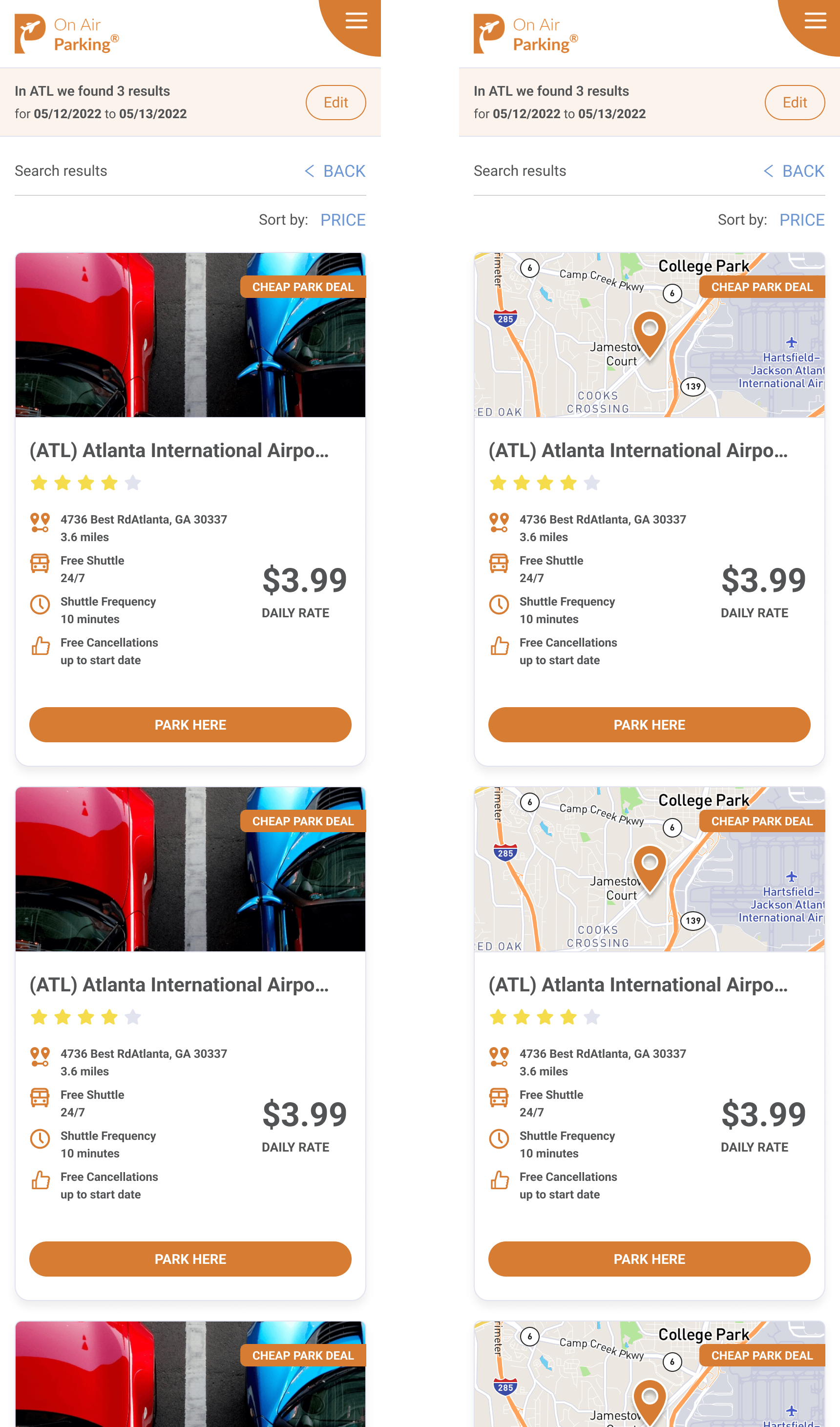
Low-Effort Solution
A lightweight redesign focused on improving information hierarchy without requiring significant engineering effort. Key location details became more visible while preserving the existing product structure and minimizing implementation time.
✅ Summary
This project reinforced the importance of designing for decision-making, not just usability. By combining analytics, customer support insights, and competitive research, we transformed a high-friction booking flow into a clearer experience that helped users choose parking with greater confidence and increased overall booking conversion.
Let’s Discuss
your Project!
Schedule a Consult


© Copyright 2022, All Rights Reserved
OnAir Parking is a marketplace for booking airport parking. Users were struggling to understand key details like location, distance, and shuttle service on the search results page. I redesigned the layout to make this information clearer and easier to compare, which helped increase conversions.
Visit thve live page →
Published:
Sep 2023
Industry:
Travel Technology
Project Type:
App Product Design
My Role:
Product Designer
Scale:
High-Traffic Consumer Platform
Business Impact:
+20% Booking CvR
Book 15 minutes call
OnAir Parking is a marketplace for booking airport parking. Users were struggling to understand key details like location, distance, and shuttle service on the search results page. I redesigned the layout to make this information clearer and easier to compare, which helped increase conversions.
Book 15 minutes call
Published:
Sep 2024
Industry:
Travel Technology
Project Type:
App Product Design
My Role:
Product Designer
Scale:
29 million downloads
Business Impact:
+19% ARPU
Client Request
"We want to simplify the parking selection experience and help users make faster, more confide booking decisions before completing their reservation."
confident

Airport Parking
Travel Tech
Online Booking
Mobile App
Reservation Platform
Overview
This project focused on optimizing a critical step in the OnAir Parking booking funnel. Through UX research and conversion analysis, we identified opportunities to improve how users compared parking options before making a reservation. The work explored multiple design hypotheses, balancing user experience improvements with realistic development effort, ultimately leading to a 20% increase in booking conversion.
Research Insights
Data Highlights
Search Results Drop-off
High
Only small part of users who reached the search results page continued to a parking details page, revealing a major decision bottleneck early in the booking journey.
Location Uncertainty
❌ Critical
Almost one in four support requests were related to parking location, while many others asked about shuttle frequency and distance to the airport—showing that users lacked essential information before booking.
User Insights
"I can't tell where this parking lot is actually located."
Customer Support
"How far is it from the airport terminal?"
Customer Support
"I don't know if the shuttle is frequent enough for my flight."
Customer Support
"I need to understand the location before I can book."
Customer Support
ⓘ Charts illustrate relative user behavior trends rather than actual product metrics.
Existing version A
Challenges
Jan-Mar 2024

❌
Missing Location Context
Users couldn't easily understand where each parking facility was located relative to the airport.
❌
Difficult Comparison
Key decision-making information was scattered, making parking options difficult to compare.
❌
Limited Visibility
Essential details like shuttle frequency, cancellation policy, and distance required extra effort to find.
❌
Low Booking Confidence
Many users lacked enough information to confidently reserve a parking spot.
❌
Early Decision Drop-off
Users frequently abandoned the booking journey before exploring parking details.
OptimizationStrategy


Location
Clarity
Comparison
Confidence
Make parking locations easier to understand and compare.
Prioritize the information users need before booking.
Help users evaluate multiple parking options at a glance.
Provide enough context to support faster booking decisions.

We redesigned the search experience to help users compare parking options faster and make booking decisions with greater confidence. By improving location visibility, information hierarchy, and decision-making context, we reduced uncertainty before reservation.
#FFFFFF
Surface
The primary background color, providing a clean and distraction-free interface.
#1F1F1F
Neutral
Used for headings, important content, and high-contrast interface components.
#FFBE17
Accent
Applied to promotional elements, highlights, and secondary visual emphasis.
#EB7819
Primary Brand
Used for primary actions, navigation highlights, and key interactive elements.
Typography
Roboto provides excellent readability across mobile interfaces with a clean, neutral appearance. Its wide range of weights creates clear visual hierarchy while supporting fast scanning and effortless interaction throughout the booking experience.
Roboto
Color System
The interface uses a warm color palette centered around orange to reinforce the brand identity and highlight primary actions. White provides clarity and spaciousness, while dark neutral tones create strong contrast for content and key interface elements.
16 px
20 px
24 px
32 px
40 px
48 px
64 px
Competitors
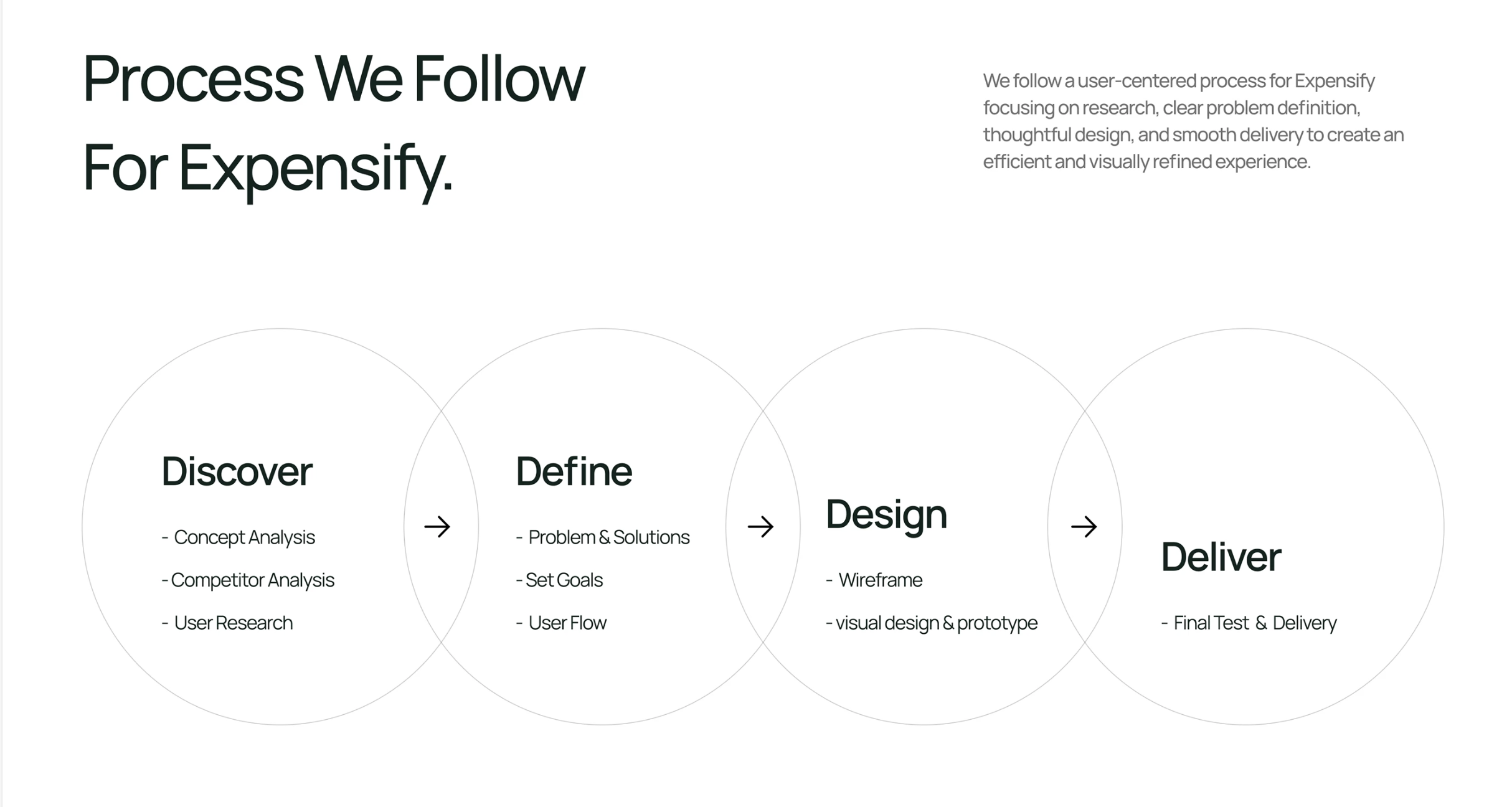
I analyzed leading airport parking platforms to understand how they present location, pricing, and booking information. The comparison revealed several opportunities to improve information hierarchy, map integration, and decision-making confidence in the OnAir Parking experience.
Concept Exploration
Multiple concepts explored different ways to improve the parking selection experience by making location information more visible and easier to understand. The exploration focused on reorganizing the information hierarchy, integrating map interactions, redesigning parking cards, simplifying navigation between list and map views, and helping users compare parking options with less effort.
Design
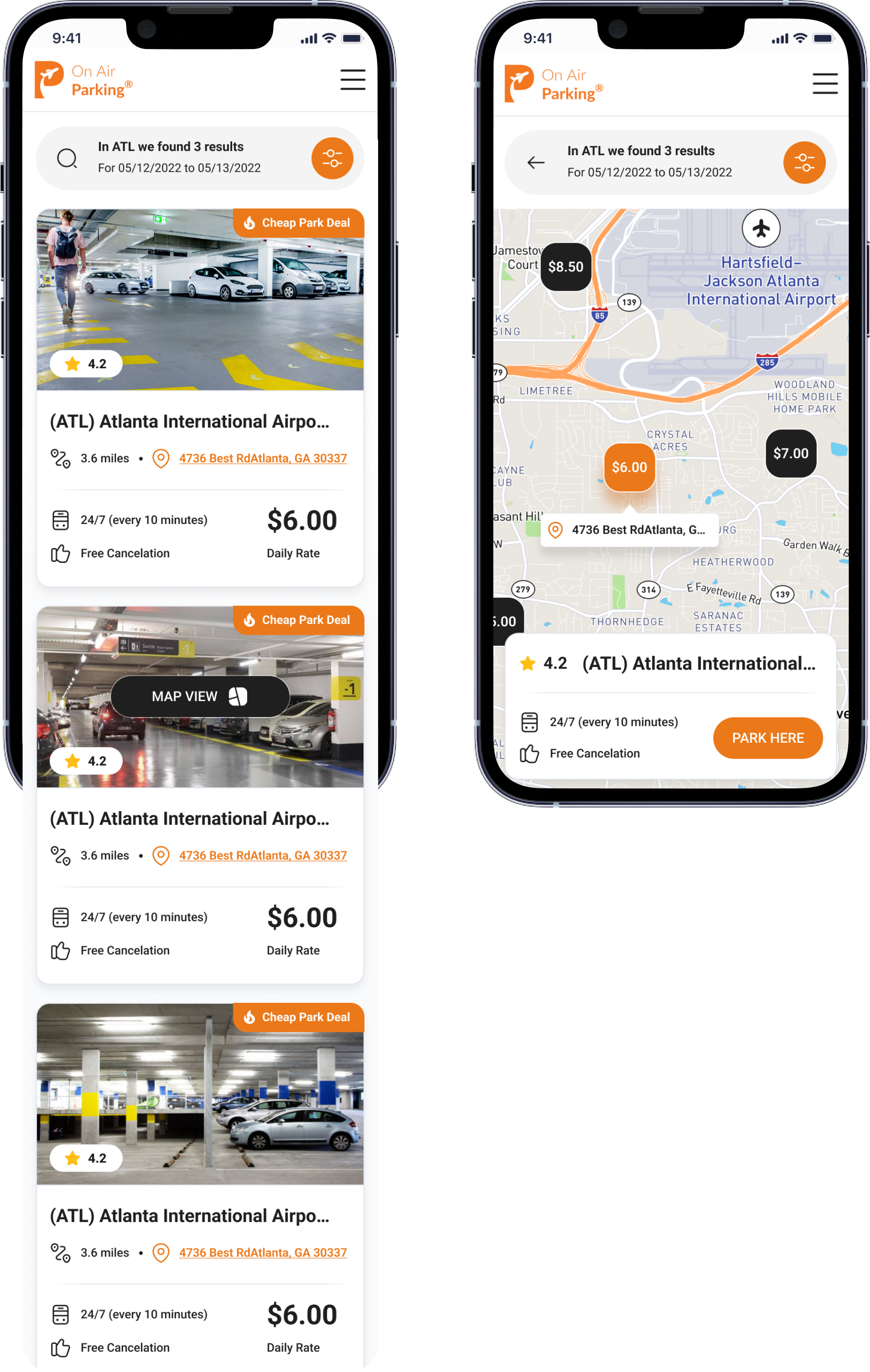
The final design introduced a cleaner visual hierarchy, redesigned parking cards, integrated map and list experiences, and clearer presentation of pricing, shuttle details, ratings, and location information. Refined spacing, stronger visual contrast, and streamlined interactions created a faster, more intuitive booking experience while reducing uncertainty before reservation.
Final Solution
The final solution combined an improved information hierarchy with integrated map interactions, redesigned parking cards, and clearer location details. Better visual hierarchy, pricing visibility, and contextual information helped users compare options faster and book with greater confidence.
Results
Aug-Sep 2024
Version A
Challenges:
❌
Unclear Value
❌
Trust Barrier
❌
Low Trial Conversion
❌
Weak Value Communication
CvR (A)
Version B
Search Results → Parking Details
+18% CvR
Parking Details → Reservation
+4% CvR
Search Results → Reservation
+20% CvR
CvR +20%
Balanced Solution
A mid-level concept introducing a simplified location preview and enhanced information hierarchy. This approach improved decision-making while keeping development complexity significantly lower than the fully interactive experience.
Low-Effort Solution
A lightweight redesign focused on improving information hierarchy without requiring significant engineering effort. Key location details became more visible while preserving the existing product structure and minimizing implementation time.
✅ Summary
This project reinforced the importance of designing for decision-making, not just usability. By combining analytics, customer support insights, and competitive research, we transformed a high-friction booking flow into a clearer experience that helped users choose parking with greater confidence and increased overall booking conversion.
Let’s Discuss your Project!
Schedule a Consult
© Copyright 2022, All Rights Reserved
Kyrylo Buriak
Client Request
"We want to simplify the parking selection experience and help users make faster, more confide booking decisions before completing their reservation."
confident
Airport Parking
Travel Tech
Online Booking
Mobile App
Reservation Platform
Overview
This project focused on optimizing a critical step in the OnAir Parking booking funnel. Through UX research and conversion analysis, we identified opportunities to improve how users compared parking options before making a reservation. The work explored multiple design hypotheses, balancing user experience improvements with realistic development effort, ultimately leading to a 20% increase in booking conversion.
Research Insights
Data Highlights
Search Results Drop-off
High
Only small part of users who reached the search results page continued to a parking details page, revealing a major decision bottleneck early in the booking journey.
Location Uncertainty
❌ Critical
Almost one in four support requests were related to parking location, while many others asked about shuttle frequency and distance to the airport—showing that users lacked essential information before booking.
User Insights
"I can't tell where this parking lot is actually located."
Customer Support
"How far is it from the airport terminal?"
Customer Support
"I don't know if the shuttle is frequent enough for my flight."
Customer Support
"I need to understand the location before I can book."
Customer Support
ⓘ Charts illustrate relative user behavior trends rather than actual product metrics.
Existing version A
Challenges
Jan-Mar 2024
❌
Missing Location Context
Users couldn't easily understand where each parking facility was located relative to the airport.
❌
Difficult Comparison
Key decision-making information was scattered, making parking options difficult to compare.
❌
Limited Visibility
Essential details like shuttle frequency, cancellation policy, and distance required extra effort to find.
❌
Low Booking Confidence
Many users lacked enough information to confidently reserve a parking spot.
❌
Early Decision Drop-off
Users frequently abandoned the booking journey before exploring parking details.
OptimizationStrategy
Location
Clarity
Comparison
Confidence
Make parking locations easier to understand and compare.
Prioritize the information users need before booking.
Help users evaluate multiple parking options at a glance.
Provide enough context to support faster booking decisions.
We redesigned the search experience to help users compare parking options faster and make booking decisions with greater confidence. By improving location visibility, information hierarchy, and decision-making context, we reduced uncertainty before reservation.
#FFFFFF
Surface
The primary background color, providing a clean and distraction-free interface.
#1F1F1F
Neutral
Used for headings, important content, and high-contrast interface components.
#FFBE17
Accent
Applied to promotional elements, highlights, and secondary visual emphasis.
#EB7819
Primary Brand
Used for primary actions, navigation highlights, and key interactive elements.
Typography
Roboto provides excellent readability across mobile interfaces with a clean, neutral appearance. Its wide range of weights creates clear visual hierarchy while supporting fast scanning and effortless interaction throughout the booking experience.
Roboto
Color System
The interface uses a warm color palette centered around orange to reinforce the brand identity and highlight primary actions. White provides clarity and spaciousness, while dark neutral tones create strong contrast for content and key interface elements.
16 px
20 px
24 px
32 px
40 px
48 px
64 px
Competitors
I analyzed leading airport parking platforms to understand how they present location, pricing, and booking information. The comparison revealed several opportunities to improve information hierarchy, map integration, and decision-making confidence in the OnAir Parking experience.
Concept Exploration
Multiple concepts explored different ways to improve the parking selection experience by making location information more visible and easier to understand. The exploration focused on reorganizing the information hierarchy, integrating map interactions, redesigning parking cards, simplifying navigation between list and map views, and helping users compare parking options with less effort.
Design
The final design introduced a cleaner visual hierarchy, redesigned parking cards, integrated map and list experiences, and clearer presentation of pricing, shuttle details, ratings, and location information. Refined spacing, stronger visual contrast, and streamlined interactions created a faster, more intuitive booking experience while reducing uncertainty before reservation.
Final Solution
The final solution combined an improved information hierarchy with integrated map interactions, redesigned parking cards, and clearer location details. Better visual hierarchy, pricing visibility, and contextual information helped users compare options faster and book with greater confidence.
Results
Aug-Sep 2024
Version A
Challenges:
❌
Unclear Value
❌
Trust Barrier
❌
Low Trial Conversion
❌
Weak Value Communication
CvR (A)
Version B
Search Results → Parking Details
+18% CvR
Parking Details → Reservation
+4% CvR
Search Results → Reservation
+20% CvR
CvR +20%
Balanced Solution
A mid-level concept introducing a simplified location preview and enhanced information hierarchy. This approach improved decision-making while keeping development complexity significantly lower than the fully interactive experience.
Low-Effort Solution
A lightweight redesign focused on improving information hierarchy without requiring significant engineering effort. Key location details became more visible while preserving the existing product structure and minimizing implementation time.
✅ Summary
This project reinforced the importance of designing for decision-making, not just usability. By combining analytics, customer support insights, and competitive research, we transformed a high-friction booking flow into a clearer experience that helped users choose parking with greater confidence and increased overall booking conversion.
OnAir Parking is a marketplace for booking airport parking. Users were struggling to understand key details like location, distance, and shuttle service on the search results page. I redesigned the layout to make this information clearer and easier to compare, which helped increase conversions.
Visit thve live page →
Published:
Sep 2023
Industry:
Travel Technology
Project Type:
App Product Design
My Role:
Product Designer
Scale:
High-Traffic Consumer Platform
Business Impact:
+20% Booking Conversion
Book 15 minutes call
Let’s Discuss your Project!
Schedule a Consult
© Copyright 2022, All Rights Reserved
Kyrylo Buriak
Client Request
"We want to simplify the parking selection experience and help users make faster, more confide booking decisions before completing their reservation."
confident
Airport Parking
Travel Tech
Online Booking
Mobile App
Reservation Platform
Overview
This project focused on optimizing a critical step in the OnAir Parking booking funnel. Through UX research and conversion analysis, we identified opportunities to improve how users compared parking options before making a reservation. The work explored multiple design hypotheses, balancing user experience improvements with realistic development effort, ultimately leading to a 20% increase in booking conversion.
Research Insights
Data Highlights
Search Results Drop-off
High
Only small part of users who reached the search results page continued to a parking details page, revealing a major decision bottleneck early in the booking journey.
Location Uncertainty
❌ Critical
Almost one in four support requests were related to parking location, while many others asked about shuttle frequency and distance to the airport—showing that users lacked essential information before booking.
User Insights
"I can't tell where this parking lot is actually located."
Customer Support
"How far is it from the airport terminal?"
Customer Support
"I don't know if the shuttle is frequent enough for my flight."
Customer Support
"I need to understand the location before I can book."
Customer Support
ⓘ Charts illustrate relative user behavior trends rather than actual product metrics.
Existing version A
Challenges
Jan-Mar 2024
❌
Missing Location Context
Users couldn't easily understand where each parking facility was located relative to the airport.
❌
Difficult Comparison
Key decision-making information was scattered, making parking options difficult to compare.
❌
Limited Visibility
Essential details like shuttle frequency, cancellation policy, and distance required extra effort to find.
❌
Low Booking Confidence
Many users lacked enough information to confidently reserve a parking spot.
❌
Early Decision Drop-off
Users frequently abandoned the booking journey before exploring parking details.
OptimizationStrategy
Location
Clarity
Comparison
Confidence
Make parking locations easier to understand and compare.
Prioritize the information users need before booking.
Help users evaluate multiple parking options at a glance.
Provide enough context to support faster booking decisions.
We redesigned the search experience to help users compare parking options faster and make booking decisions with greater confidence. By improving location visibility, information hierarchy, and decision-making context, we reduced uncertainty before reservation.
#FFFFFF
Surface
The primary background color, providing a clean and distraction-free interface.
#1F1F1F
Neutral
Used for headings, important content, and high-contrast interface components.
#FFBE17
Accent
Applied to promotional elements, highlights, and secondary visual emphasis.
#EB7819
Primary Brand
Used for primary actions, navigation highlights, and key interactive elements.
Typography
Roboto provides excellent readability across mobile interfaces with a clean, neutral appearance. Its wide range of weights creates clear visual hierarchy while supporting fast scanning and effortless interaction throughout the booking experience.
Roboto
Color System
The interface uses a warm color palette centered around orange to reinforce the brand identity and highlight primary actions. White provides clarity and spaciousness, while dark neutral tones create strong contrast for content and key interface elements.
16 px
20 px
24 px
32 px
40 px
48 px
64 px
Competitors
I analyzed leading airport parking platforms to understand how they present location, pricing, and booking information. The comparison revealed several opportunities to improve information hierarchy, map integration, and decision-making confidence in the OnAir Parking experience.
Concept Exploration
Multiple concepts explored different ways to improve the parking selection experience by making location information more visible and easier to understand. The exploration focused on reorganizing the information hierarchy, integrating map interactions, redesigning parking cards, simplifying navigation between list and map views, and helping users compare parking options with less effort.
Design
The final design introduced a cleaner visual hierarchy, redesigned parking cards, integrated map and list experiences, and clearer presentation of pricing, shuttle details, ratings, and location information. Refined spacing, stronger visual contrast, and streamlined interactions created a faster, more intuitive booking experience while reducing uncertainty before reservation.
Final Solution
The final solution combined an improved information hierarchy with integrated map interactions, redesigned parking cards, and clearer location details. Better visual hierarchy, pricing visibility, and contextual information helped users compare options faster and book with greater confidence.
Results
Aug-Sep 2024
Version A
Challenges:
❌
Unclear Value
❌
Trust Barrier
❌
Low Trial Conversion
❌
Weak Value Communication
CvR (A)
Version B
Search Results → Parking Details
+18% CvR
Parking Details → Reservation
+4% CvR
Search Results → Reservation
+20% CvR
CvR +20%
Balanced Solution
A mid-level concept introducing a simplified location preview and enhanced information hierarchy. This approach improved decision-making while keeping development complexity significantly lower than the fully interactive experience.
Low-Effort Solution
A lightweight redesign focused on improving information hierarchy without requiring significant engineering effort. Key location details became more visible while preserving the existing product structure and minimizing implementation time.
✅ Summary
This project reinforced the importance of designing for decision-making, not just usability. By combining analytics, customer support insights, and competitive research, we transformed a high-friction booking flow into a clearer experience that helped users choose parking with greater confidence and increased overall booking conversion.
OnAir Parking is a marketplace for booking airport parking. Users were struggling to understand key details like location, distance, and shuttle service on the search results page. I redesigned the layout to make this information clearer and easier to compare, which helped increase conversions.
Visit thve live page →
Published:
Aug 2023
Industry:
Travel Technology
Project Type:
App Product Design
My Role:
Product Designer
Scale:
High-Traffic Consumer Platform
Business Impact:
+20% Booking Conversion
Book 15 minutes call
Let’s Discuss your Project!
Schedule a Consult
© Copyright 2022, All Rights Reserved
Kyrylo Buriak
Client Request
"We want to simplify the parking selection experience and help users make faster, more confide booking decisions before completing their reservation."
confident
Airport Parking
Travel Tech
Online Booking
Mobile App
Reservation Platform
Overview
This project focused on optimizing a critical step in the OnAir Parking booking funnel. Through UX research and conversion analysis, we identified opportunities to improve how users compared parking options before making a reservation. The work explored multiple design hypotheses, balancing user experience improvements with realistic development effort, ultimately leading to a 20% increase in booking conversion.
Research Insights
Data Highlights
Search Results Drop-off
High
Only small part of users who reached the search results page continued to a parking details page, revealing a major decision bottleneck early in the booking journey.
Location Uncertainty
❌ Critical
Almost one in four support requests were related to parking location, while many others asked about shuttle frequency and distance to the airport—showing that users lacked essential information before booking.
User Insights
"I can't tell where this parking lot is actually located."
Customer Support
"How far is it from the airport terminal?"
Customer Support
"I don't know if the shuttle is frequent enough for my flight."
Customer Support
"I need to understand the location before I can book."
Customer Support
ⓘ Charts illustrate relative user behavior trends rather than actual product metrics.
Existing version A
Challenges
Jan-Mar 2024
❌
Missing Location Context
Users couldn't easily understand where each parking facility was located relative to the airport.
❌
Difficult Comparison
Key decision-making information was scattered, making parking options difficult to compare.
❌
Limited Visibility
Essential details like shuttle frequency, cancellation policy, and distance required extra effort to find.
❌
Low Booking Confidence
Many users lacked enough information to confidently reserve a parking spot.
❌
Early Decision Drop-off
Users frequently abandoned the booking journey before exploring parking details.
OptimizationStrategy
Location
Clarity
Comparison
Confidence
Make parking locations easier to understand and compare.
Prioritize the information users need before booking.
Help users evaluate multiple parking options at a glance.
Provide enough context to support faster booking decisions.
We redesigned the search experience to help users compare parking options faster and make booking decisions with greater confidence. By improving location visibility, information hierarchy, and decision-making context, we reduced uncertainty before reservation.
#FFFFFF
Surface
The primary background color, providing a clean and distraction-free interface.
#1F1F1F
Neutral
Used for headings, important content, and high-contrast interface components.
#FFBE17
Accent
Applied to promotional elements, highlights, and secondary visual emphasis.
#EB7819
Primary Brand
Used for primary actions, navigation highlights, and key interactive elements.
Typography
Roboto provides excellent readability across mobile interfaces with a clean, neutral appearance. Its wide range of weights creates clear visual hierarchy while supporting fast scanning and effortless interaction throughout the booking experience.
Roboto
Color System
The interface uses a warm color palette centered around orange to reinforce the brand identity and highlight primary actions. White provides clarity and spaciousness, while dark neutral tones create strong contrast for content and key interface elements.
16 px
20 px
24 px
32 px
40 px
48 px
64 px
Competitors
I analyzed leading airport parking platforms to understand how they present location, pricing, and booking information. The comparison revealed several opportunities to improve information hierarchy, map integration, and decision-making confidence in the OnAir Parking experience.
Concept Exploration
Multiple concepts explored different ways to improve the parking selection experience by making location information more visible and easier to understand. The exploration focused on reorganizing the information hierarchy, integrating map interactions, redesigning parking cards, simplifying navigation between list and map views, and helping users compare parking options with less effort.
Design
The final design introduced a cleaner visual hierarchy, redesigned parking cards, integrated map and list experiences, and clearer presentation of pricing, shuttle details, ratings, and location information. Refined spacing, stronger visual contrast, and streamlined interactions created a faster, more intuitive booking experience while reducing uncertainty before reservation.
Final Solution
The final solution combined an improved information hierarchy with integrated map interactions, redesigned parking cards, and clearer location details. Better visual hierarchy, pricing visibility, and contextual information helped users compare options faster and book with greater confidence.
Results
Aug-Sep 2024
Version A
Challenges:
❌
Unclear Value
❌
Trust Barrier
❌
Low Trial Conversion
❌
Weak Value Communication
CvR (A)
Version B
Search Results → Parking Details
+18% CvR
Parking Details → Reservation
+4% CvR
Search Results → Reservation
+20% CvR
CvR +20%
Balanced Solution
A mid-level concept introducing a simplified location preview and enhanced information hierarchy. This approach improved decision-making while keeping development complexity significantly lower than the fully interactive experience.
Low-Effort Solution
A lightweight redesign focused on improving information hierarchy without requiring significant engineering effort. Key location details became more visible while preserving the existing product structure and minimizing implementation time.
✅ Summary
This project reinforced the importance of designing for decision-making, not just usability. By combining analytics, customer support insights, and competitive research, we transformed a high-friction booking flow into a clearer experience that helped users choose parking with greater confidence and increased overall booking conversion.
OnAir Parking is a marketplace for booking airport parking. Users were struggling to understand key details like location, distance, and shuttle service on the search results page. I redesigned the layout to make this information clearer and easier to compare, which helped increase conversions.
Visit thve live page →
Published:
Sep 2023
Industry:
Travel Technology
Project Type:
App Product Design
My Role:
Product Designer
Scale:
High-Traffic Consumer Platform
Business Impact:
+20% Booking Conversion
Book 15 minutes call
Let’s Discuss your Project!
Schedule a Consult
© Copyright 2022, All Rights Reserved
Kyrylo Buriak
Client Request
"We want to simplify the parking selection experience and help users make faster, more confide booking decisions before completing their reservation."
confident
Airport Parking
Travel Tech
Online Booking
Mobile App
Reservation Platform
Overview
This project focused on optimizing a critical step in the OnAir Parking booking funnel. Through UX research and conversion analysis, we identified opportunities to improve how users compared parking options before making a reservation. The work explored multiple design hypotheses, balancing user experience improvements with realistic development effort, ultimately leading to a 20% increase in booking conversion.
Research Insights
Data Highlights
Search Results Drop-off
High
Only small part of users who reached the search results page continued to a parking details page, revealing a major decision bottleneck early in the booking journey.
Location Uncertainty
❌ Critical
Almost one in four support requests were related to parking location, while many others asked about shuttle frequency and distance to the airport—showing that users lacked essential information before booking.
User Insights
"I can't tell where this parking lot is actually located."
Customer Support
"How far is it from the airport terminal?"
Customer Support
"I don't know if the shuttle is frequent enough for my flight."
Customer Support
"I need to understand the location before I can book."
Customer Support
ⓘ Charts illustrate relative user behavior trends rather than actual product metrics.
Existing version A
Challenges
Jan-Mar 2024
❌
Missing Location Context
Users couldn't easily understand where each parking facility was located relative to the airport.
❌
Difficult Comparison
Key decision-making information was scattered, making parking options difficult to compare.
❌
Limited Visibility
Essential details like shuttle frequency, cancellation policy, and distance required extra effort to find.
❌
Low Booking Confidence
Many users lacked enough information to confidently reserve a parking spot.
❌
Early Decision Drop-off
Users frequently abandoned the booking journey before exploring parking details.
OptimizationStrategy
Location
Clarity
Comparison
Confidence
Make parking locations easier to understand and compare.
Prioritize the information users need before booking.
Help users evaluate multiple parking options at a glance.
Provide enough context to support faster booking decisions.
We redesigned the search experience to help users compare parking options faster and make booking decisions with greater confidence. By improving location visibility, information hierarchy, and decision-making context, we reduced uncertainty before reservation.
#FFFFFF
Surface
The primary background color, providing a clean and distraction-free interface.
#1F1F1F
Neutral
Used for headings, important content, and high-contrast interface components.
#FFBE17
Accent
Applied to promotional elements, highlights, and secondary visual emphasis.
#EB7819
Primary Brand
Used for primary actions, navigation highlights, and key interactive elements.
Typography
Roboto provides excellent readability across mobile interfaces with a clean, neutral appearance. Its wide range of weights creates clear visual hierarchy while supporting fast scanning and effortless interaction throughout the booking experience.
Roboto
Color System
The interface uses a warm color palette centered around orange to reinforce the brand identity and highlight primary actions. White provides clarity and spaciousness, while dark neutral tones create strong contrast for content and key interface elements.
16 px
20 px
24 px
32 px
40 px
48 px
64 px
Competitors
I analyzed leading airport parking platforms to understand how they present location, pricing, and booking information. The comparison revealed several opportunities to improve information hierarchy, map integration, and decision-making confidence in the OnAir Parking experience.
Concept Exploration
Multiple concepts explored different ways to improve the parking selection experience by making location information more visible and easier to understand. The exploration focused on reorganizing the information hierarchy, integrating map interactions, redesigning parking cards, simplifying navigation between list and map views, and helping users compare parking options with less effort.
Design
The final design introduced a cleaner visual hierarchy, redesigned parking cards, integrated map and list experiences, and clearer presentation of pricing, shuttle details, ratings, and location information. Refined spacing, stronger visual contrast, and streamlined interactions created a faster, more intuitive booking experience while reducing uncertainty before reservation.
Final Solution
The final solution combined an improved information hierarchy with integrated map interactions, redesigned parking cards, and clearer location details. Better visual hierarchy, pricing visibility, and contextual information helped users compare options faster and book with greater confidence.
Results
Aug-Sep 2024
Version A
Challenges:
❌
Unclear Value
❌
Trust Barrier
❌
Low Trial Conversion
❌
Weak Value Communication
CvR (A)
Version B
Search Results → Parking Details
+18% CvR
Parking Details → Reservation
+4% CvR
Search Results → Reservation
+20% CvR
CvR +20%
Balanced Solution
A mid-level concept introducing a simplified location preview and enhanced information hierarchy. This approach improved decision-making while keeping development complexity significantly lower than the fully interactive experience.
Low-Effort Solution
A lightweight redesign focused on improving information hierarchy without requiring significant engineering effort. Key location details became more visible while preserving the existing product structure and minimizing implementation time.
✅ Summary
This project reinforced the importance of designing for decision-making, not just usability. By combining analytics, customer support insights, and competitive research, we transformed a high-friction booking flow into a clearer experience that helped users choose parking with greater confidence and increased overall booking conversion.
OnAir Parking is a marketplace for booking airport parking. Users were struggling to understand key details like location, distance, and shuttle service on the search results page. I redesigned the layout to make this information clearer and easier to compare, which helped increase conversions.
Visit thve live page →
Published:
Sep 2023
Industry:
Travel Technology
Project Type:
App Product Design
My Role:
Product Designer
Scale:
High-Traffic Consumer Platform
Business Impact:
+20% Booking Conversion
Book 15 minutes call
Let’s Discuss your Project!
Schedule a Consult
© Copyright 2022, All Rights Reserved
Kyrylo Buriak