Riverside
Transcription Flow Conversion Boost
This project was completed as part of the Conversion Rate Store team, where my role focused on the UX and product design side. Funnel data revealed a critical issue. Only 2.58 % of users who started the transcription process continued to registration, compared to 9.68 % on the homepage. Despite strong intent, 89 % of users dropped off after receiving the free transcript. Qualitative insights showed that users did not fully understand the additional value of the product or see a reason to register after the free step. Our goal was to redesign the transcription flow so that value becomes visible earlier, friction is reduced, and the UI guides users toward registration with clear and timely cues.
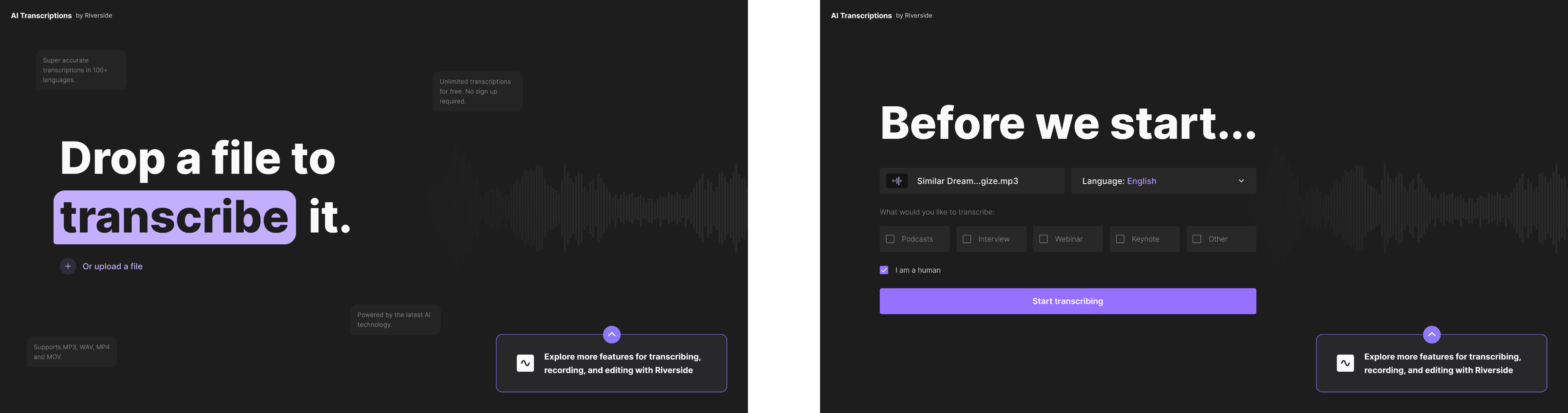
The design strategy focused on communicating product value at the exact moments when users were most engaged. On the first screen I redesigned the headline with a strong focus on the action word “transcribe” and added subtle background messages that highlighted four core benefits of the product. These messages acted as a lightweight onboarding layer that explained why using Riverside is better than a simple free utility. On the right, I integrated a waveform-based visual element to connect the UI to the idea of audio processing and create a sense of continuity across the flow. I also introduced a promo toggle on the right side. When expanded, it explains what users can access with a free trial of the full product. This allowed us to keep the layout clean while still surfacing subscription value for users who were ready for more.
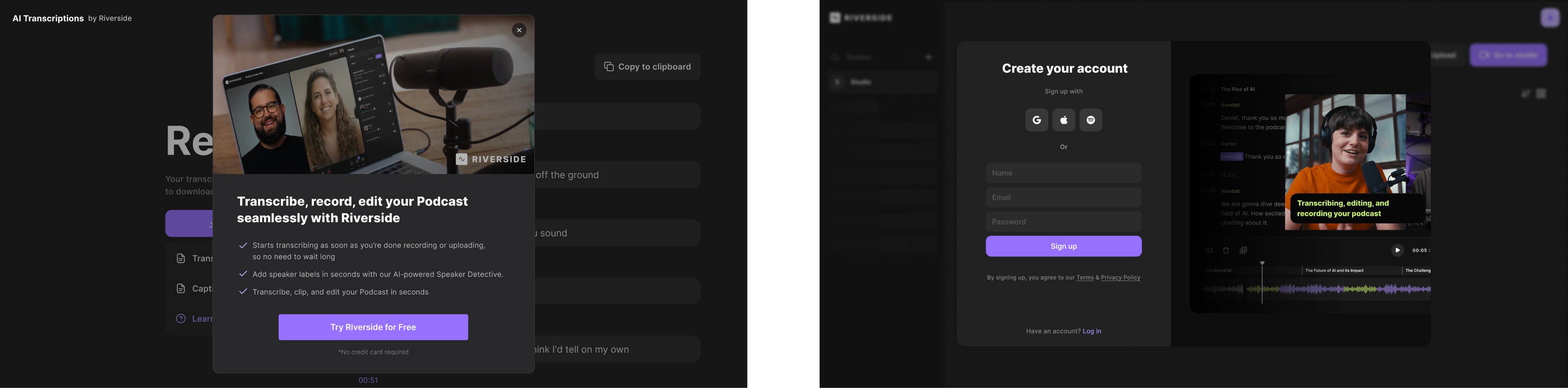
After the user uploads a file, the “Before we start” screen guides them through choosing the language and selecting the transcription type. This step was redesigned to feel like a small interactive quiz. The goal was to increase engagement, reduce cognitive load and prepare the user for the next step. During the processing stage I created a live animated loader that visually transforms the waveform into text. This idea helped reduce perceived waiting time and reinforced the feeling of a high quality, intelligent tool. Once the transcript is ready, users reach the “Ready” screen, where they can read the text, download it, copy it or start another transcription. At this moment I introduced two additional conversion touchpoints. The first is a modal promoting the free trial when the user clicks download. The second appears right after, directing them to create an account. The combination of contextual prompts, clean UI and clear value messaging created a natural and non intrusive path toward registration.
The result of this hypothesis was a measurable improvement in conversion. A/B testing showed a 10 % increase in the registration rate from the transcription flow. This confirmed that early value communication and well placed prompts during moments of high engagement significantly reduce the drop off. The design not only improved immediate metrics but also established a reusable pattern for Riverside: contextual value surfaces inside functional workflows convert better than static or separated promotional elements.

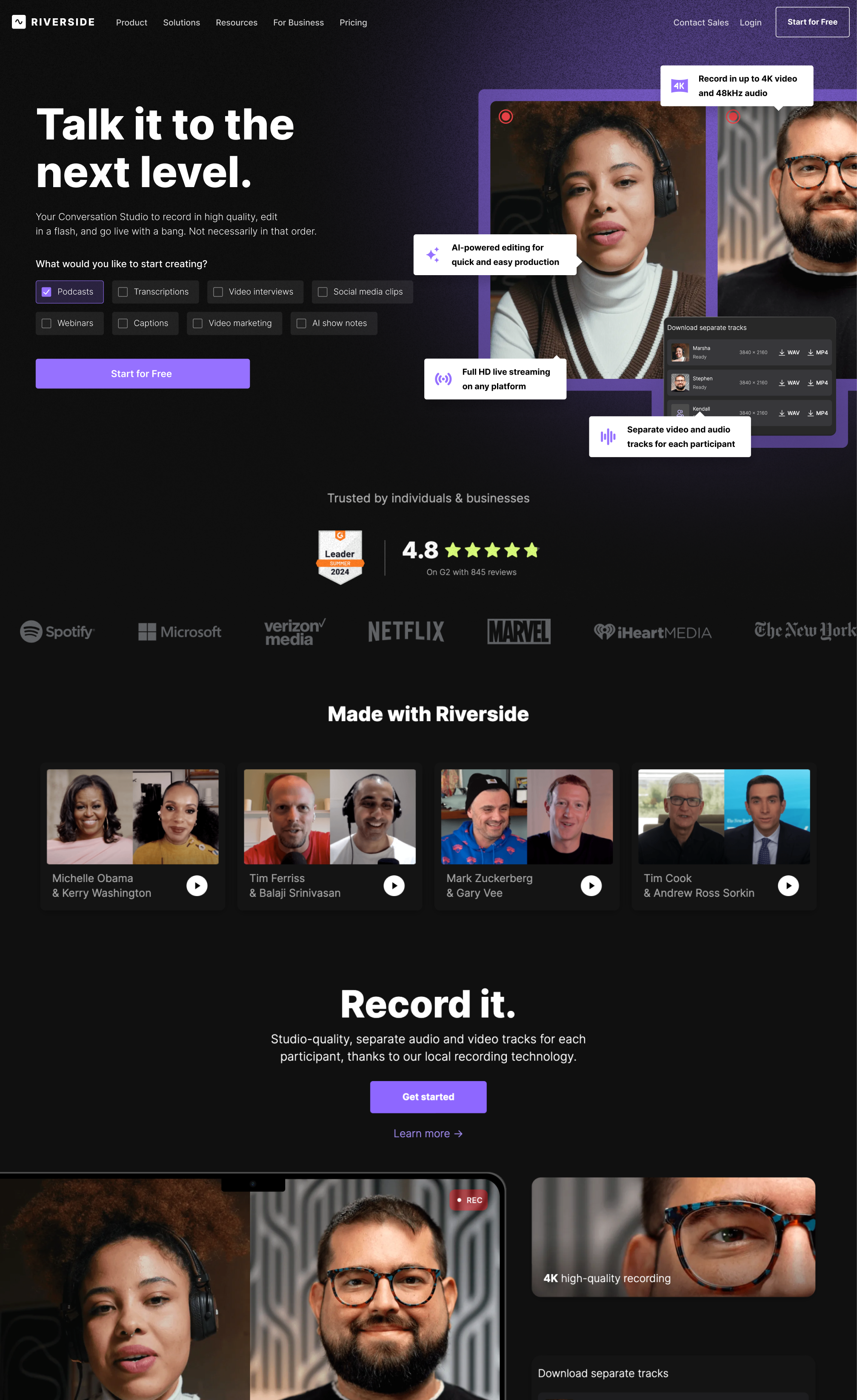
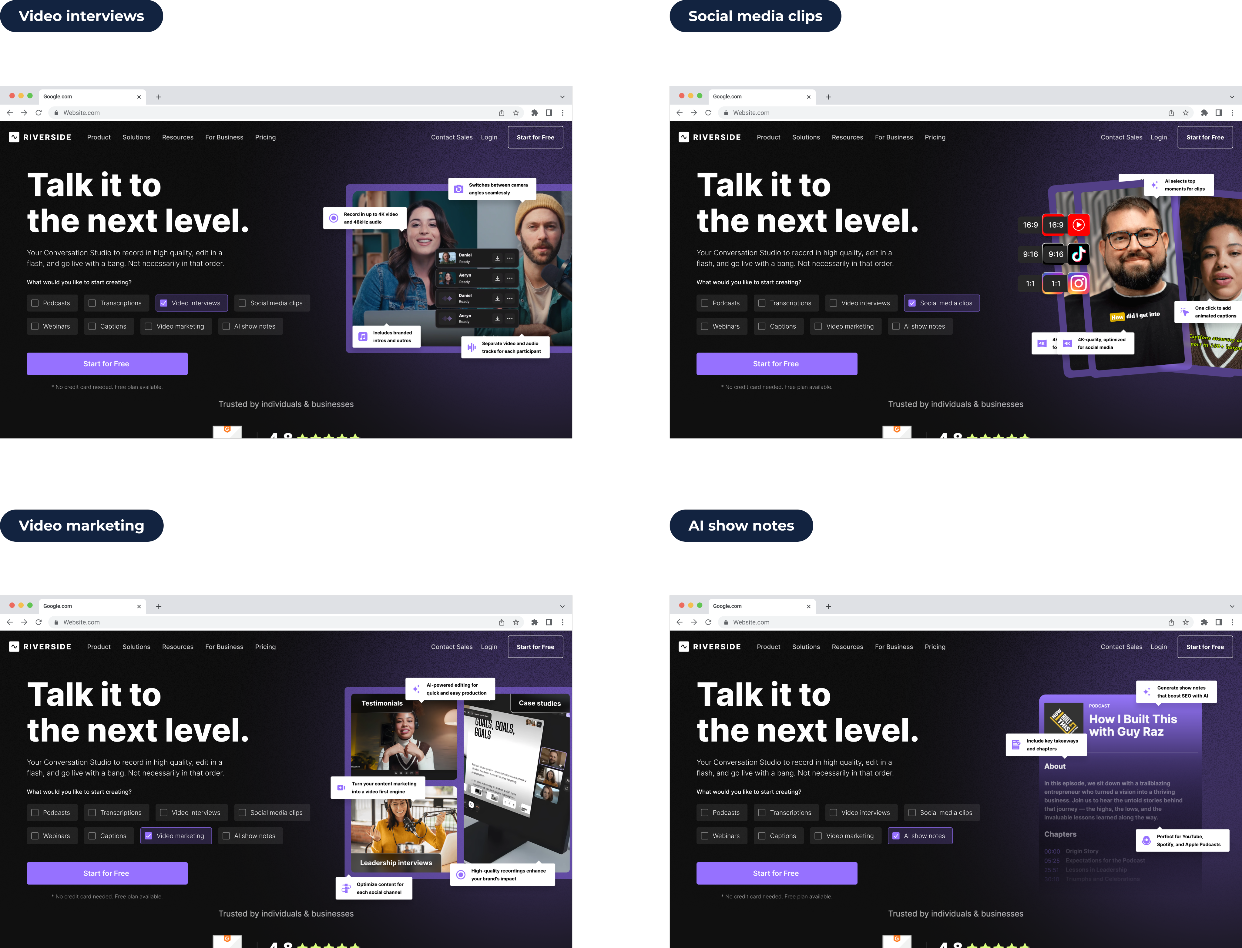
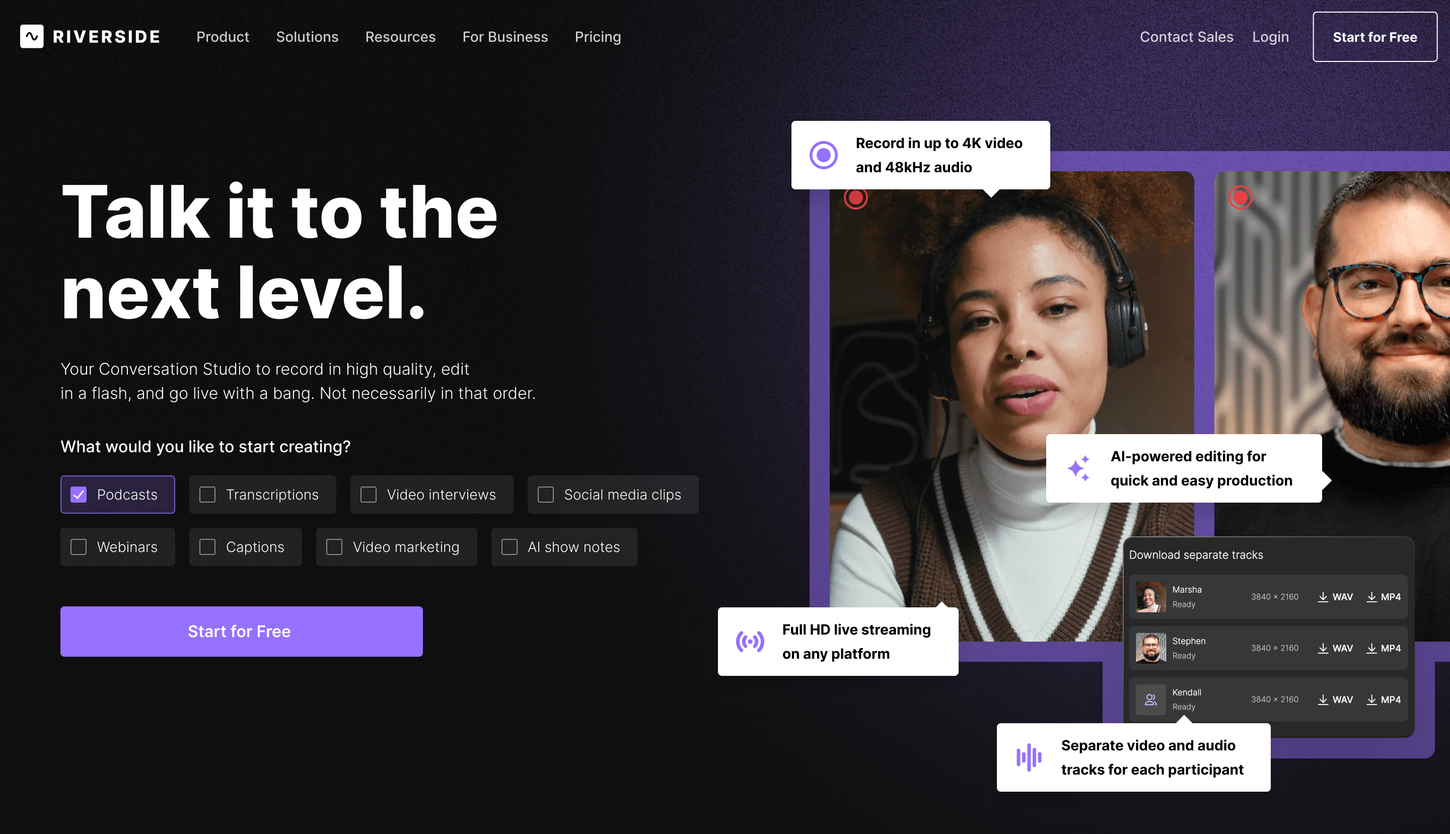
Homepage Personalisation and Use Case Visualisation
This project was completed as part of the Conversion Rate Store team, where I worked as the Product (UI/UX) Designer. Before the redesign, we analysed both the page performance data and the results of user interviews. Around 20 % of interviewed users said they were unsure whether Mac cleaning tools could be trusted, and more than 30 % mentioned that they did not fully understand what CleanMyMac actually does after scanning the homepage. As a result, many visitors hesitate or drop off because they cannot clearly see the product’s capabilities early enough. The task for this hypothesis was to improve clarity, reduce uncertainty and make the first screens more relevant to user intent.

Approach
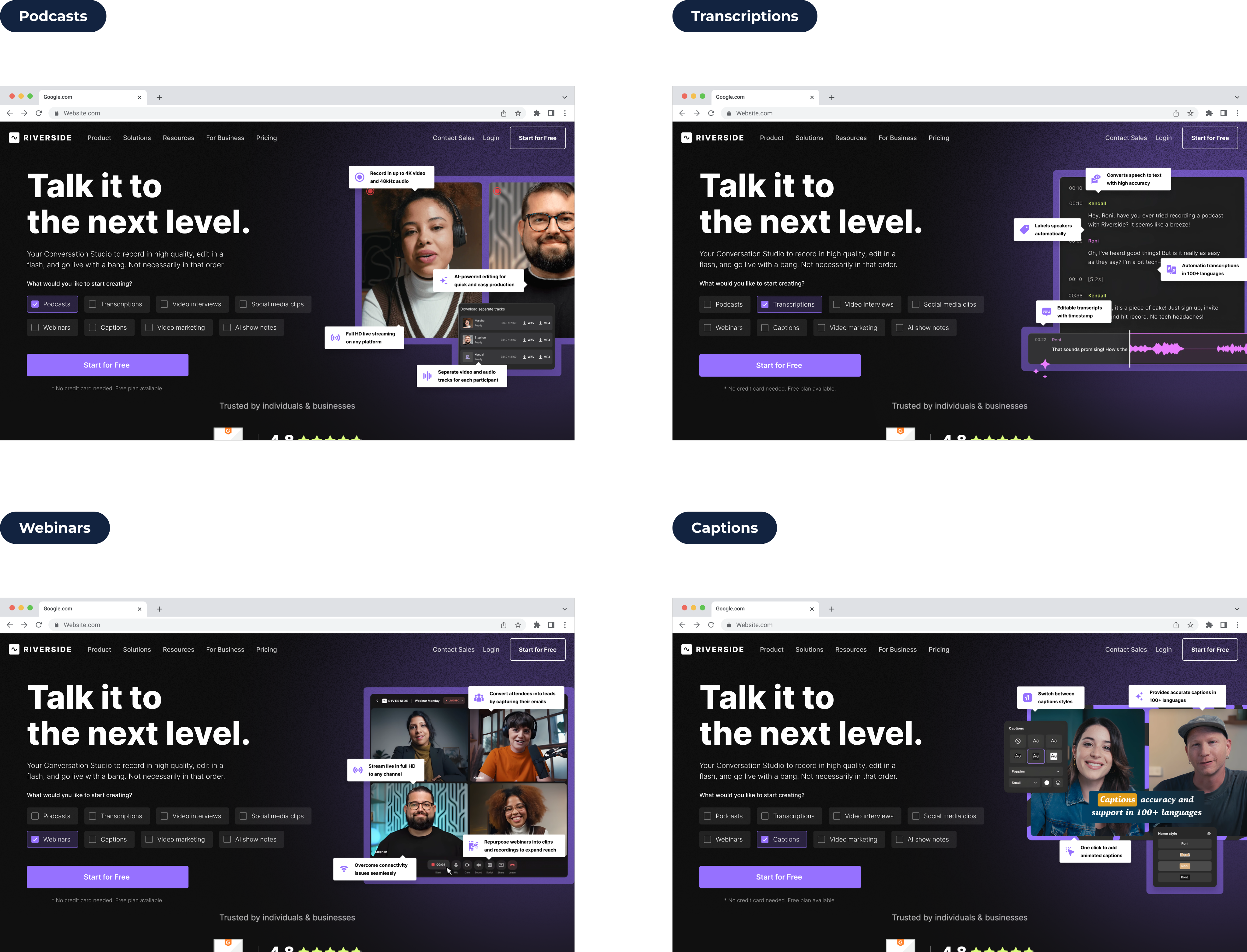
My design approach focused on turning the hero section into a personalised, guided entry point. After a user selects a use case, I introduced a set of dynamic preview cards showing a quick visual demonstration of the product tailored to their selection. These cards act as a lightweight product demo directly inside the hero, helping users understand Riverside’s capabilities without scrolling or navigating away. I reorganised the layout to surface these personalised previews higher on the page and refined the visual hierarchy so the “Start for Free” CTA becomes more prominent. By simplifying the upper structure, removing unnecessary distractions and clarifying the freemium value, the new design reduces cognitive load and helps users quickly build a correct expectation of what the product can do for their chosen workflow.
Result
The redesign created a more predictable and informative first-screen experience, addressing the confusion found in research. By showing personalised product value immediately and clarifying what users get for free, we increased confidence and reduced hesitation around the use case selector. A/B testing validated this approach with a measurable uplift of 5 % in the main conversion metric. The improvement confirmed that giving users an instant, contextual preview of the product significantly increases their likelihood to sign up and establishes a reusable pattern for how Riverside can present value in high-intent areas of the homepage.