Oakwell Beer SPA
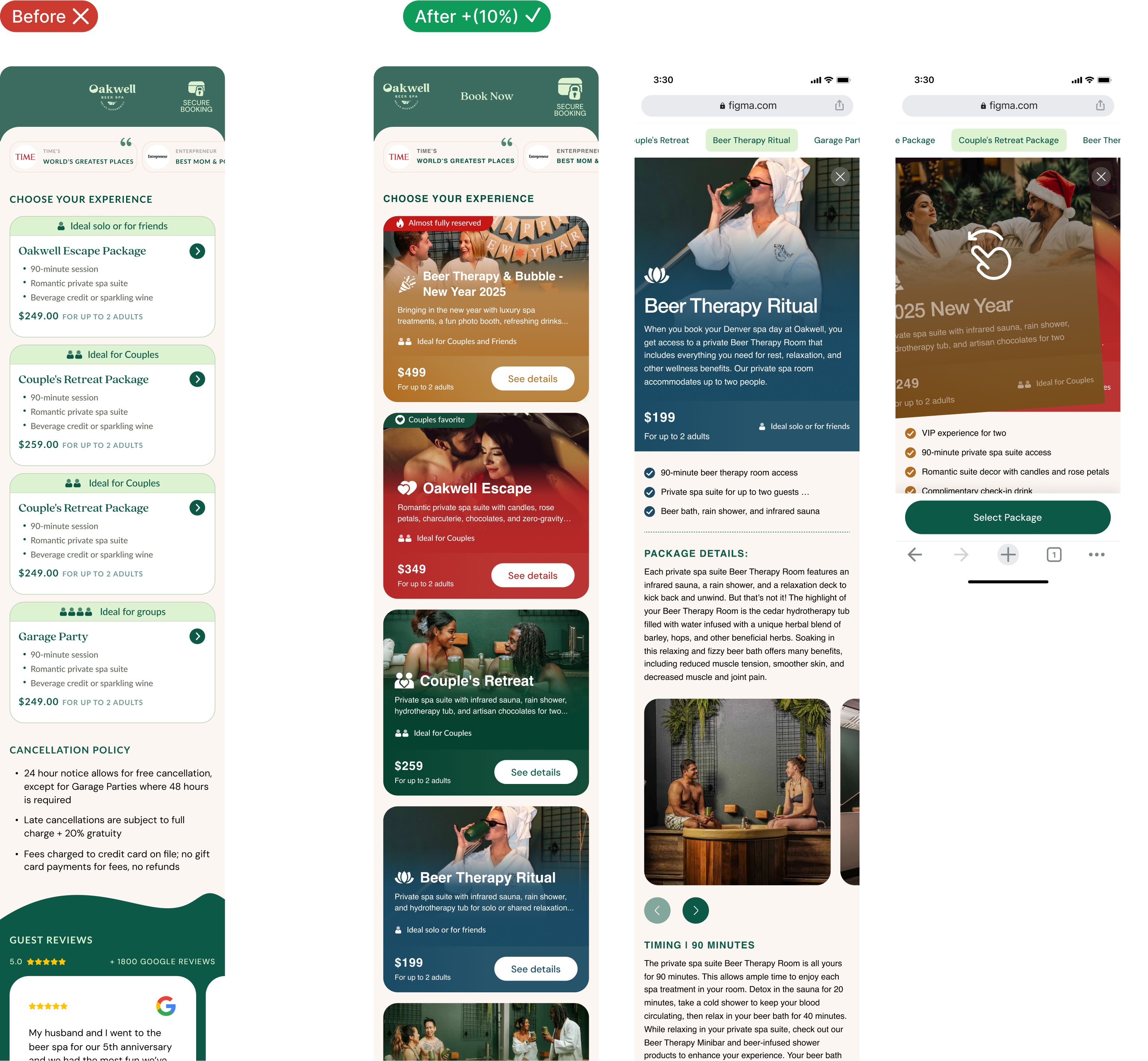
Challenge
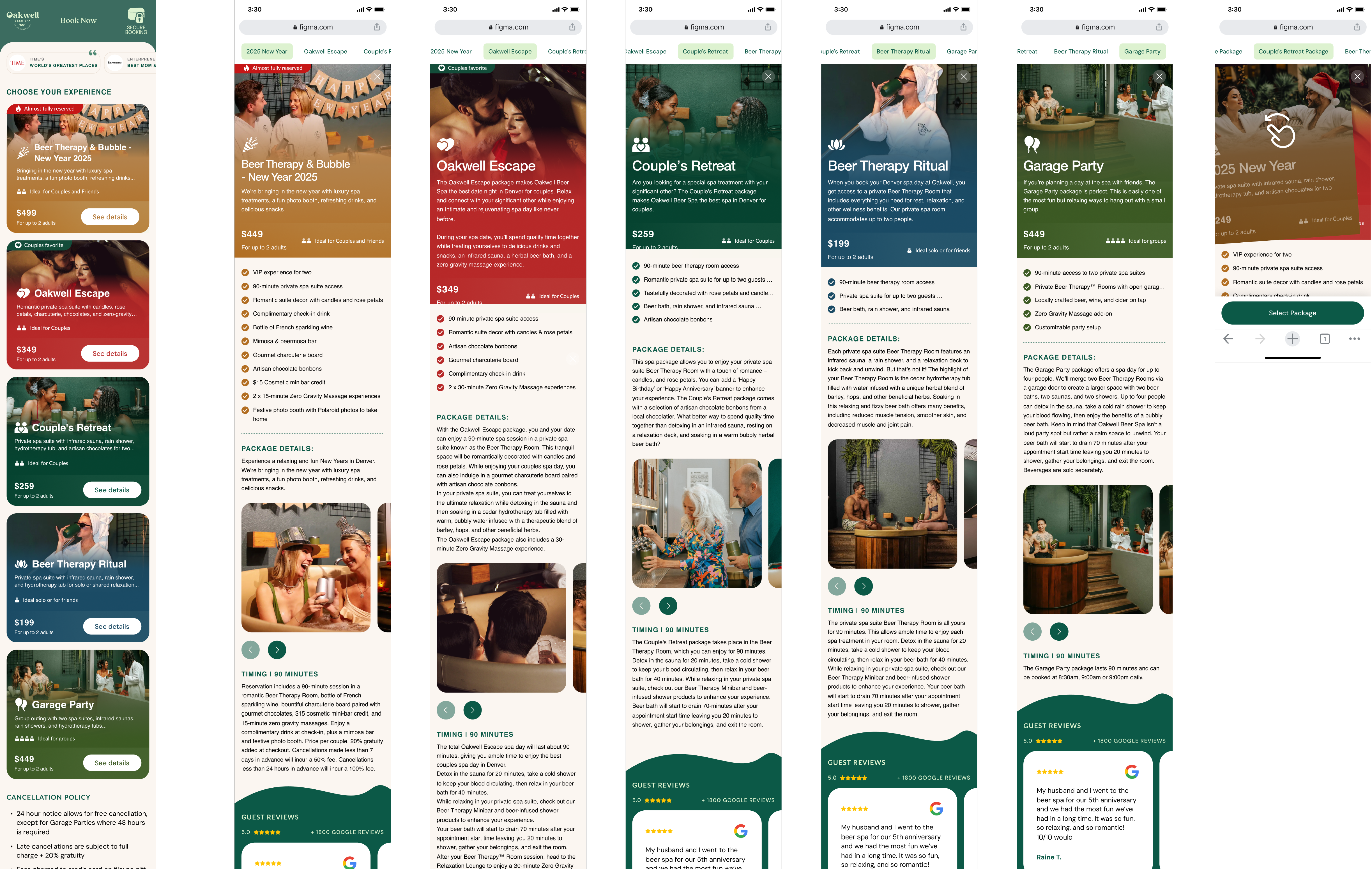
This project was completed as part of the Conversion Rate Store team, where my role focused on the UX and product design side. User research revealed a major drop-off on the service selection page. All services looked nearly identical because the cards used the same muted colors, similar text blocks, and no clear visual cues.
Approach
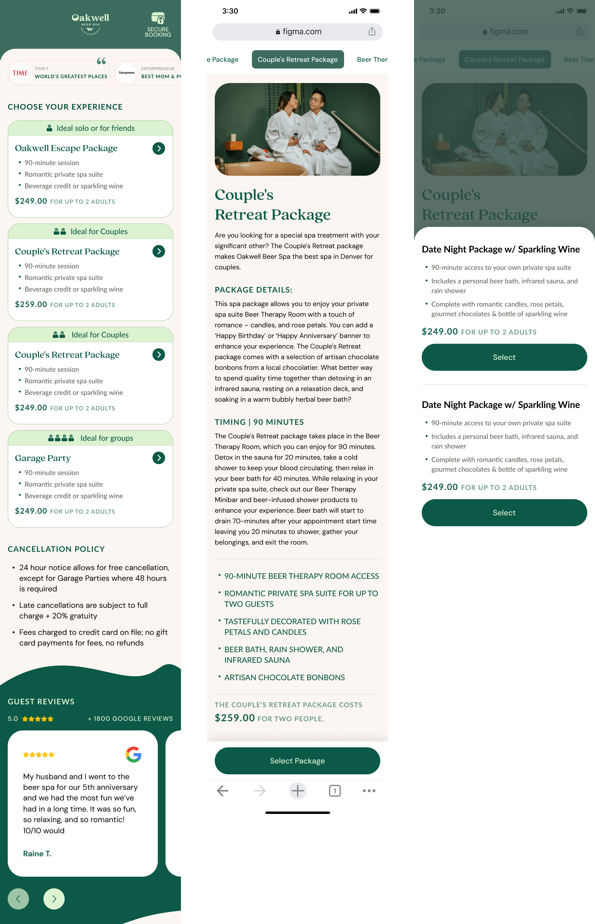
The idea was to introduce emotional clarity through color, photography, and stronger hierarchy while keeping the layout practical and easy to scan. The client already had a strong library of studio photos that matched each service, so I explored how to pair each package with its own visual identity. The design challenge was to present richer, more expressive cards without overwhelming users and while keeping all essential information visible at first glance. I also reworked the structure of each detail page and added a sticky call-to-action to support smoother progression through the booking flow.
Outcome
The redesigned service cards became more expressive, easier to compare, and far more aligned with the emotional nature of the product. Users could instantly understand the difference between packages and navigate with more confidence thanks to clear hierarchy and consistent visual logic. The combination of strong imagery, color-coded categories, and an improved detail layout resulted in a conversion lift of more than 15 %, proving that a more intuitive and emotionally engaging presentation directly supported user decision making.
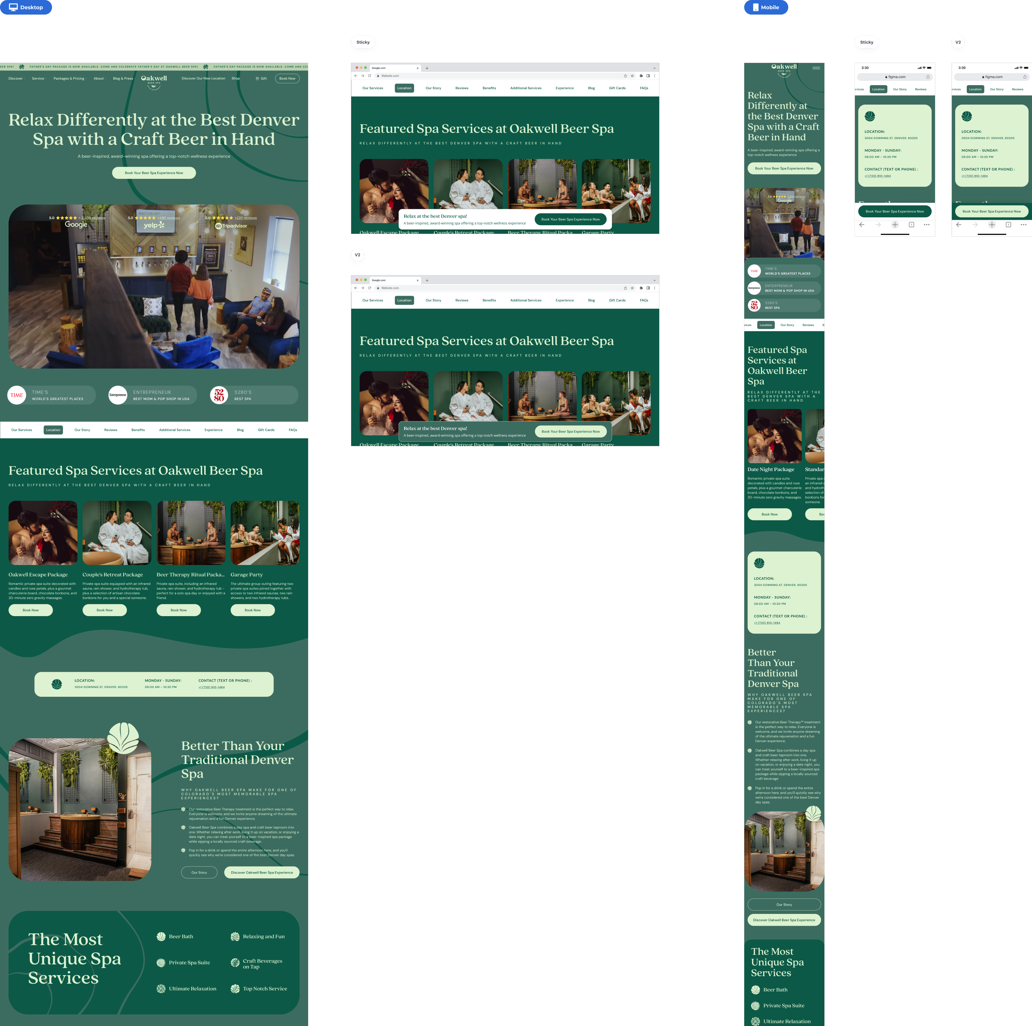
Homepage redesign
Redesigning the Home Page to Reduce Overload and Boost Clarity
The goal of this iteration was to rework the home page so it could guide users more confidently toward booking. Research showed that visitors were overwhelmed by dense content, unclear service categorization, and weak visibility of trust elements and conversion triggers. To address this, the new design simplified the above-the-fold section, strengthened navigation, and introduced clear CTAs supported by social proof. Service listings were reorganized into structured groups, pricing became easier to scan, and trust badges, reviews, and brand story elements were surfaced earlier to support quick decision making. This cleaner and more intentional page flow helped users navigate the content without friction and contributed to an increase in booking-stage conversions.