CNDO
Project Context
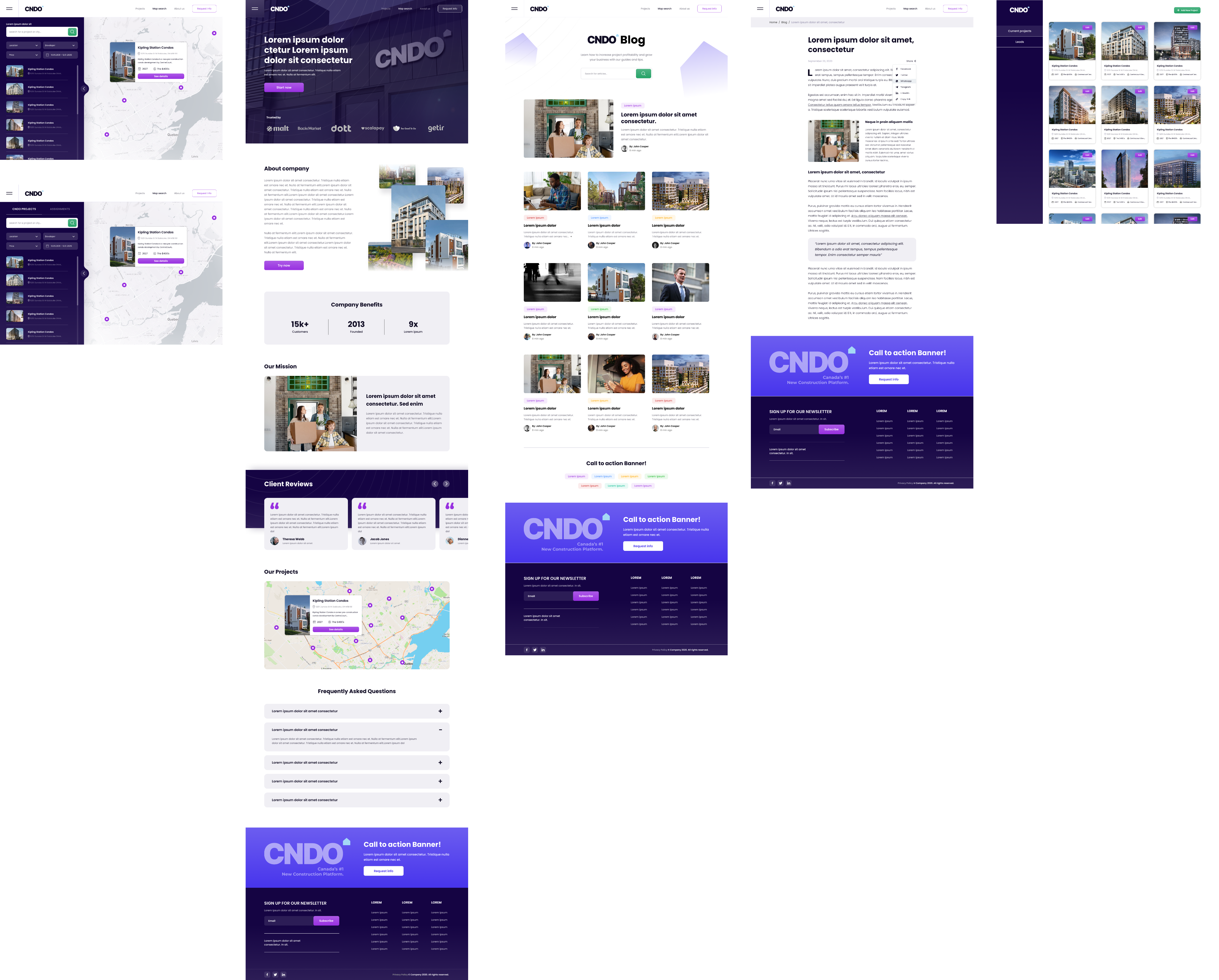
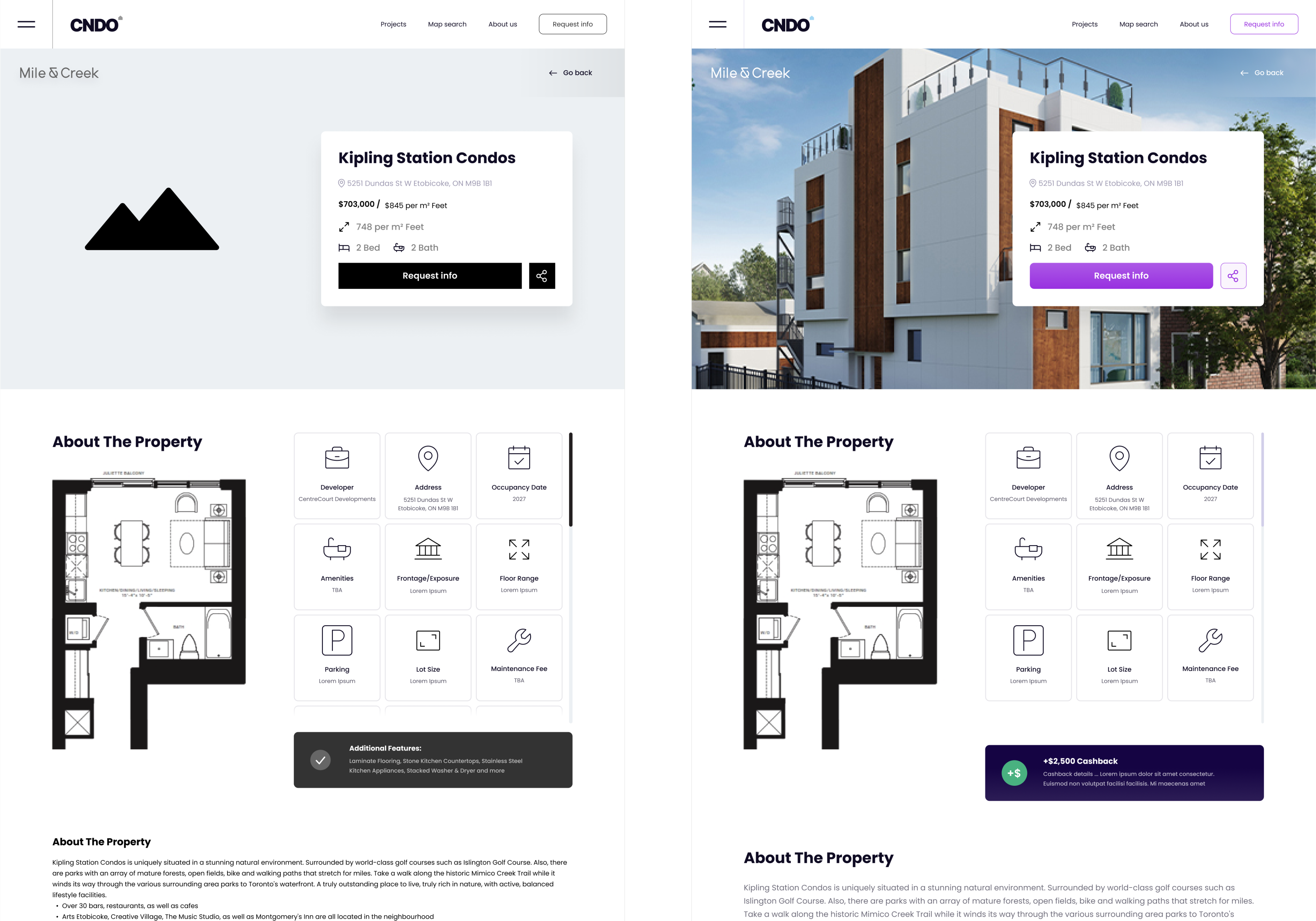
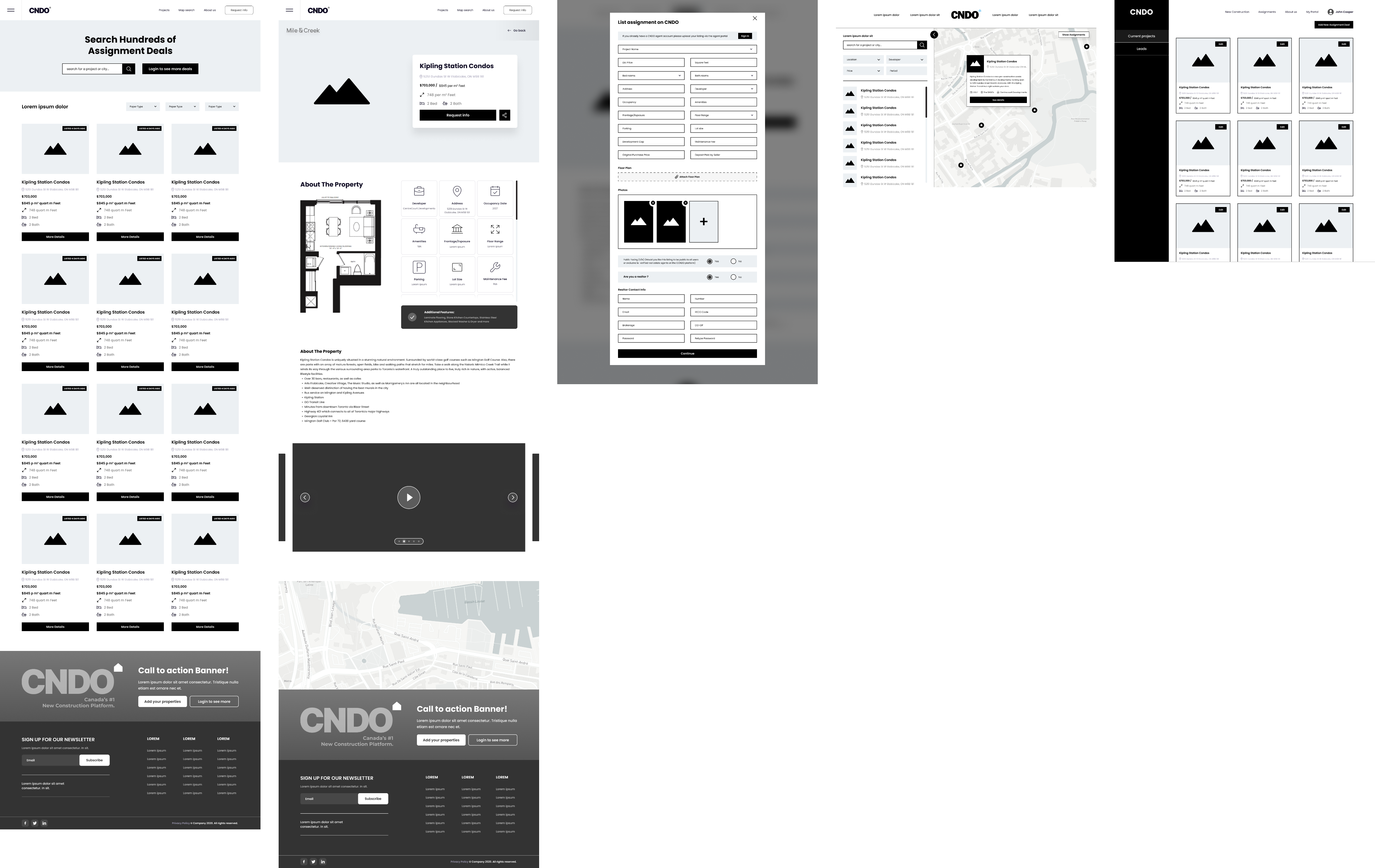
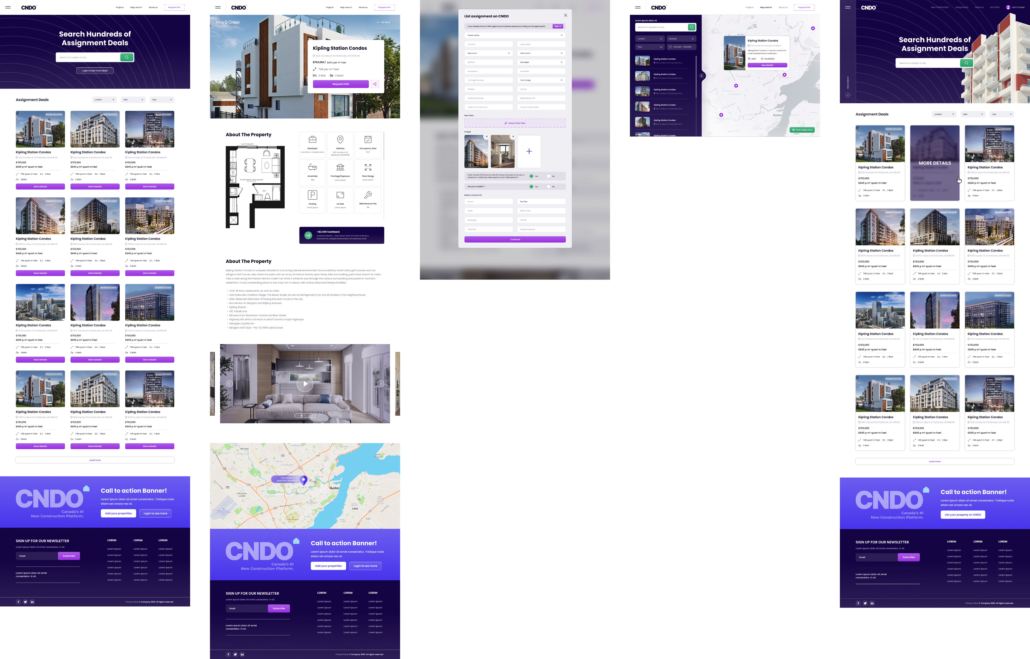
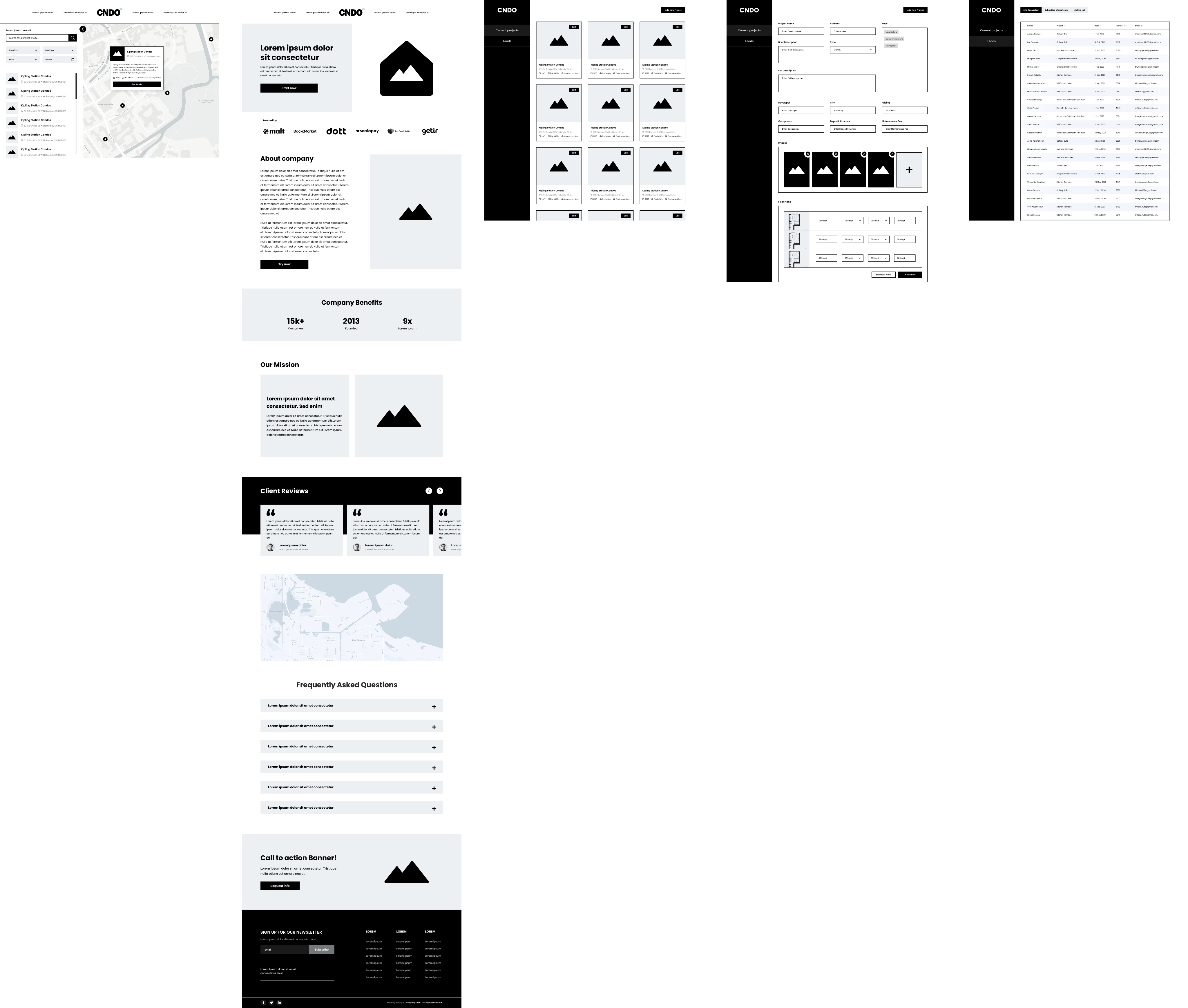
CNDO is a real estate platform for exploring and purchasing pre-construction projects across Canada. When I joined the project, the client had only a set of rough wireframes and functional notes describing dozens of pages, including the main catalog, individual project pages, map search, blog, and internal lead-management tools. The core issue was that the existing structure felt dated, visually inconsistent, and difficult to navigate. Users struggled to understand project information quickly, and the platform lacked a professional and trustworthy visual identity.
UX Strategy
My focus was to bring clarity and structure to a platform that contained a large amount of dense data. I reorganized the user flows across all key pages, creating predictable layouts for project information, developer details, pricing, floor plans, map locations, and forms. The map-based search received a more intuitive filtering and preview logic, helping users browse projects with less cognitive load. For the admin and CRM sections, I improved the layout of tables such as Leads and Submitted Worksheets, making it easier for teams to review, filter, and update information.
UI Direction
The redesign shifted the product to a clean and premium visual style suitable for the real estate market. I introduced a modern color palette, improved typography, clearer spacing rules, and an overall stronger hierarchy. Project cards, galleries, floor plan blocks, and map previews were redesigned to feel more polished and easier to scan. The interface now communicates trust and professionalism, with refined icons, consistent components, and smoother micro-interactions that elevate the experience.
Outcome
The final result was a complete design system for all user-facing and internal pages of the platform. The new structure made it significantly easier for buyers and investors to browse projects, compare details, and explore options without friction. The client emphasized that the redesign finally presented CNDO as a modern and credible product. The clearer UX logic and upgraded UI are now the foundation of the upcoming MVP and ongoing development work.