
Aeyla.
Redesigning the PDP and Cart to Fix a BrokenPurchase Flow
This project was completed as part of the Conversion Rate Store team, where I worked as the Product (UI/UX) Designer. The Dual Pillow PDP was the main entry point for more than 70 % of users, yet over half of mobile visitors never saw the Add to cart button due to scroll depth issues. The page was overloaded with information, the shopping block lacked hierarchy, reviews were buried, and the slide in cart created unnecessary friction. My role as the product designer was to translate these behavioral insights into a focused redesign that increased motivation to buy and reduced the cognitive load throughout the purchase journey.
Understanding the Drop Off and Rebuilding the Structure
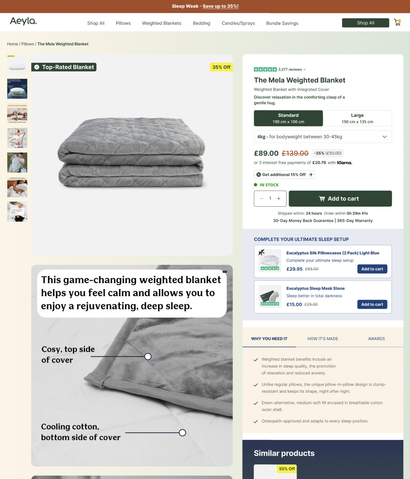
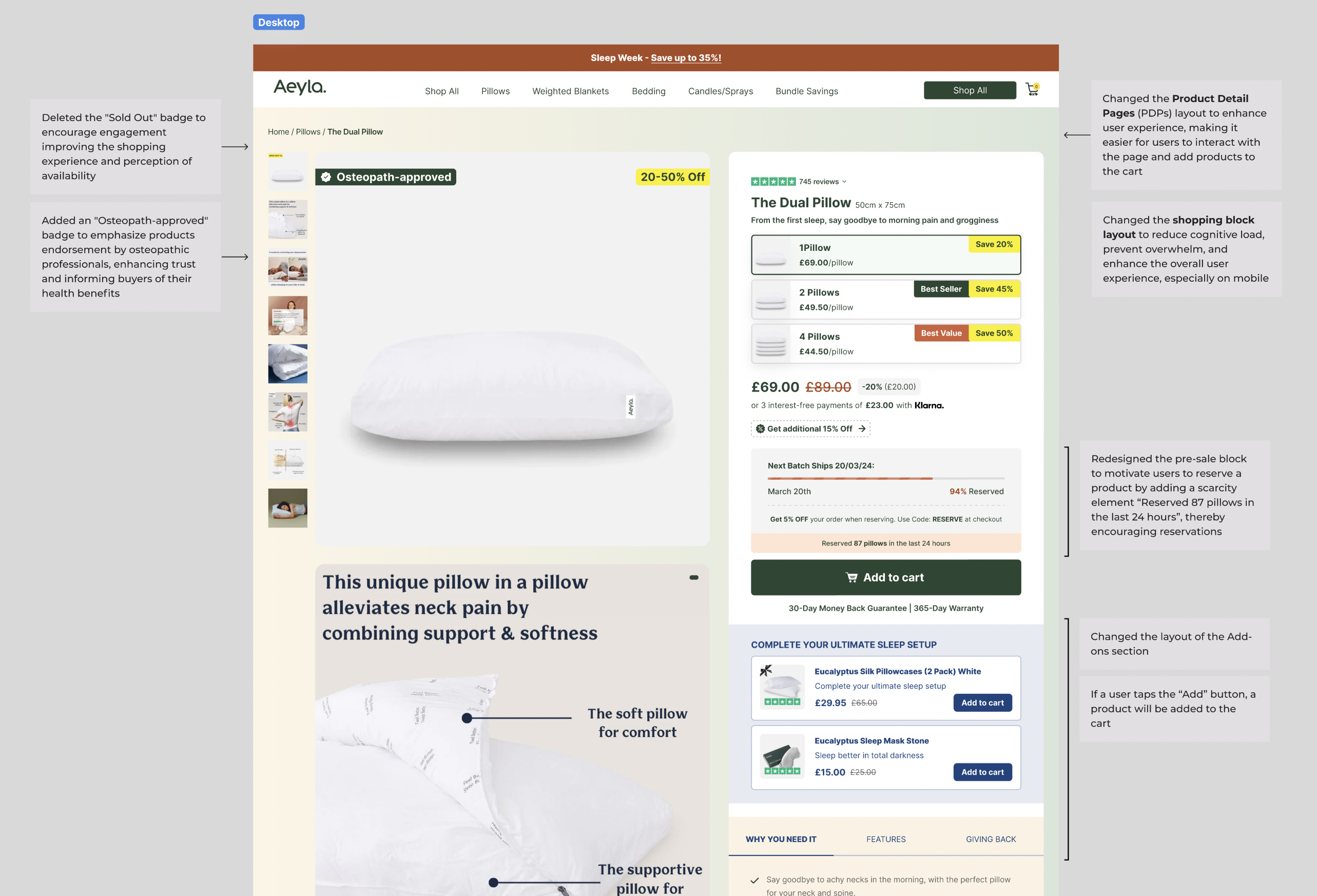
Analytics showed several critical patterns. Cart to detail rates were healthy, but cart abandonment was extremely high, especially on mobile. Many users stopped immediately after adding a product, suggesting that the shopping experience felt overwhelming or unclear. The PDP lacked trust elements at the moment users needed them, and the decision making content was scattered across the page. I reorganized the PDP into a clear structure where the hero visual, shopping block, trust signals, and product benefits worked together in a logical and predictable order.
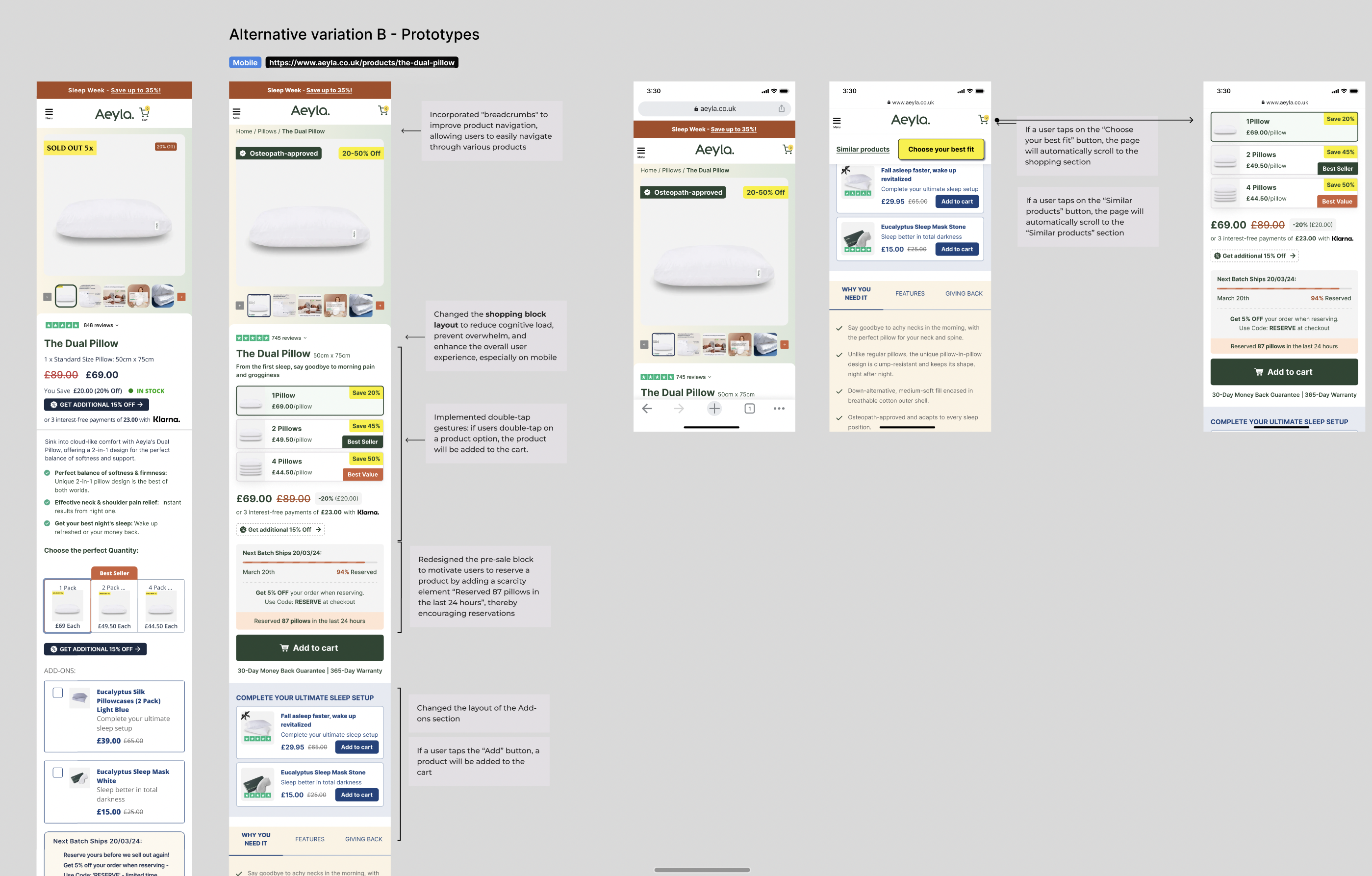
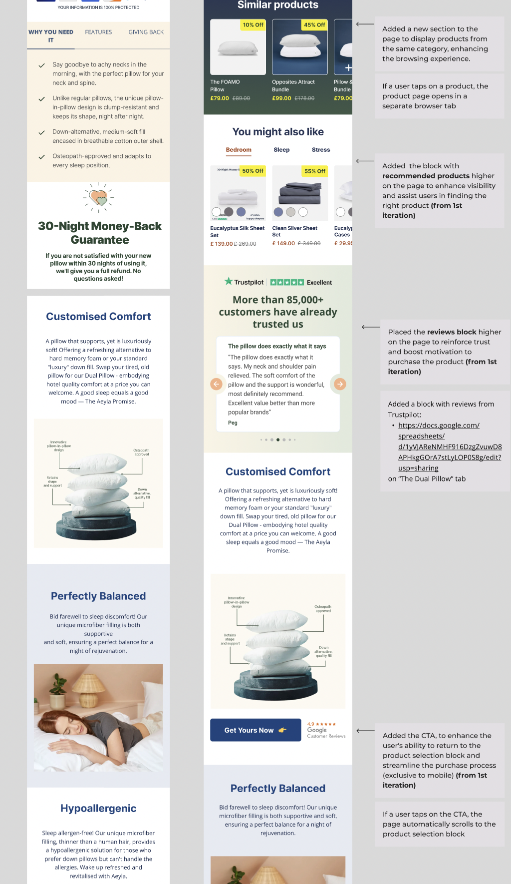
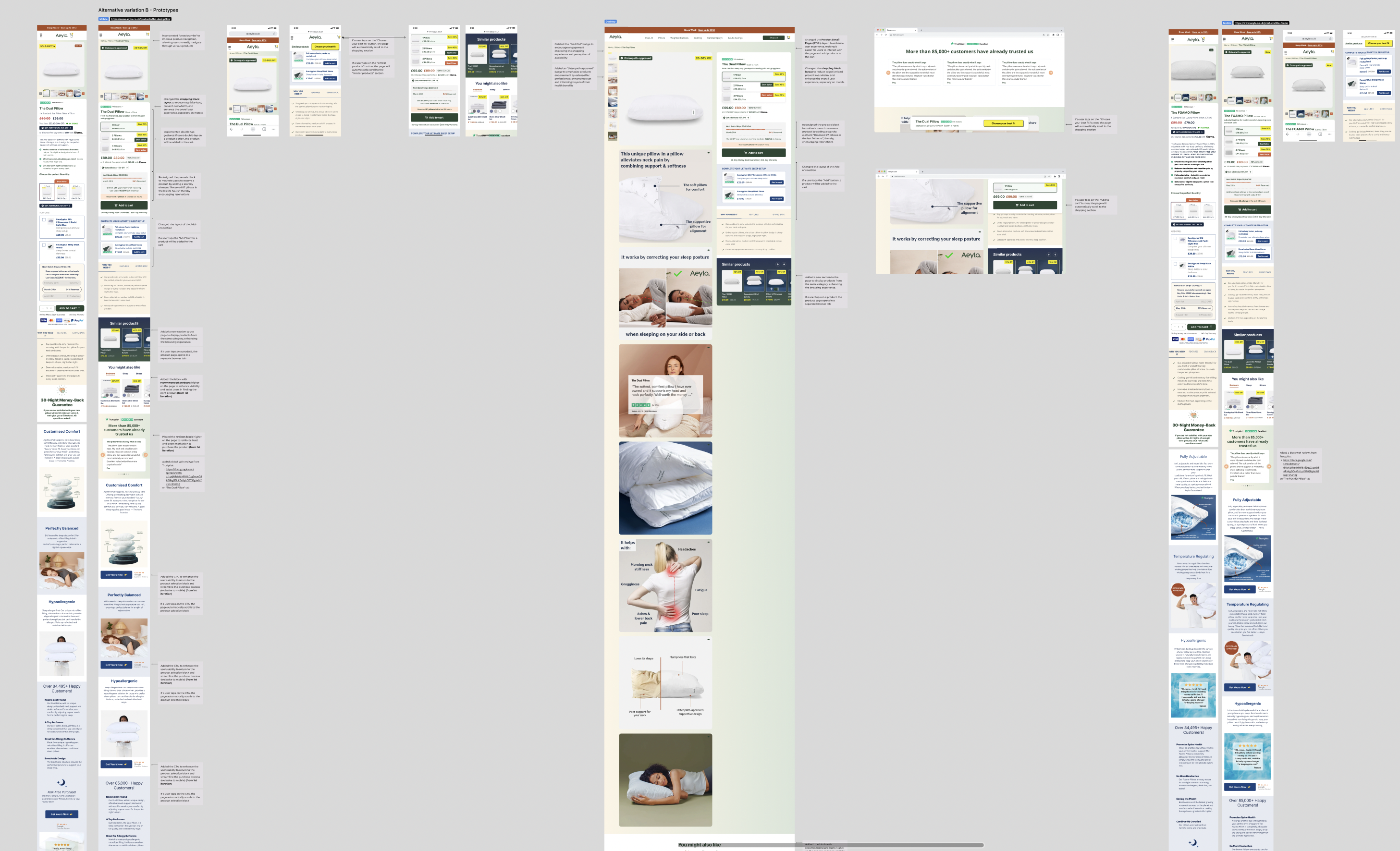
Improving the PDP Experience and Increasing Motivation
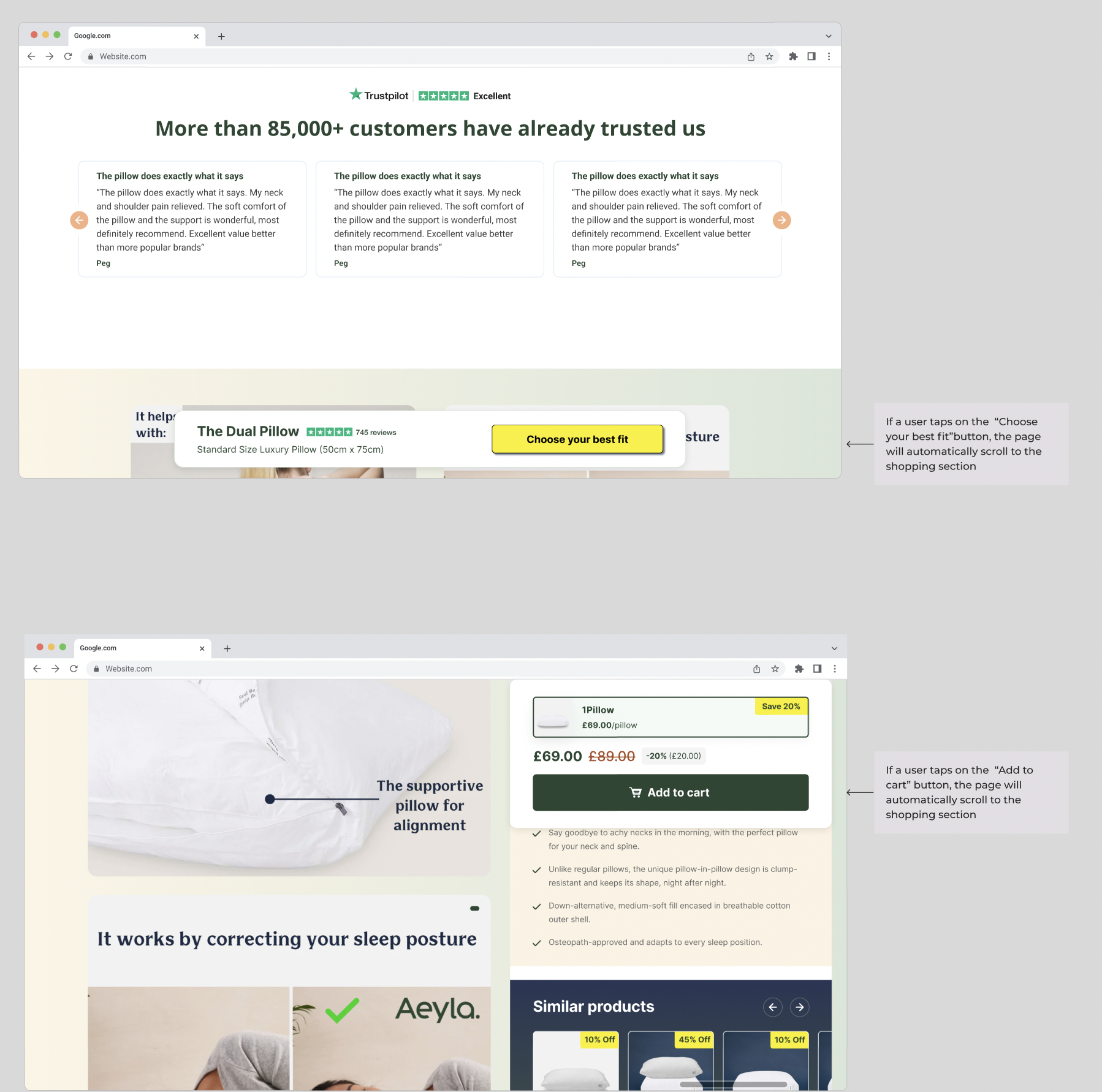
I redesigned the entire shopping block to simplify variation selection, highlight the most valuable bundles, and clarify pricing. To increase visibility, I added badges for discounts, scarcity messaging, and the osteopath approved label. Trust elements like reviews and expert endorsements were moved higher, while new recommended products and similar items were positioned earlier to improve product discovery. A new sticky CTA allowed users to jump back to the purchase section at any moment, solving the visibility issue on mobile and keeping motivation high.
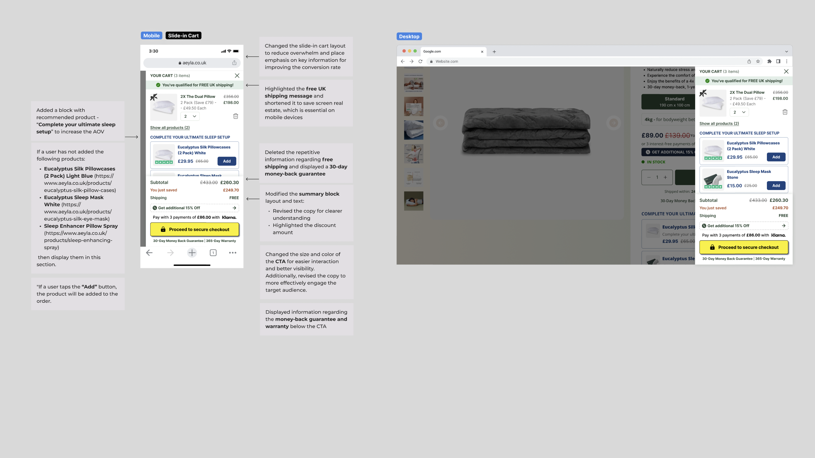
Optimizing the Slide In Cart to Lift AOV and Reduce Abandonment
The cart was redesigned to highlight only the most important information. I simplified the layout, grouped pricing details, and clarified discounts. A new block with recommended add ons, such as pillowcases and sleep masks, helped increase AOV without interrupting the checkout flow. I removed repeated messaging, improved copy across the cart, and updated the CTA design to make the next step more obvious. The result was a cleaner, more focused cart experience that supported users instead of adding complexity.
Outcome and What Drove the Improvement
The final design delivered a meaningful uplift, with conversion improving by more than ten % across the tested variations. The changes worked because they solved the real behavioral issues uncovered by research. Users could see the purchase section without excessive scrolling, understand product options with