Natpat
Context and starting point
This project was completed as part of the Conversion Rate Store team, where my role focused on the UI/UX and product design side. NATPAT is a wellness brand for kids, and the redesign began with a clear hypothesis. If we rebuild the buying flow, redesign the homepage with clearer product bundles, playful character driven visuals and a stronger content structure, users will understand the products faster and feel more confident moving toward purchase. The first A/B test confirmed this direction. The new homepage delivered an uplift of eleven % in conversion from the homepage, proving that design, structure and product clarity directly influence buying intent. As the Product UI and UX designer, I was responsible for rethinking the entire experience from the ground up, including the card system, layout logic and overall visual direction.
Problem and the hypothesis behind the redesign
Through research and funnel analysis, we discovered that while engagement on the homepage was high, users did not consistently progress to Product Listing or PDP pages. The hypothesis for the redesign was simple. If we change the UI structure and refresh the layout to better communicate product types, benefits, bundles and visual characters, users will feel more motivated to continue to the next step. The assumption was that a clearer, more engaging homepage would increase the conversion rate from the homepage to the buying journey because users would understand the value of the patches earlier. My goal was to validate this through a new homepage structure, stronger content hierarchy and an emotionally richer design system.
UX challenges and the need for a new structure
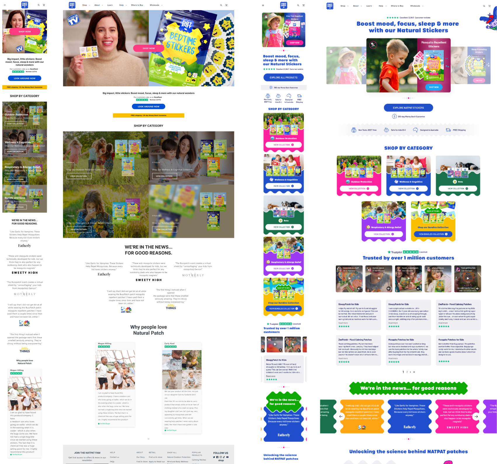
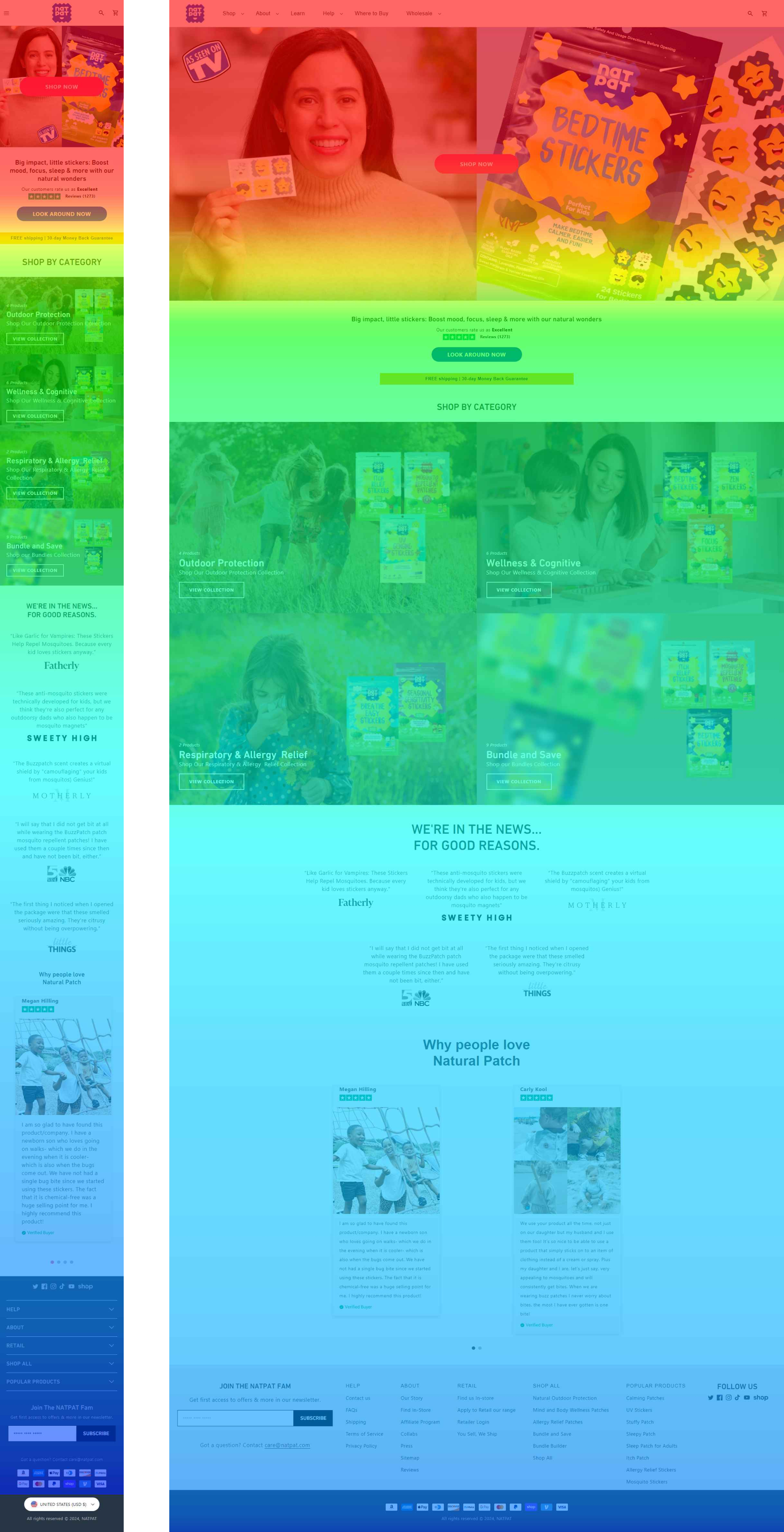
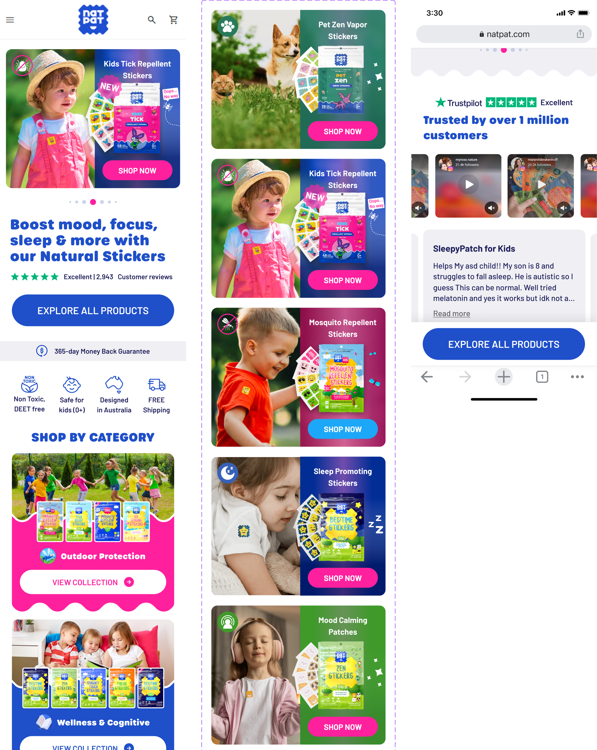
One of the biggest challenges was reorganising the buying logic. NATPAT sells a wide range of patches, and the old layout showed them in a way that felt cluttered and inconsistent. I had to design clear, repeatable card templates for individual products, multi packs, categories and bundles. Each needed to communicate the character of the product while staying functional on both desktop and mobile.
Visual direction and the introduction of illustrated styles
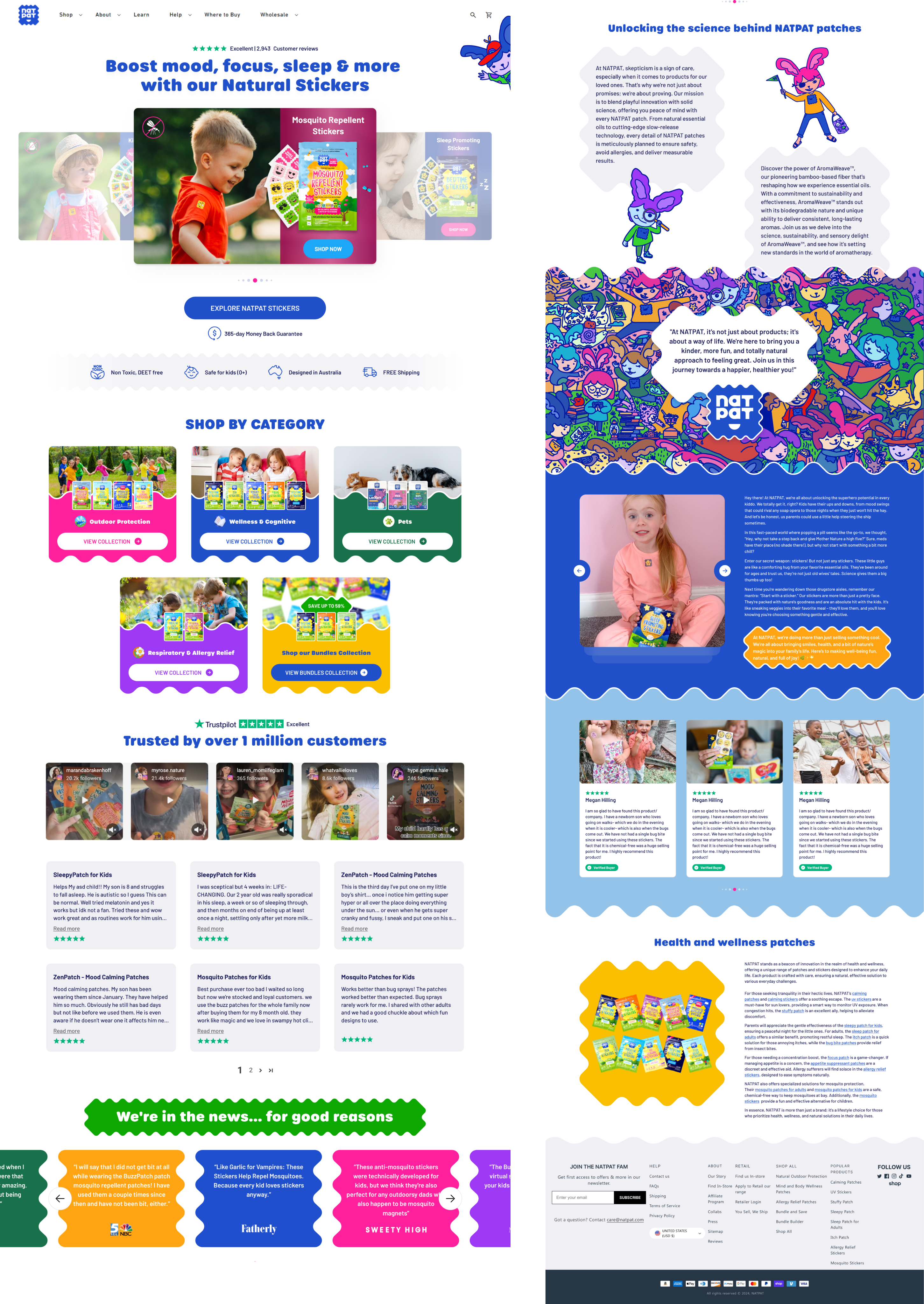
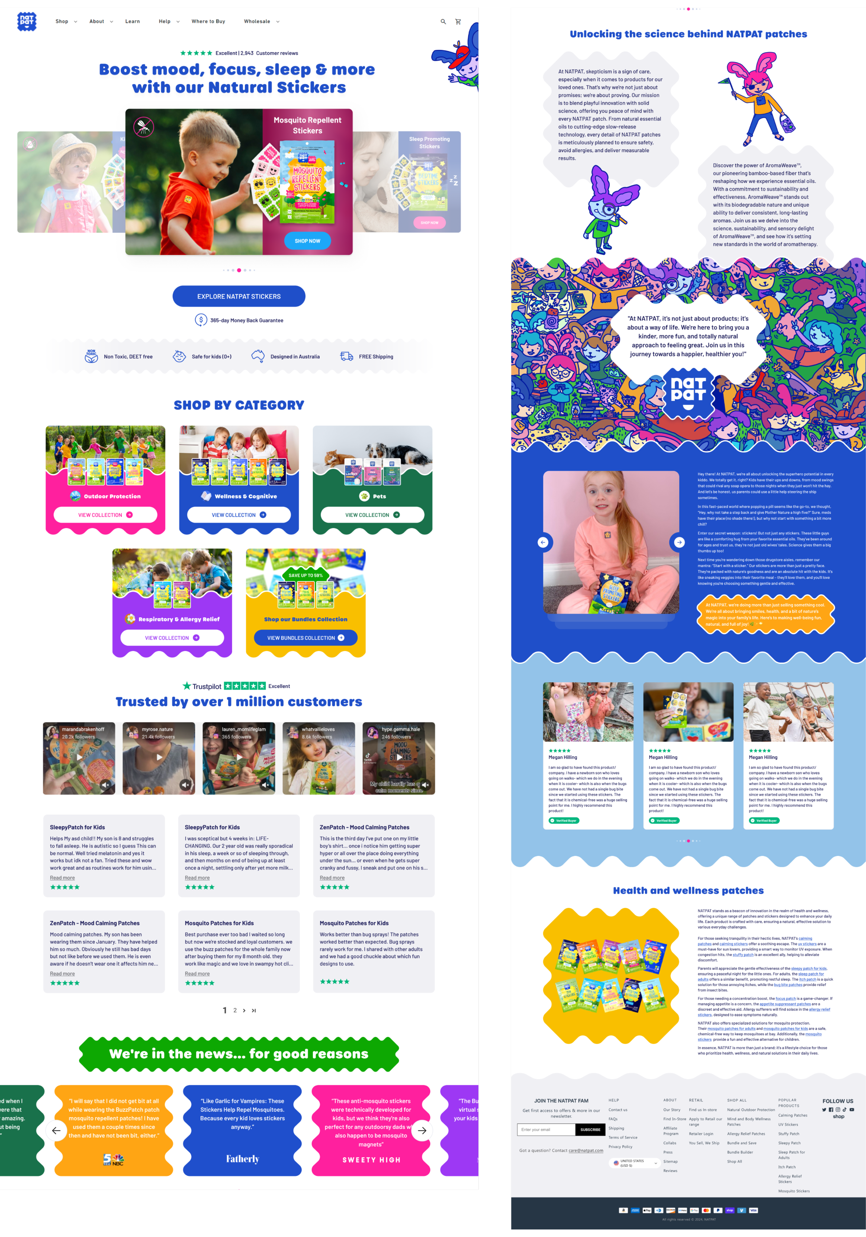
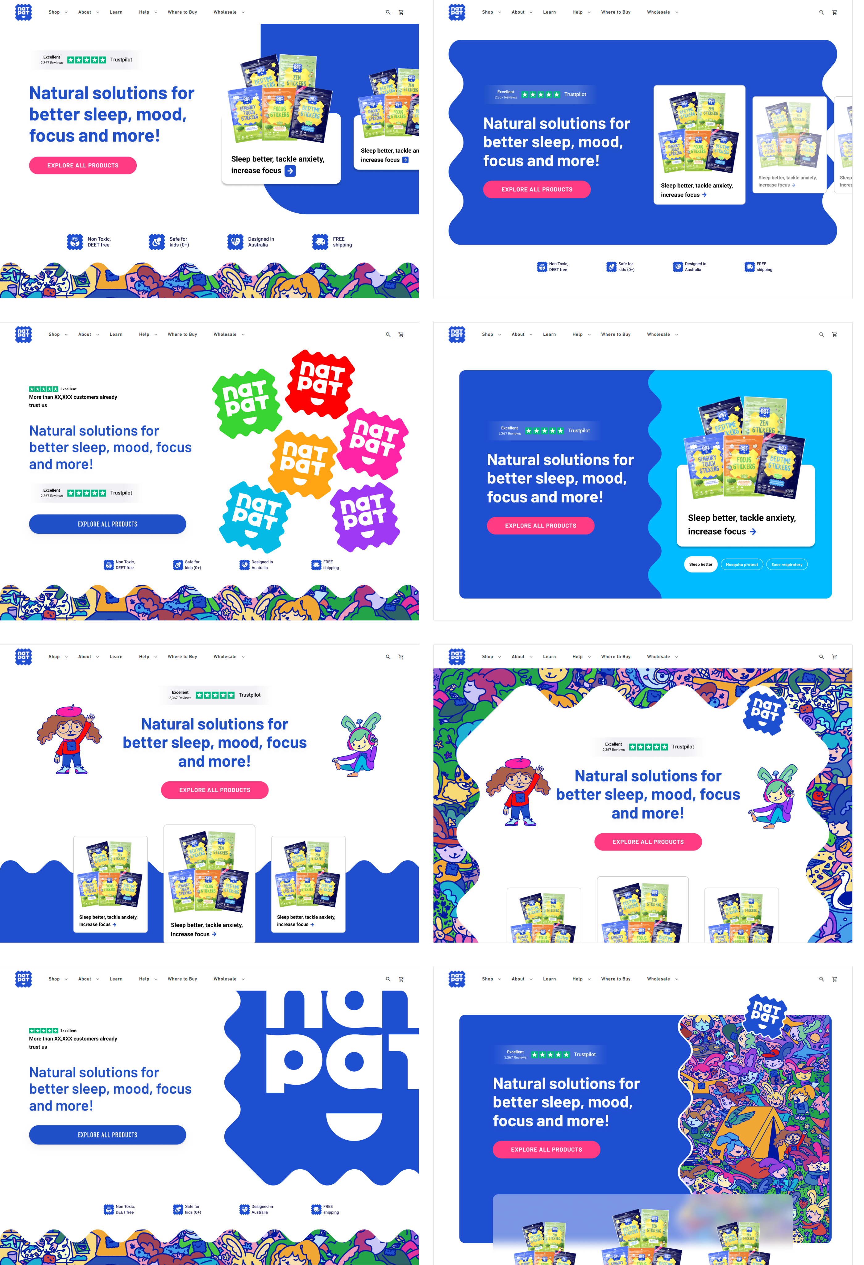
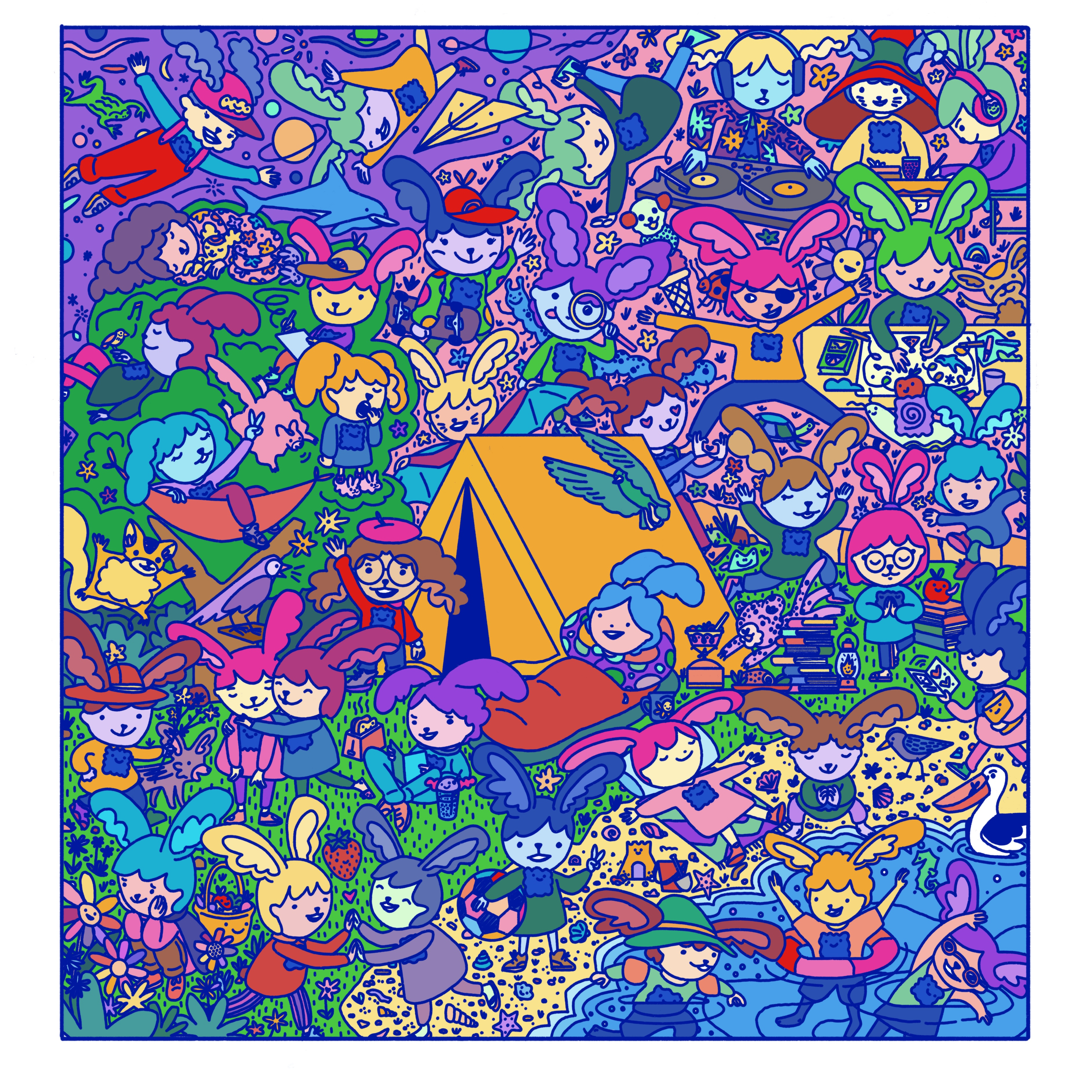
The client wanted to introduce a new illustrated style, including characters, textured backgrounds and playful frame shapes. I developed a system of soft edged, slightly irregular patch inspired frames that echoed the shape of the stickers themselves. These frames became a core UI element for cards, banners and category sections. I also connected different characters to different patch types so users could instantly associate each product with a personality or emotional theme. This approach helped create consistency while expanding the brand identity. The new illustrations, gradients and textures gave the homepage a warmer and more engaging tone, especially on mobile.
Designing for mobile first and creating a high impact hero
Since most NATPAT users browse on mobile, I built the design mobile first. The hero section was redesigned to be more persuasive with a clear CTA, product benefits, safety indicators and a dynamic carousel of key patches. I implemented a sticky CTA for mobile to keep the purchase action always visible without interrupting browsing. Additional information blocks, missing in the original design, were introduced to answer common user questions such as science behind the patches, real customer stories and news features. The new layout made it possible to scroll through everything in a natural, storytelling flow that built trust step by step.
Bringing the concept to life through UX flows and card systems
My role included designing the full card system for the homepage: product cards, bundle cards, pack sizes and category previews. I created multiple visual variations and tested how they behaved on small screens, ensuring they stayed readable and emotionally attractive. Reviews were expanded with more UGC, personalised highlights and a more human tone of voice. Galleries and lifestyle photos were integrated to show real children using the patches, reinforcing the emotional and practical value. Each part of the redesign positioned NATPAT as a friendly brand that understands parents’ concerns while staying visually fun for kids.

Results and insights from the A/B test
The A/B test showed that the redesigned homepage increased conversion by eleven %, and qualitative data explained why. Users spent more time engaging with the new product cards and character based bundles, the benefits were easier to understand, and the restructured layout made it clearer which patches to choose. Mobile users especially reacted well to the