DoYogaWithMe
Challenge
This project was completed as part of the Conversion Rate Store team, where my role focused on the UX and product design side. DoYogaWithMe approached our team with a clear problem. Their platform had grown over the years, but the overall experience felt outdated, confusing and visually inconsistent. Navigation was difficult, pages looked similar, and new visitors struggled to understand where to start. The UI lacked contrast, clarity and trust. Our redesign aimed to modernize the entire platform, simplify navigation for both registered and non registered users and improve conversion across the site. After launch, the new design delivered a noticeable performance boost, including a significant uplift in registrations and premium plan purchases.
UX Issues and Research Insights
User research confirmed that most visitors were lost within the first minutes of browsing. Multiple pages looked similar, content categories overlapped and there was no clear structure for discovering classes or understanding the difference between free and premium experiences. Many users described the site as helpful but “too old looking” and “hard to navigate”. These insights shaped our strategy and showed that the main barrier to conversion was not the product itself, but how the experience was structured.
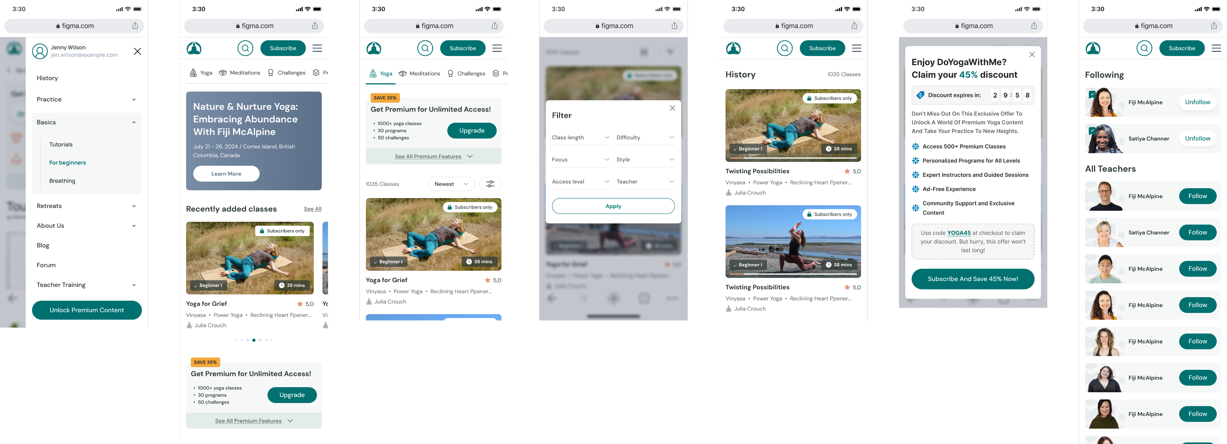
Navigation and Structure Strategy
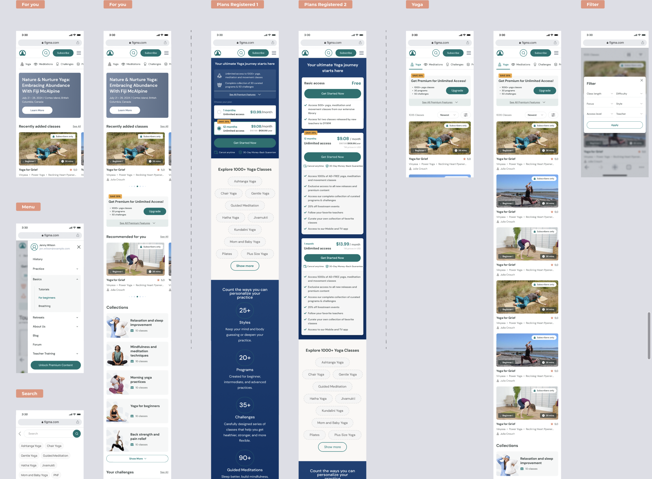
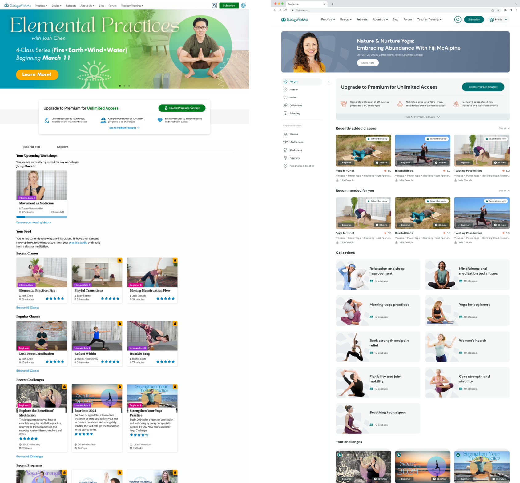
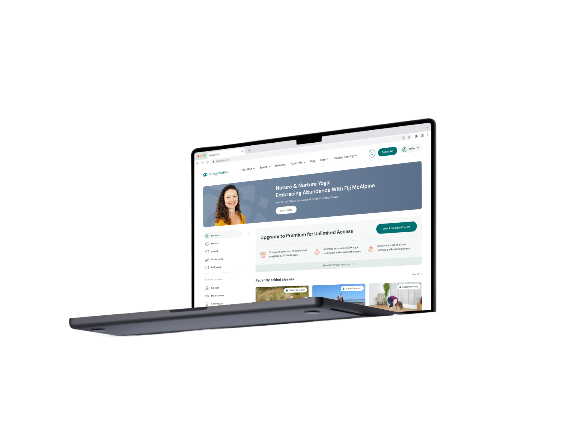
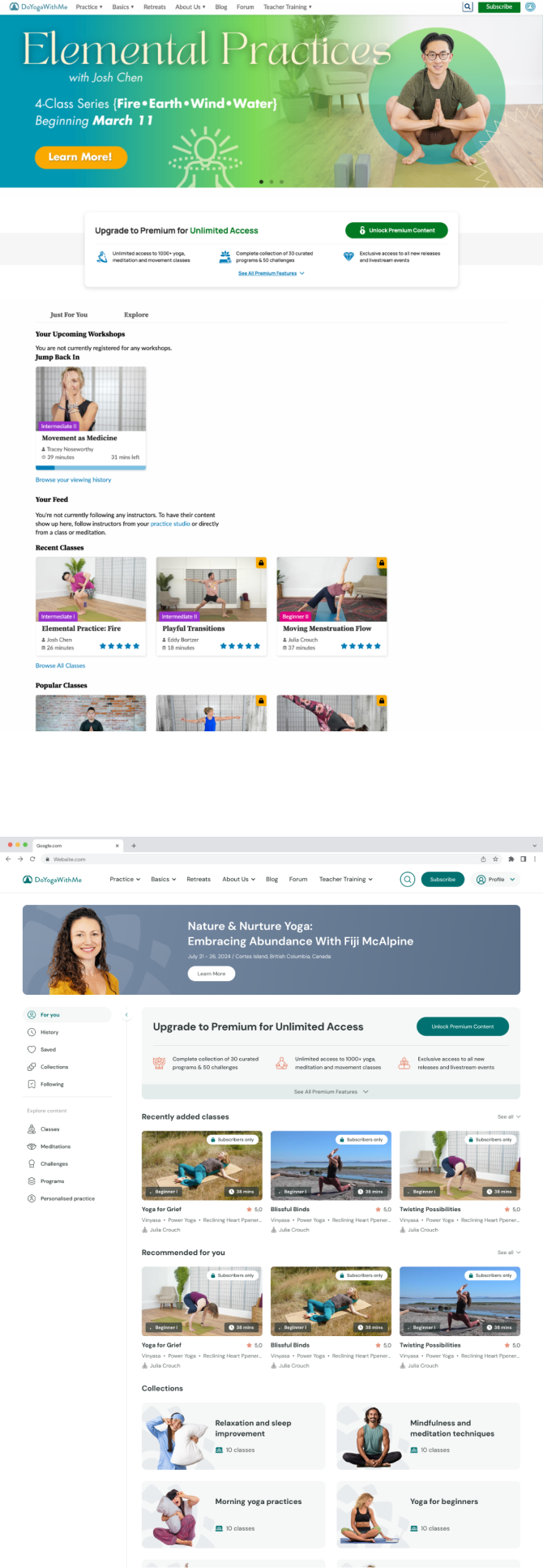
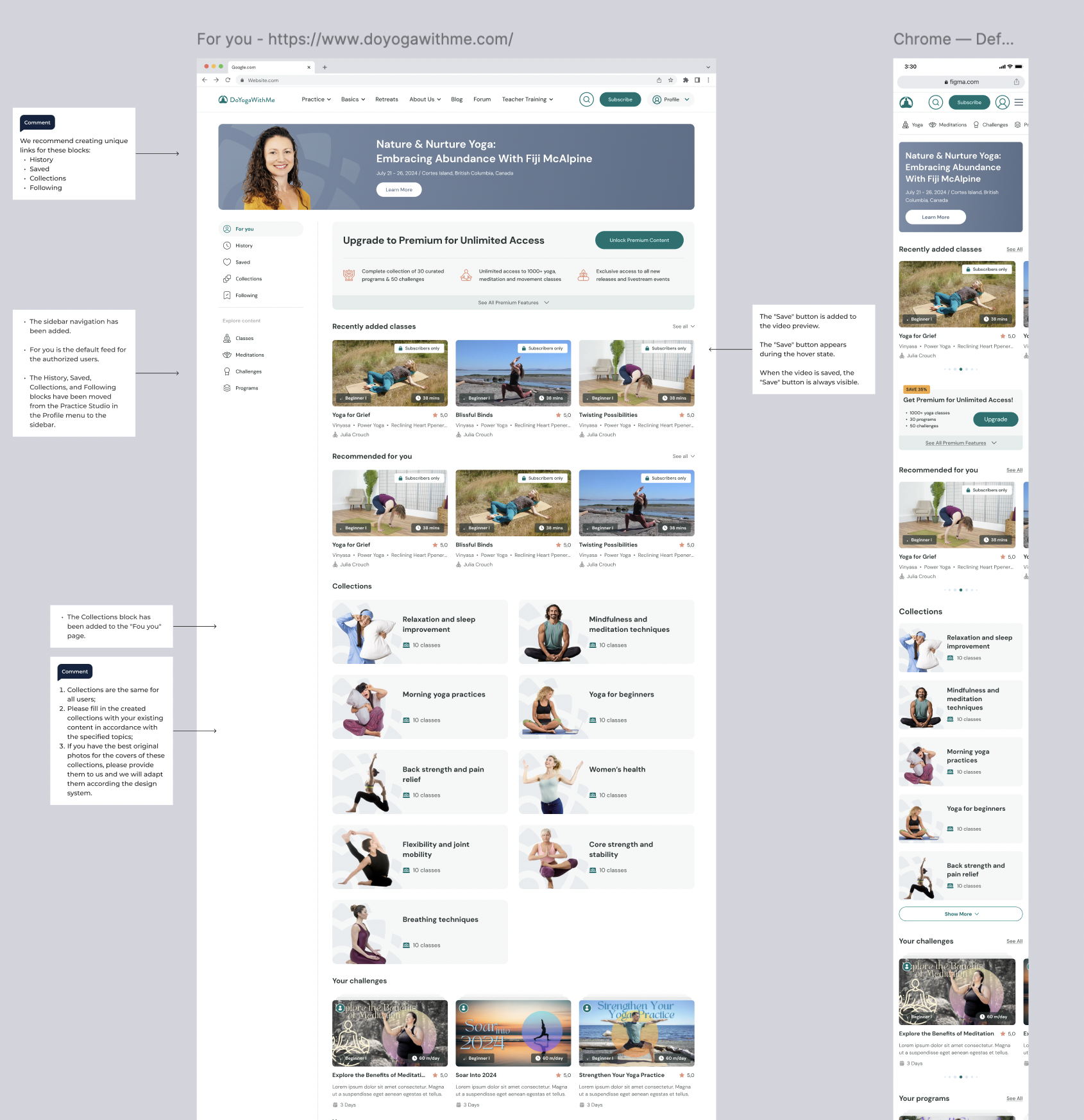
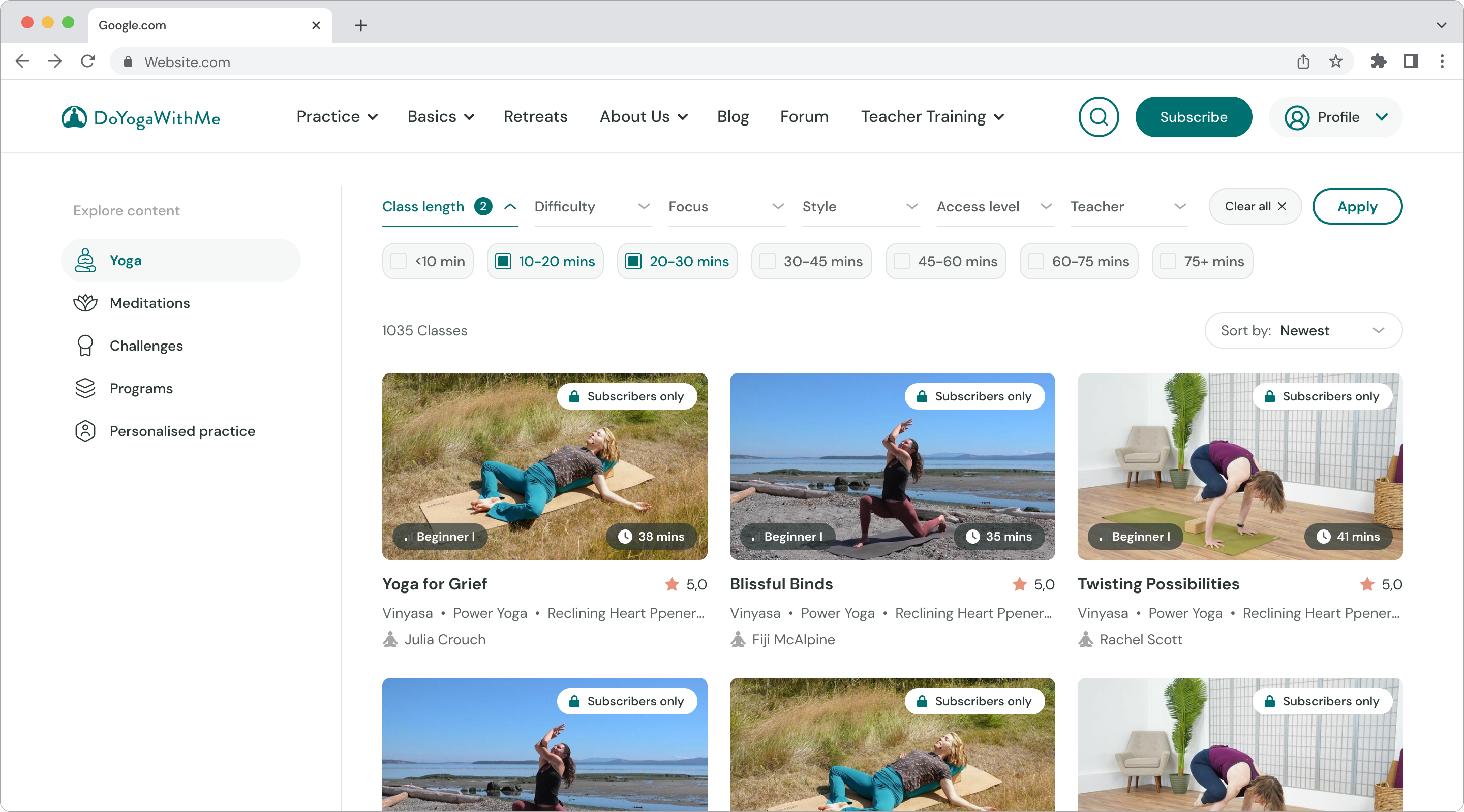
To address the core UX problems, I introduced a redesigned navigation system built around a clean and permanent sidebar. The previous header only partially guided users, while the new sidebar created a stable anchor for exploring classes, collections, history, saved items and recommendations. Importantly, we kept the original site map intact to simplify development while completely rethinking how information was organized and accessed. This approach reduced friction without breaking existing logic or SEO flows.

UI Redesign and Visual Refresh
The visual upgrade was as important as the structural one. I created a brighter and more confident color system, improved contrast, applied a clearer typographic hierarchy and introduced higher quality imagery to elevate trust. The site received a modern, friendly and more premium look that aligned with the emotional tone of a yoga and wellness brand. Card components for classes, collections and challenges were redesigned to be more scannable and recognizable across the interface.
Content Architecture and Personalization
A major improvement came from rethinking how content was grouped and presented. I redesigned the main blocks such as Recently added classes, Recommended for you, Collections and Challenges. The new layout felt more curated, personal and structured. Collections received stronger visual identities, and each topic was easier to discover, which increased engagement and improved the pathway toward subscription.
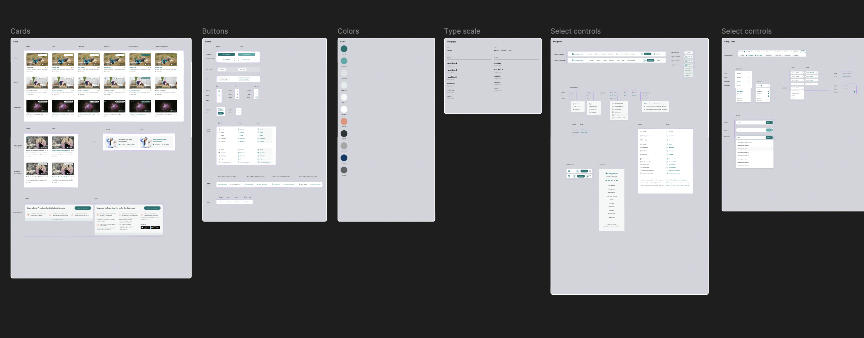
Full Interactive Research Prototype
Before development, I built a fully interactive Figma prototype that simulated the entire browsing experience. Every hover state, animation, menu movement and card interaction worked exactly as it would on a real site. This allowed users to test the redesign as if it were live, providing accurate and actionable feedback. The research phase validated all major UX decisions and helped the client make an informed choice about moving forward with a full rebuild.
Final Results
The redesign delivered strong outcomes. The clearer navigation, refreshed UI and improved content structure contributed to a measurable increase in registrations and a meaningful rise in premium plan purchases, reaching an uplift of about ten to twelve % across key conversion steps. Engagement improved, user confusion decreased and the entire platform felt significantly more modern and trustworthy. The client was fully satisfied with both the process and the final result, and the redesign became a solid foundation for future improvements.